Simplicity

I love simplicity in design. It’s not easy to achieve but I always admire when a piece is taken back to the bare essence of an idea. So when Textileartist.org announced a challenge by Emily Jo Gibbs, I was intrigued with her style. The instructions were to find a stick or an object such as a paintbrush to be your inspiration. Then, sketch the item and use that sketch to create an applique. Ha! Applique is perfect for another homework assignment. Plus, the simplicity of using a sketch as the design. I have hundreds of sketches that I could use. But I found a stick, and did a sketch of it, including the shadow.
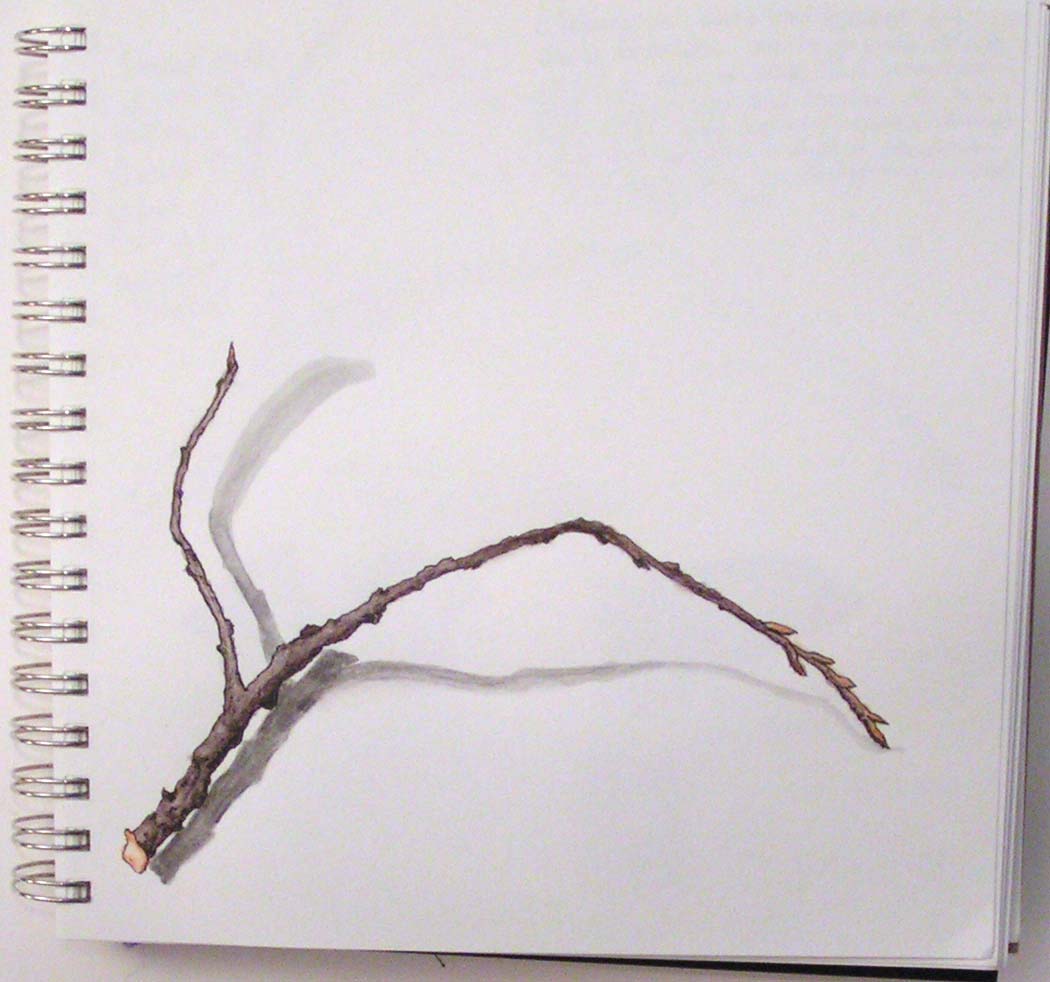
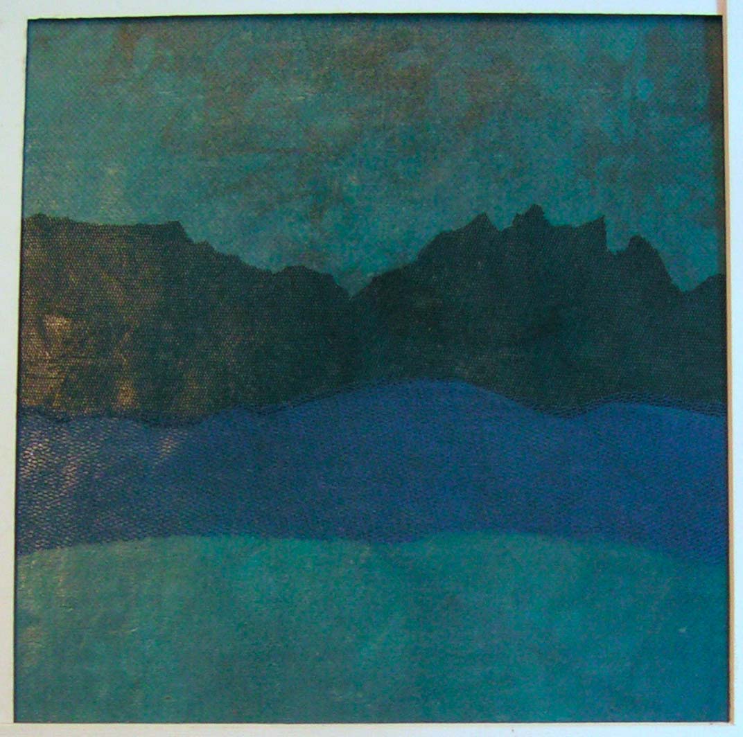
Then I created a pattern for the applique pieces out of tracing paper, chose some hand dyed organza and a linen background.
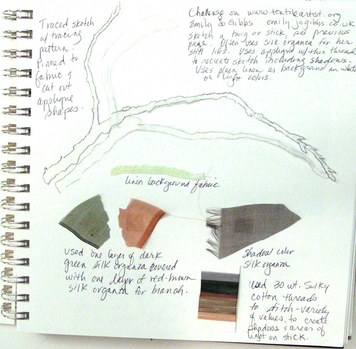
Here’s the documentation in my sketchbook for Level 3 Stitch class.

Then on to hand stitching while listening to a portion of an online class given by MOMA. I love the simplicity of the piece. A bare bones sketch in applique. As I said, I have loads of sketches that I could recreate this way.

For the MOMA class, the artist featured this week was Barnett Newman. I had never heard of him before and it was interesting to learn about his style. Again, simplicity is evident. His work that he is best known for are his “zips”, the line of yellow oxide down the middle of the painting in a solid colored background. But the “zips” weren’t usually exact and had more complexity to them as you get closer and view the painting at more length. Many of his paintings are really large so that as you get closer, you are engulfed by color. The painting above is done in his style. Acrylic paint on sketchbook paper. I don’t think it quite gives the same impact as it might have on canvas or board. But it was an interesting experiment.

It’s a fun course and now we are studying Willem de Kooning.

Thanks for stopping by and stay safe!


Completed Envelope Book

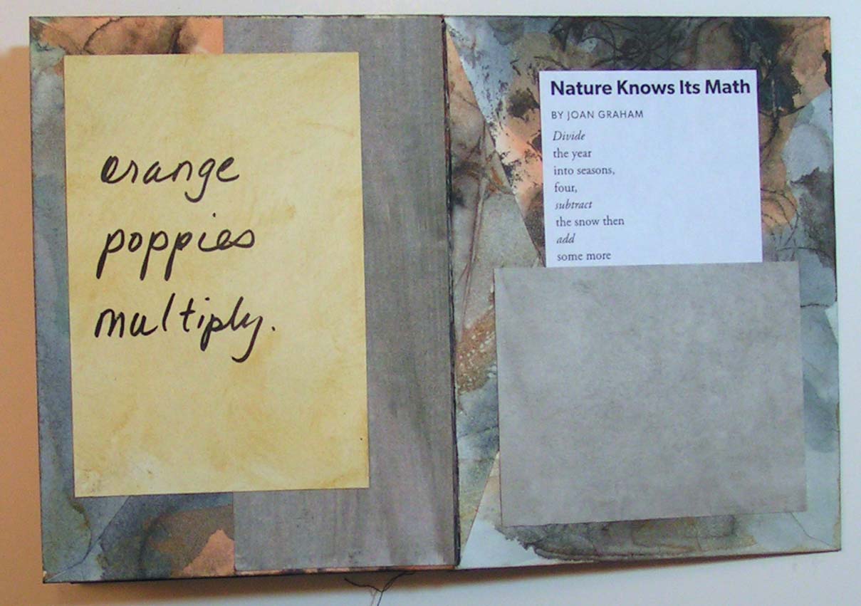
I finished up the envelope book I showed you last week. I decided to use my own handwriting for the poem even though I generally dislike my own writing. But I went with it anyway. I used a poem by Joan Graham called ‘Nature Knows Its Math’. It seemed to fit and I added in a few more sketches on several pages that referenced the poem.

Here’s the front again. I used a painted piece of rice paper for the binding. The binding paper has a couple layers of acrylic medium to make it stronger. It almost feels like fabric.

I really enjoyed creating this book. It is a very easy book construction and can be decorated in an infinite number of ways. Have you tried creating your own books? I’d love to see them if you have.


Take care and stay safe!


Creating an Envelope Book

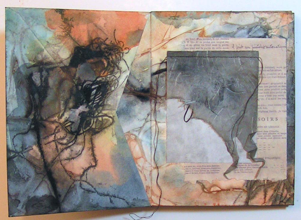
Our local group’s challenge this week was to create an envelope book. Paula showed us how to put the envelopes together. We were actually supposed to collage the pages but I didn’t end up doing much collage work.

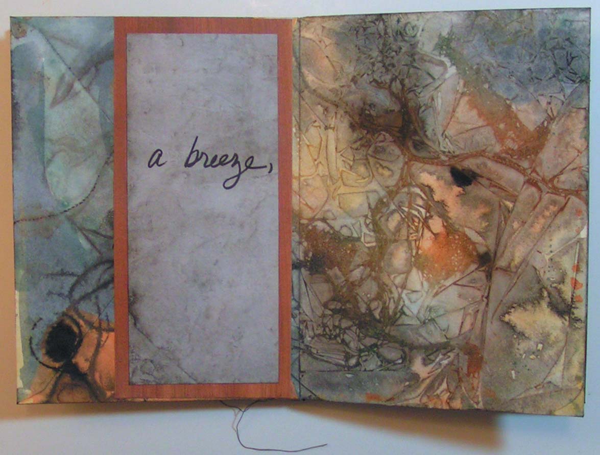
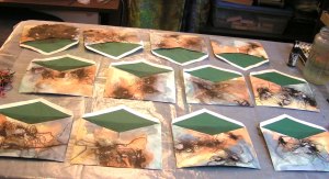
I decided to paint my envelopes first. I did that with watercolors and high fluid acrylic dark brown paint. I used a variety of threads, cheesecloth and plastic wrap to get the various organic designs. Afterwards, I had to iron all the envelopes as they got very warped from the liquid applied. The glue also didn’t hold well and they all started to come apart.


Here is an example of one envelope after the paint dried and the envelope was ironed.

I then put the book together. You slide the flap into the previous envelope, fold the envelope back in the opposite direction and then just keep adding another envelope until you have a book. In the right hand photo, you can probably see that the envelopes haven’t been glued yet. I had to glue them all back together and then glue each flap into the prior envelope. That way the book holds together. Now on to embellishing.

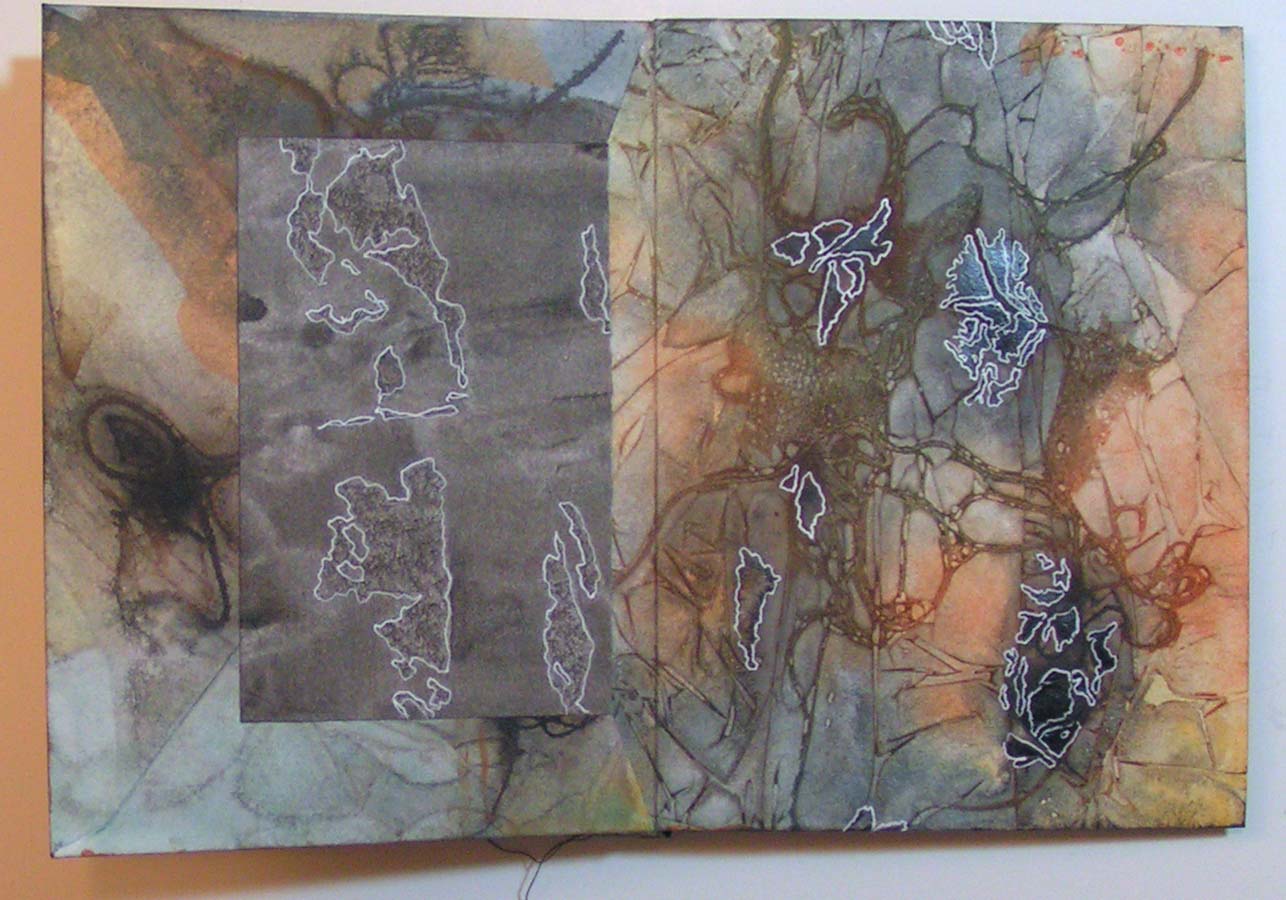
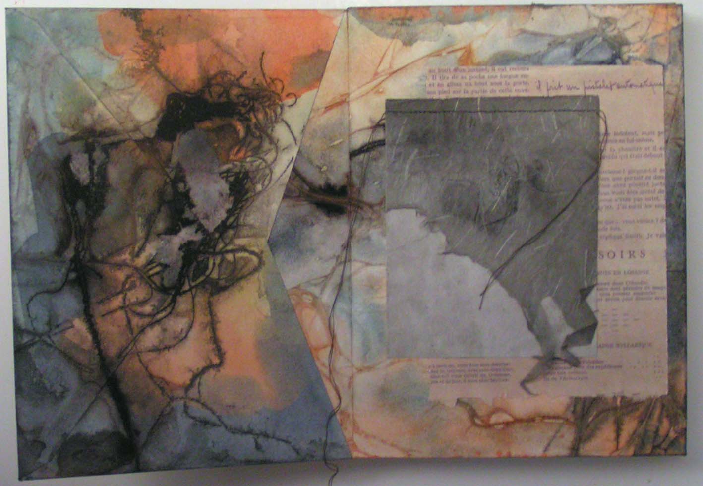
This is the front cover. I added some paint pens, markers and colored pencil. Always fun to see what you can find in these very organic looking designs.

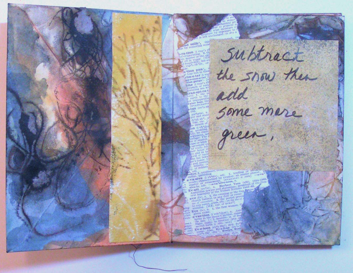
Here’s another set of pages where I added some collage elements on the right hand side. The darker grey torn paper can be lifted to see what’s underneath. The plan is to add some poetry to the blank papers that I am adding in.  I’m still working on finishing the book but I’ll show you more next week.

Stay safe!


Five in a Row

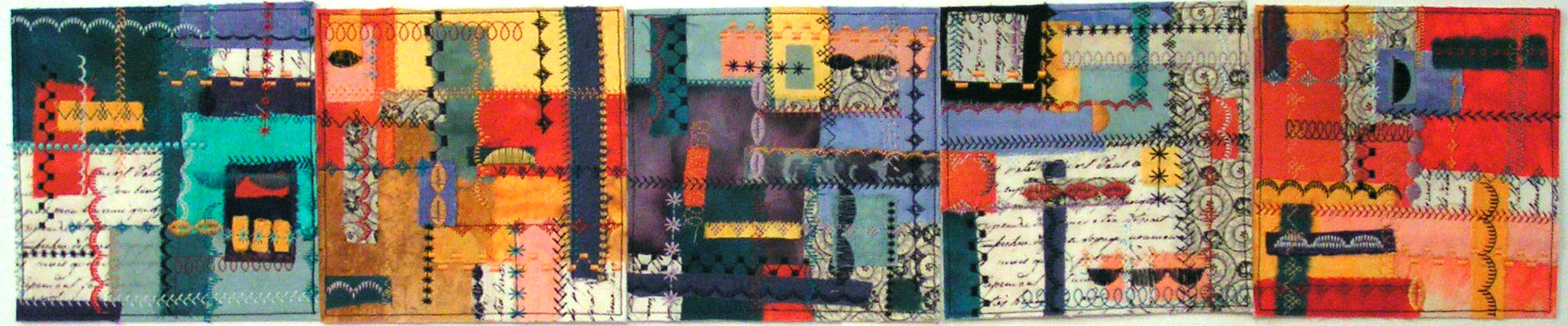
A couple of weeks ago, I showed you some color studies I have been creating. I finished the last one and thought you might like to see all five of them.

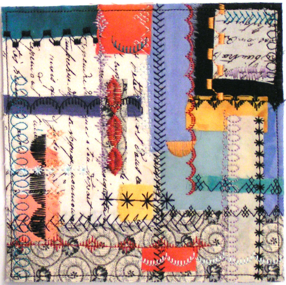
Here is the last one that has more black and white and less of the other colors.

And here is a photo with all five in a row. I tried the different colors in many different positions trying to decide which ones looked the best together as well as the overall progression of color. This was the combination I liked best so far. But that could change depending on what method I decide to attach them together.

These were fun. I don’t use the automatic stitch choices on my machine much. It took a bit to figure out how to do only one or two stitches and all those other fancy functions that I rarely use on my machine. But it was a good learning process.

I hope you’re staying safe. I am staying at home and yesterday, my art group met by Zoom. We had a great time and it was easy. If you haven’t given it a try, Zoom is well worth the look.

After The Snow

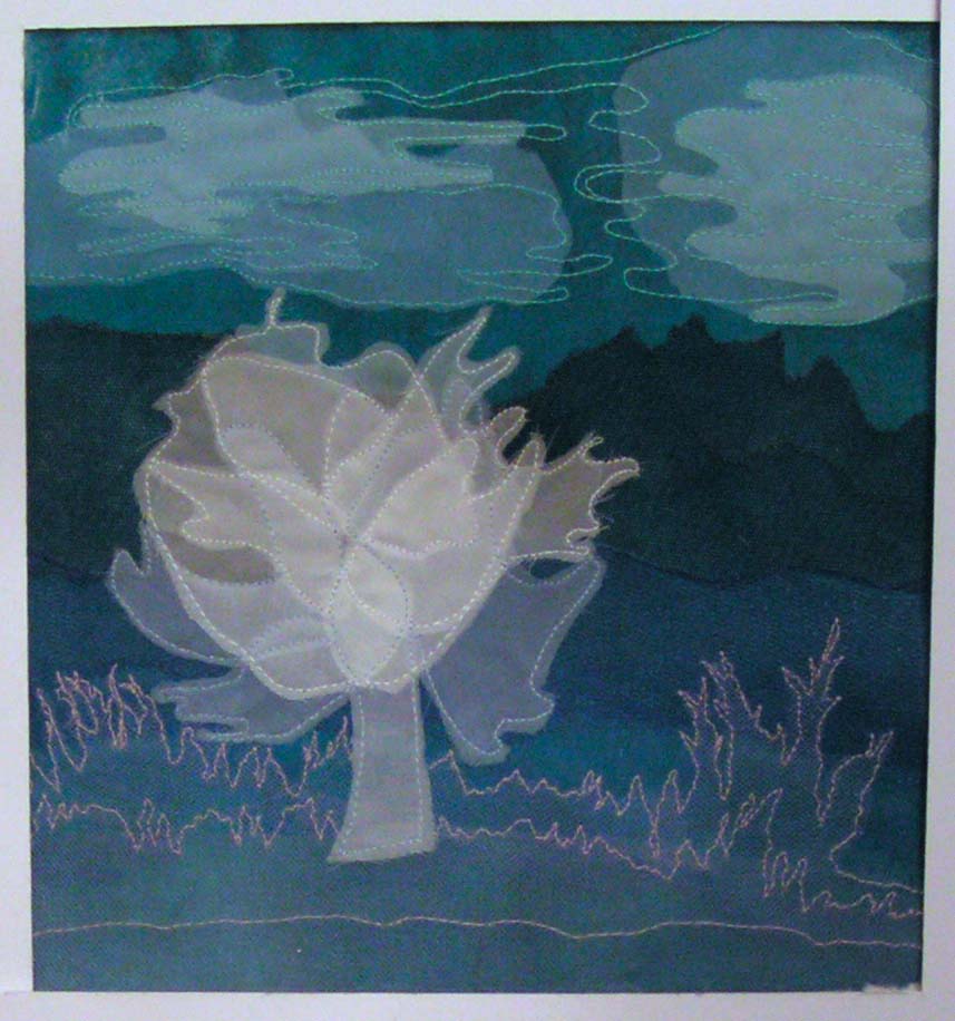
I have seen a lot of people recreating famous paintings online. So I thought I would give it a try with an applique piece. I used Paul Klee’s Before The Snow as inspiration. I had printed the photo of the original out in black and white so that I could see the values and the shapes better. It has been several months since I printed out the photo and I knew it had something to do with snow but I didn’t remember the title even. So I started thinking it would look good in a combination of blues and purples.

I used a hand dyed fabric for the background, covered that with fusible and then added tulle and sheer fabric.

Here I have added the clouds and the foreground plants.

Then I added the tree. So it was definitely looking snowy. And then it snowed here, which isn’t that unusual in April but when you’re housebound, the cabin fever seems to increase since it was too cold to even go outside in the garden. But I was celebrating the snow with this new piece.

Then I added free motion machine stitching. I tried to keep the stitching fairly simple and just give a little bit of line definition. So then I decided to go back and look at the original photo in color. Imagine my surprise when it turns out that it’s Before the Snow and it’s in fall colors. But that’s OK, After The Snow turned out as I had been seeing it in my mind’s eye.

Thanks for stopping by and I hope you’re staying well.