Ponderosa Pine Applique

I have always loved the bark on the Ponderosa pines. It has great texture and the pieces that slough off look like puzzle pieces. Needless to say, I have a collection of those.

Here’s a photo of the Ponderosa pine bark. Not only great texture, but interesting colors and shapes.

Here’s a photo of the resulting applique I created based on bark. I used a felt background with inclusions to give more volume to the raised areas. I then added a variety of silk applique and stitched down with hand dyed wool thread in a variety of colors. I then machine stitched the background to flatten those areas and give the piece more depth.

New Work to BACC

I took a trip to Bigfork today to drop off some new work for the Christmas season.

I created three new smaller pieces (5″ x 7″) since those seem to sell quickly. This one is called Summer Dreams.

This one is Solitude.

And the last one is Autumn Dreams.

I also took this much larger one (18″ x 24″) called Overlook.

This water lily piece that is called Tranquility (12″ x 12″).

And this piece which is called The Trail of the Cedars (18.5″ x 15.25″).

Here’s a close up of the stitching.

So if you’re in the area and you’re looking for some great gifts, check out BACC in Bigfork, MT.

Thanks for stopping by and I hope you are all staying safe and have a great holiday season!

Two More White Samples

I hope you aren’t getting tired of seeing white samples. Perhaps it’s to make up for all those color samples that happened before.

This one is trapunto. I used wool to stuff with and I can see the change in color of the “white” wool through the silk that is on top. It’s not a big deal but you can see the edges where the wool didn’t fill the stitched shape completely.

This one is shadow quilting. I used a heavy interfacing to cut out the bark shapes and then back stitched around them.

Have a great weekend!

White on White Samples

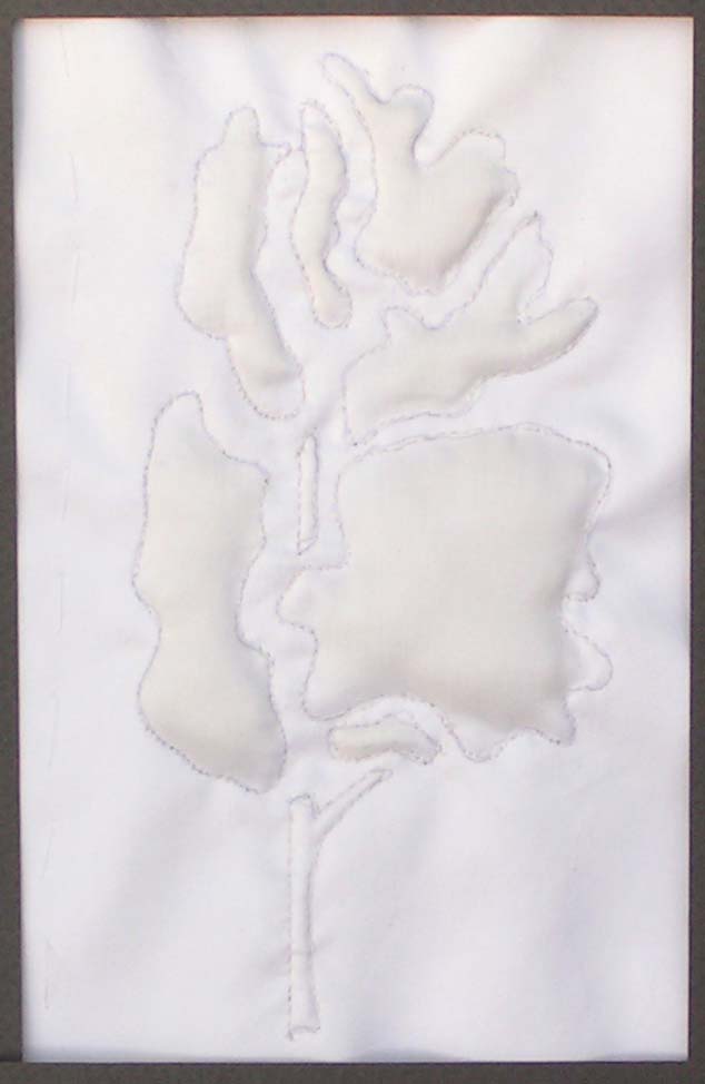
Last week I “went” to class for Level 3 Stitch. We had class online. It was an interesting experience. Not quite the same as real class but we are able to move forward and continue class so it was good. It was really great to get feedback on the applique pieces and we’re starting to think about what our “big” project will be. We also looked at white on white and how that affects design. So now, you guessed it, white on white samples.

It’s interesting to see all the different “whites” in fabric. Something may look white but then you put it up to something that is a much brighter and whiter white and it is a totally different color.

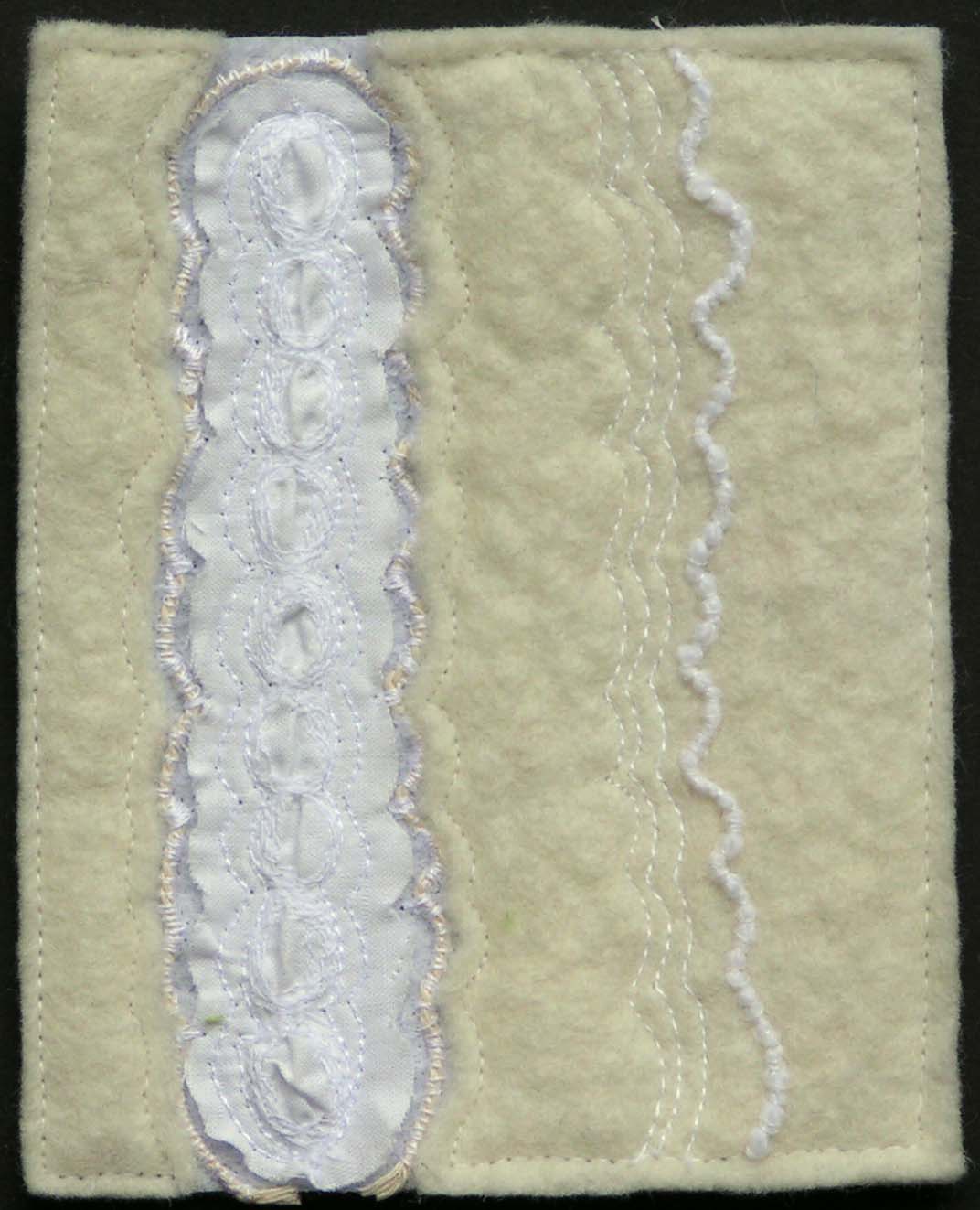
White felt is definitely not the same as white cotton fabric. It’s interesting to see the different textures that sewing on different types of fabric creates.

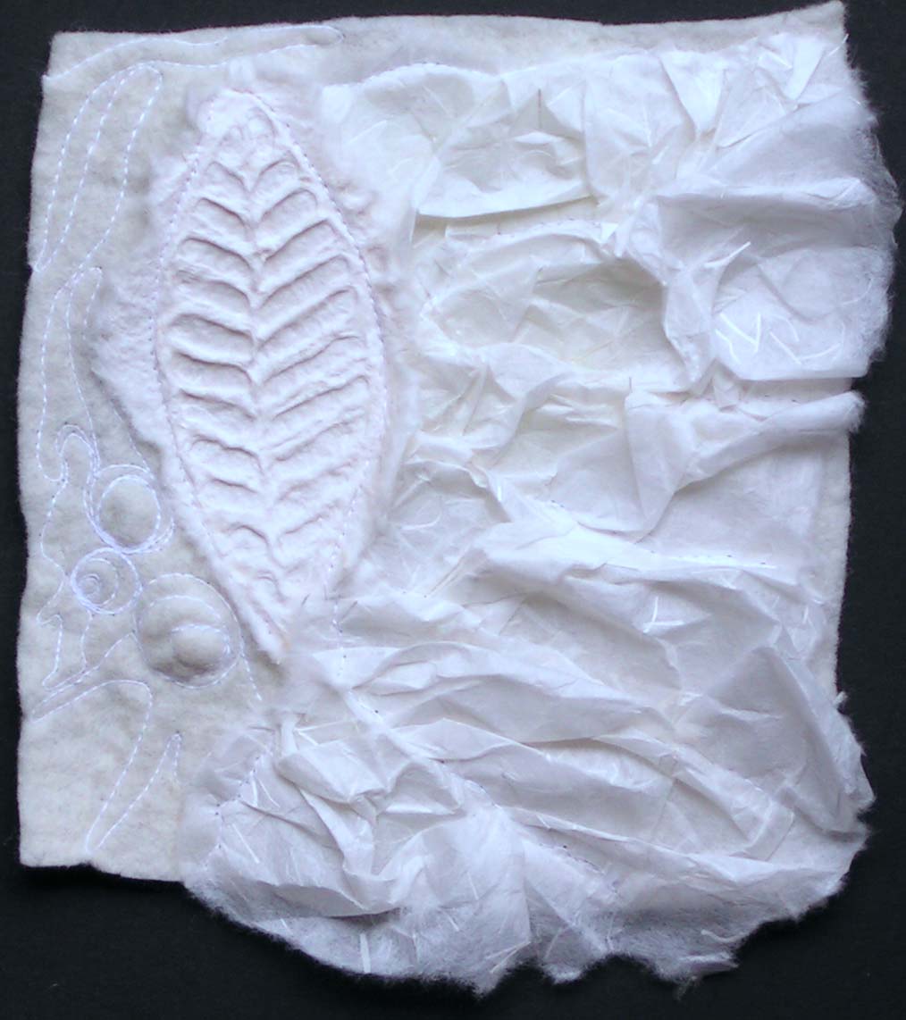
And even paper is game.

Lighter fabrics are easy to manipulate with stitching.

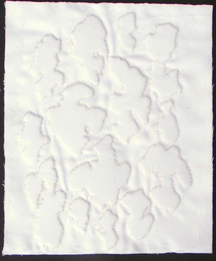
I have been searching through my stash to find what I have in white.

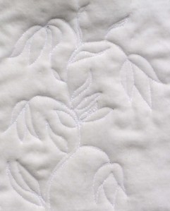
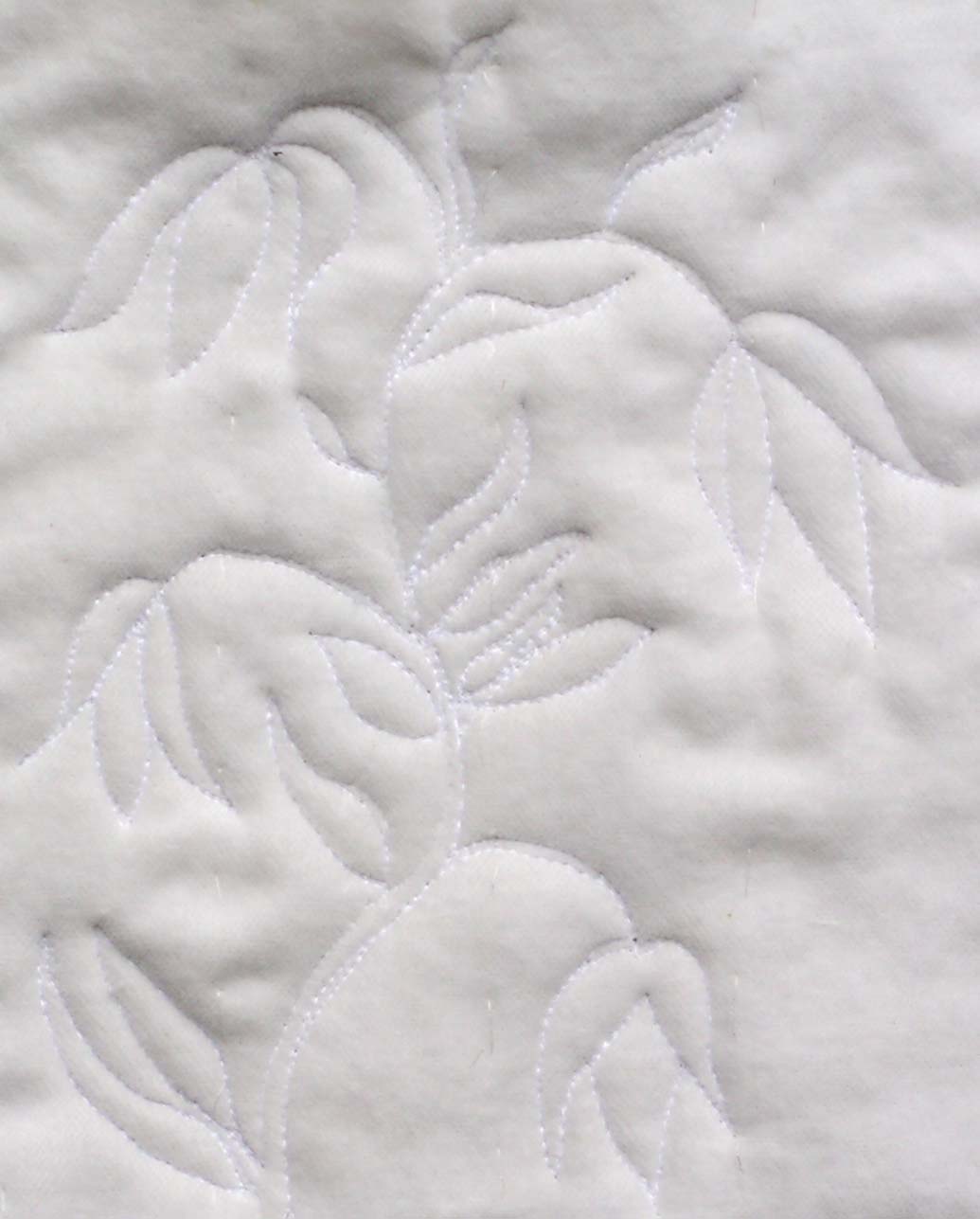
Quilting in white definitely shows the shadows of the stitching.

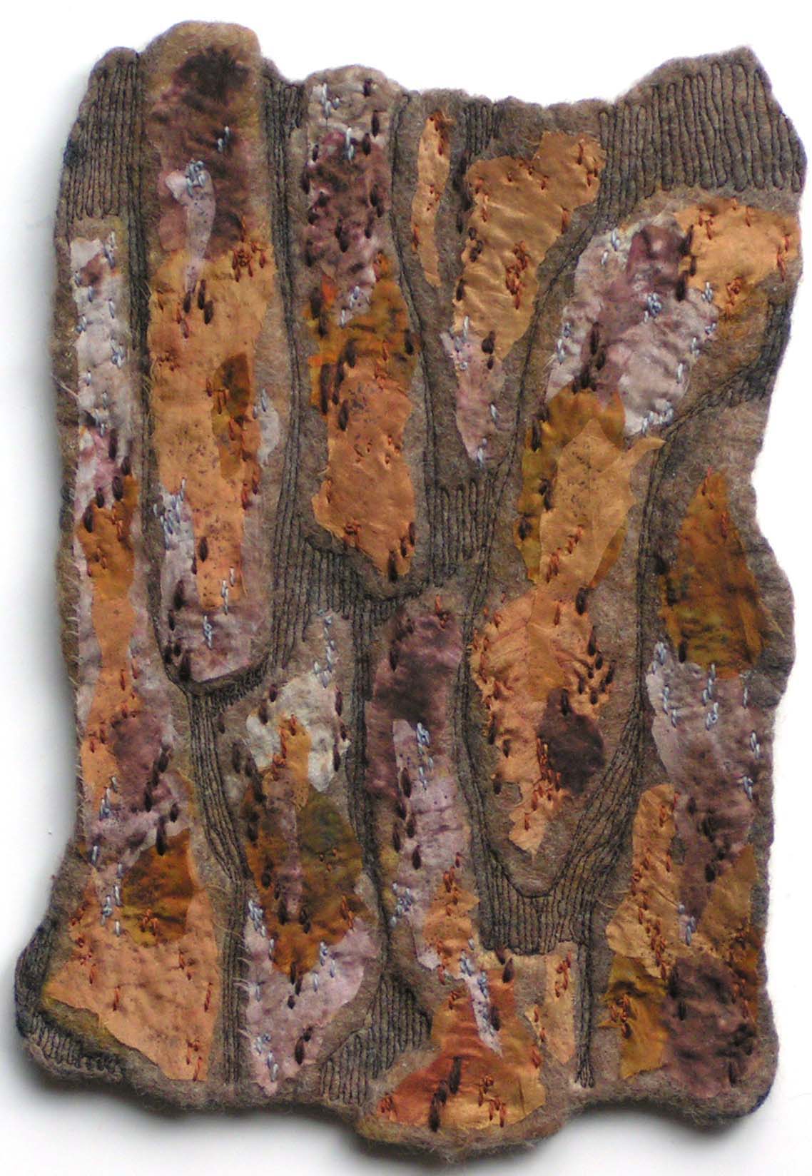
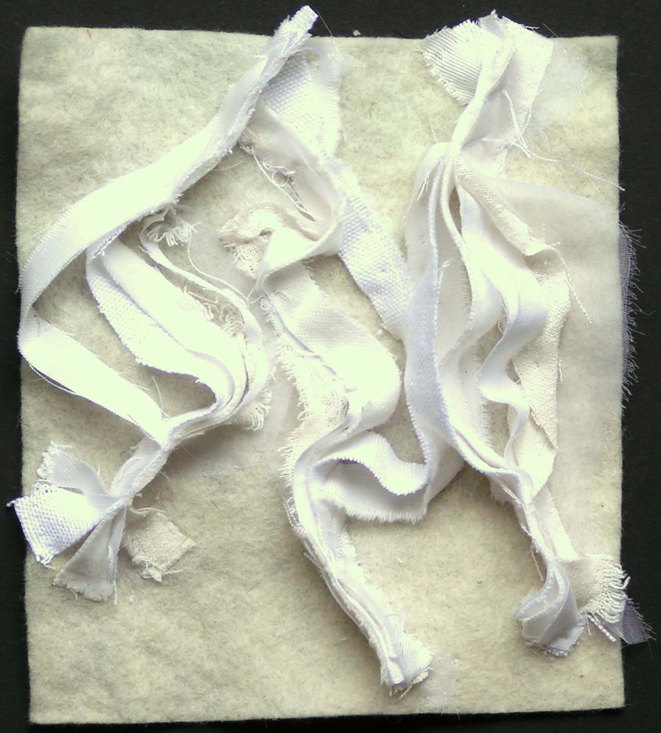
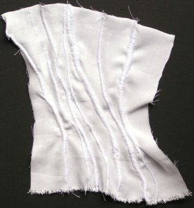
I borrowed this idea from one of my classmates color samples. This stitch and slash technique is really good with different colors of fabric as it really achieves some interesting color mixing. I thought I would see what it did with different white fabrics. It gives a really nice texture. It kind of reminds me of stone carvings.

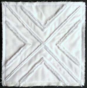
And this last one is using the cut off partially sewn edges from the piece above. This could definitely give some interesting textures.

Have you ever stitched white on white samples? I’d love to see them if you have! Hope you are all staying safe out there in this big, weird world.

After The Snow

I have seen a lot of people recreating famous paintings online. So I thought I would give it a try with an applique piece. I used Paul Klee’s Before The Snow as inspiration. I had printed the photo of the original out in black and white so that I could see the values and the shapes better. It has been several months since I printed out the photo and I knew it had something to do with snow but I didn’t remember the title even. So I started thinking it would look good in a combination of blues and purples.

I used a hand dyed fabric for the background, covered that with fusible and then added tulle and sheer fabric.

Here I have added the clouds and the foreground plants.

Then I added the tree. So it was definitely looking snowy. And then it snowed here, which isn’t that unusual in April but when you’re housebound, the cabin fever seems to increase since it was too cold to even go outside in the garden. But I was celebrating the snow with this new piece.

Then I added free motion machine stitching. I tried to keep the stitching fairly simple and just give a little bit of line definition. So then I decided to go back and look at the original photo in color. Imagine my surprise when it turns out that it’s Before the Snow and it’s in fall colors. But that’s OK, After The Snow turned out as I had been seeing it in my mind’s eye.

Thanks for stopping by and I hope you’re staying well.