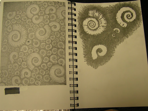
This is a sketch that I am working on to develop stencils and screen prints of fossils. These are ammonites. I do have one stencil of an ammonite but it is a bit precise and straight edged for me. I like the more natural look in this sketch.
Hand Dyed Wool Embroidery Floss and Dyed Felt
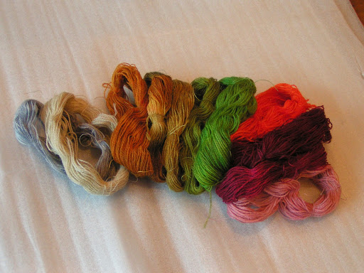
I’ve been working on getting all my embroidery supplies ready for my Level 1 Hand Embroidery class in February. This is lace weight wool that I made into skeins and dyed. I was trying for some earth tones, greens and a variety of rusty reds. Except for the reds, I got what I intended. I did make one bright orange for some lichen that I’m planning on embroidering. I have also ordered some supplies that I will show you after they arrive.
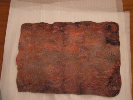
I also dyed the piece that I made in the sander tutorial. It is going to be used for the book covers for my Traveling Pages. I’m going to work this week on the mechanics of how I’m putting the book together. So more on that later in the week. I have finished my last page to be sent off to Gayle. I’ll show you that as soon as she receives it.
Thanks for all your comments on the sander tutorial. I’m glad you enjoyed it.
Fiber Nester Disappearance
You may remember in December I made a Fiber Nester for birds to take fibers and make their nests. It was hanging up for several weeks and then last week I noticed it was gone. I thought the wind blew it down so I was looking around on the ground for it. I couldn’t find it. Finally, I went out to have a better look.
And this is what I found. This is a branch from the same tree that it was hanging on. It is torn open with lots of fibers missing and draped over the branch. I thought maybe it was squirrels. They got cold and needed some extra insulation. My husband thinks it was a pack rat. What do you think?
I’m going to make some more and put them out closer to spring. I am going to make one with neutral, natural fibers and one with colored fibers. It will be experiment to see which the birds prefer. When I originally posted this, someone suggested they wouldn’t take the colored fibers as it would draw predators to their nests. So we’ll see. More later…
Dyed Scarves
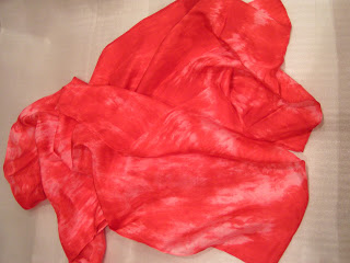
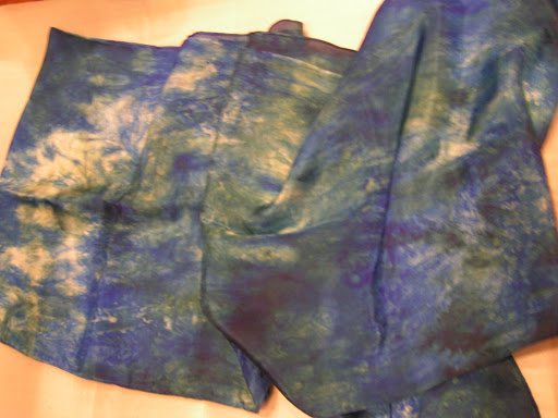
These are scarves that I dyed a few weeks ago but hadn’t gotten a chance to post about.
I did a variety of colors and they are all done with low immersion dyeing with acid dyes.
I am planning on using these as base for more surface design.
I plan on using a combination of techniques including discharge, stamping, stenciling, screen printing etc.
This one has both black and brown in it.
This one is brown and is pretty boring but that’s OK since I’m planning on adding more complexity.
And my favorite autumn combinations.
This is larger than the others and is really black and red but the lighting was pretty poor when I was taking these photos.
This one was dyed with walnut ink.
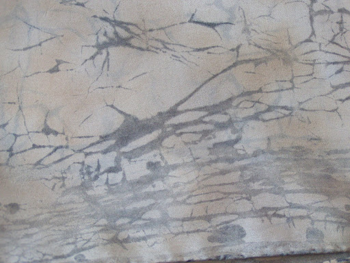
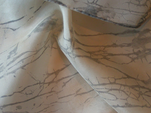
This one was also dyed with walnut ink as the first layer. I then used flour paste as a resist on the entire scarf. If you haven’t tried flour paste, it is really quite messy. I forgot one step but it still worked out. I didn’t pin the scarf down and left it to dry on a piece of plastic. The flour paste contracted and rolled up the edges of the scarf. It was quite a sight. But I flattened it out after it was dry (24 hours) and cracked the paste. I then thinned black textile paint with water and covered the pasted side completely with black paint. It was really ugly then.
After the black paint dried (another 24 hours), I rolled up the pasted and painted scarf and put it in a bucket of cold water. The paste peeled right off and I was left with this wondrous texture.
I love it! I washed the scarf to make sure all the paste came out. The black lightened a bit after washing but I really like the soft look.
I am planning on adding fossil motifs as another layer. I have a bit of practicing to do before I add them to the scarf as I don’t want to “ruin” it. I’m planning on using thickened dyes in shades of ecru and browns. I have the other walnut dyed scarf so I’m planning on trying the flour paste again. I may try them on some of the acid dyed scarves as well. More on these later after they have more surface design applied.
Design Focus Friday – Form
I’ve shown you this photo before. It is the start of an exercise from the book Watercolor and Collage Workshop by Gerald Brommer. The exercise is to work from abstraction to representation. So you start with abstract shapes as above. I was thinking about making rocks so I chose the browns and blacks. I added the blues at the end because I felt it needed a little contrasting color.
The next step is to tear up pieces of rice paper with fibers embedded and glue it over your dry watercolor abstract painting. You can cover the whole surface or part of the surface. I covered most of the surface except for some of the edges. You use half glue and half water to glue the paper down. The pieces of paper were generally less than an inch square and were very irregular in shape.
Here’s a closer view so you can see the fibers in the paper.
You then let that dry and start adding paint again. I forgot to take a photo of the in between stage but I have to tell you it was really ugly. Could that be why I forgot to take a photo? I added lots more paint and made some rock shapes. But they were very flat and ugly looking. But I persevered and kept adding more paint, small shapes and line. Then you turn your piece in all different directions and look to see what is the best orientation to finish out your piece. So it ended up with the rings of the notebook on the bottom of the painting.
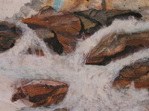
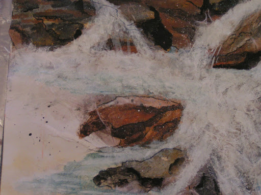
Then add more paper if you aren’t satisfied with your piece. So that’s what I did. I decided to make it look like a river with rocks. So here’s the added paper. I then added more paint on top of the paper once it was dry. I did scrub off some of the paint on the tops of the rocks as I felt they were too dark. I was trying to make the rocks have form and the painting to have some depth. I also added more shading to the rocks with black and grey paint. I worked on the water with white and turquoise blue. I spattered some paint and also drew some more line.
And this is the result. I decided it looked more like the ocean with water pouring in at high tide over the rocks. I did use the photos from the book for a resource of what rocks look like and how the water flows but otherwise, this scene doesn’t represent any particular place.
How do you think I did? Did I achieve believable rocks with implied form on the 2 dimensional surface? Do you feel the depth in the subject?
Actually, I am amazed that I painted this. The collage process really adds depth and different colors underneath the water that I never would have thought to paint myself if I was trying to paint this type of scene. One of the things I learned with this process is not to give up when it is looking really ugly. Keep pressing forward adding more paint and more rice paper. You might amaze yourself as I did! Do leave me a comment if you are working on form in your work. I’d love to see what you’re doing.