
I’ve shown you this photo before. It is the start of an exercise from the book Watercolor and Collage Workshop by Gerald Brommer. The exercise is to work from abstraction to representation. So you start with abstract shapes as above. I was thinking about making rocks so I chose the browns and blacks. I added the blues at the end because I felt it needed a little contrasting color.

The next step is to tear up pieces of rice paper with fibers embedded and glue it over your dry watercolor abstract painting. You can cover the whole surface or part of the surface. I covered most of the surface except for some of the edges. You use half glue and half water to glue the paper down. The pieces of paper were generally less than an inch square and were very irregular in shape.

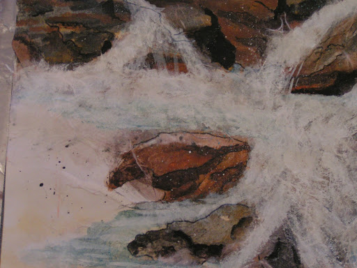
Here’s a closer view so you can see the fibers in the paper.

You then let that dry and start adding paint again. I forgot to take a photo of the in between stage but I have to tell you it was really ugly. Could that be why I forgot to take a photo? I added lots more paint and made some rock shapes. But they were very flat and ugly looking. But I persevered and kept adding more paint, small shapes and line. Then you turn your piece in all different directions and look to see what is the best orientation to finish out your piece. So it ended up with the rings of the notebook on the bottom of the painting.

Then add more paper if you aren’t satisfied with your piece. So that’s what I did. I decided to make it look like a river with rocks. So here’s the added paper. I then added more paint on top of the paper once it was dry. I did scrub off some of the paint on the tops of the rocks as I felt they were too dark. I was trying to make the rocks have form and the painting to have some depth. I also added more shading to the rocks with black and grey paint. I worked on the water with white and turquoise blue. I spattered some paint and also drew some more line.

And this is the result. I decided it looked more like the ocean with water pouring in at high tide over the rocks. I did use the photos from the book for a resource of what rocks look like and how the water flows but otherwise, this scene doesn’t represent any particular place.
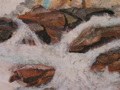
How do you think I did? Did I achieve believable rocks with implied form on the 2 dimensional surface? Do you feel the depth in the subject?
Actually, I am amazed that I painted this. The collage process really adds depth and different colors underneath the water that I never would have thought to paint myself if I was trying to paint this type of scene. One of the things I learned with this process is not to give up when it is looking really ugly. Keep pressing forward adding more paint and more rice paper. You might amaze yourself as I did! Do leave me a comment if you are working on form in your work. I’d love to see what you’re doing.

I think you did an amazing job. The rocks look very realistic to me. It looks three dimensional to me. Fantastic job.
This looks great and yes the rocks do look real. The texture adds so much and I am always looking for ways to add it to my work. I will have to look for the book you mentioned.
Wow! It looks amazing Ruth. I love the depth that the finished piece has. I'm ready to go sit on one of the rocks and dangle my feet in the water.
Totally awesome results! So amazing the effects the rice paper made. Your rocks look great! I would be so thrilled with it if I had done that. Maybe one day I can give this a try.
Wonderful art. I enjoyed seeing the steps that led to the final result.
It looks great to me, & I loved seeing the process.