Design Focus Friday – Rhythm

 Do you listen to music while you create? Does that change the rhythm in your work. The marbling above has a nice flowing rhythm with a little excitement added in with the red dots.

 This postcard is repetitious and has more of a staccato type of rhythm as the eye jumps around more.

And this is also very repetitive but flows better as your eye has a tendency to move up or downward.
This is probably the last of the Design Focus Friday posts. It has been a year since I started this journey and I feel it has really helped me with thinking about design a bit before jumping right into a piece. I hope you have enjoyed the series of posts and thanks for stopping by.
In another note, my big project is almost complete. I just have a bit of mopping up to do and then it will be off to the publisher. Yes – I wrote a book about felting. I will soon have a bit more information for you. I’m very excited that it is finished and there will be more details to follow. So I will be around the blogs more, leaving comments and showing you some actual new work in the near future. WooHoo!

Design Focus Friday – Rhythm

 The use of chain stitch as a filler in this piece gives a very flowing rhythm to the end result.

 The use of dots could seem more disjointed in rhythm but because they are spaced close together, the eye sees the entire shape instead of just the dots. So it ends up being more sinuous than spotty.

The rhythmic repetition of squares by themselves creates a choppier rhythm than the two pieces above.

How do you use elements in your work to create rhythm? Leave a comment and a link so we can all take a look! Thanks for stopping by and I will soon be back to normal operations as my big project is almost complete. WooHoo!!

Design Focus Friday – Rhythm


Rhythm in art refers to the movement of the viewer’s eye, a movement across recurrent motifs providing the repetition inherent in the idea of rhythm. It is based on repetition and involves a clear repetition of elements that are the same or slightly modified. Most often we think of rhythm in the context of shapes and their arrangement.


Flowing horizontal curves give a feeling of relaxation and calm or connecting and slowing. The rhythmic pattern chosen will quickly establish an emotional response to a piece. If the shapes are rigidly defined with sudden and startling value changes, you will achieve a feeling of abruptness and dynamic contrast. If the rhythm is consistent or regular throughout the composition, the mood will also be consistent. However, if the rhythm is in an irregular pattern, it may be unsettling to the eye.
Alternating rhythm consists of successive patterns in which the same elements reappear in a regular order. This is seen many times in the natural world. Alternating rhythms and rhythmic variety can relieve predictability in a design.


Progressive rhythm gives a feeling of a sequential pattern and is achieved with a progressive variation of the size of a shape. This is seen in perspective changes when we look at buildings from an angle. The perspective changes the horizontals and verticals in to a converging pattern that creates a regular sequence of shapes gradually diminishing in size.

Questions to get you started:

Rhythm is usually associated with music. Can you make a composition that is based on your favorite piece of music? How does the repetition of the shapes you are using remind you of the music? How can you use the various elements i.e. line, shape, color, value, texture to form the rhythm and feeling of the music?

Can you use rhythmic repetitions in your work to show movement? How can you depict sequential patterns? Or alternating rhythms?

Design Focus Friday – Scale and Proportion

Whoops! It isn’t Friday, I seem to have missed that but here’s a short post about scale and proportion. Both of the pieces that I show here are based on leaves. The one above has a different scale than the one below. What do you think the difference in scale in the two pieces makes?

Both pieces have multiple leaves, but the top piece is completely covered with “large” leaves in comparison to the size of the work. This second piece to me is more about the placement of the leaves and is entitled “Balance”. Do you use different proportions in your work? I’d love to hear about it.

Design Focus Friday – Scale/Proportion

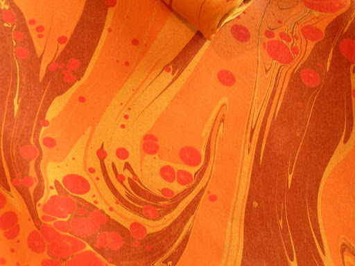
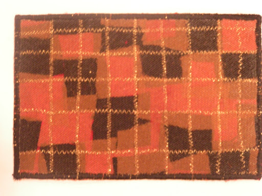
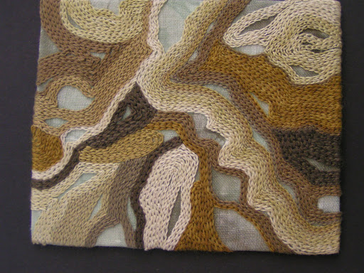
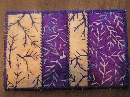
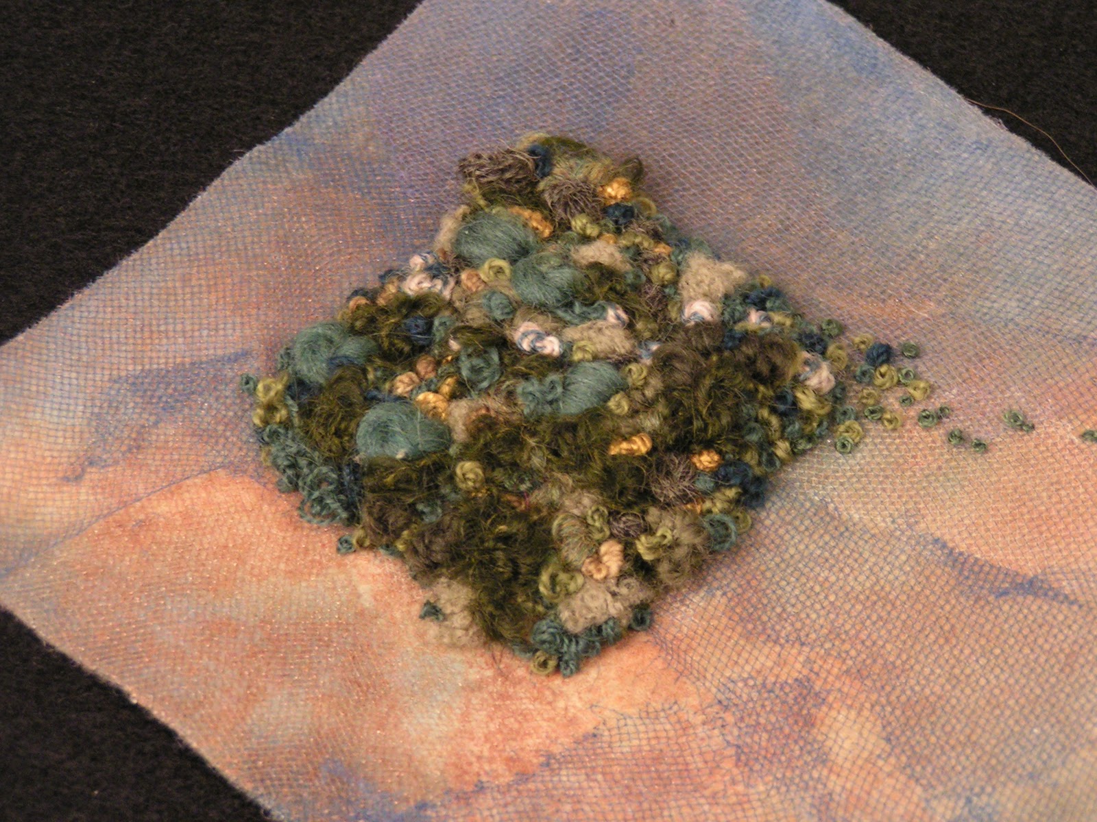
 Scale and proportion basically refer to size. Scale means size i.e. large scale means big. However, unless you have a standard of reference, the term “big” is meaningless. Proportion means relative size as in size measured against other elements or against some mental norm or standard.
 

Scale and proportion are closely tied to emphasis and focal point. Large scale makes for an obvious emphasis especially in proportion to other elements of the composition.

 The scale of art can be considered in several ways:

• Human scale – consider the scale of the work itself in relation to human size; Unusual or unexpected scale is attention getting. Sheer size does impress us.

• Context – consider the surroundings and the circumstances in which the art is displayed – does the scale of the work affect the meaning in that particular context?

• Internal proportions – scale and size are relative to the overall area of the format of the work; changes in scale within a design change the total effect of the design. The choice of scale and proportion should help to achieve the artist’s intentions.

• Contrast of scale – scale can be used to draw our notice to the unexpected or exaggerated, as when small objects are magnified or large ones reduced. A sudden change in scale draws attention.

• Scale confusion – deliberate change of natural scale to intrigue or mystify the viewer rather than to clarify the focal point – surrealism often uses this technique.

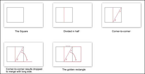
Proportion is linked to ratio. The proportion is judged to be correct if the ratio of one element to another is correct. The ancient Greeks sought to discover perfect proportion and developed the golden rectangle. This has influenced art and design throughout history and is found in growth patterns in nature. (click on the illustration above to enlarge)

Questions to get you started:

Do you usually make pieces that are small or do you always work in a large format? How does switching to a different size format affect your work? Can you make three separate works about the same subject but vary the scale and proportion in the work? How do you think the viewer will feel about the change in scale/proportion and it’s affect on the meaning of the work?
 

Can you use contrast of scale or scale confusion in your composition? How does this exaggeration make you see your work differently? Do you use the “golden rectangle” in your proportions? What happens if you deliberately make a piece based on the “golden rectangle”?