Future Silk Screens

 I worked this week on finishing up my fossil sketches.
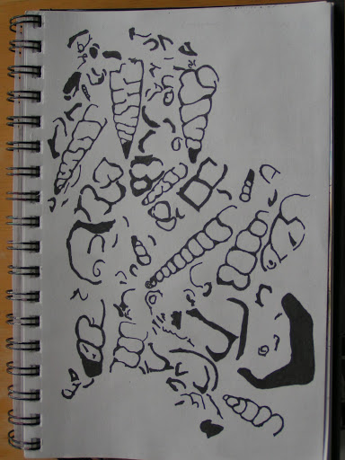
 This one will be for a background type of silk screen for an all over pattern effect.

 These two were a bit tedious to draw and get all the black filled in but I think they will make good silk screens.

 I then scanned the sketches into the computer as black and white photos. Then I put them into PSE (Photoshop Elements) and cleaned them up a bit. Do you think my fossil fish looks mean?

 This one I reversed the colors in Photoshop. You an do this by opening your photo, clicking on filter, then adjustments and then click invert. Worked like a charm! Any stray bits of black I painted over with the paintbrush tool using white.

 I couldn’t decide if I liked the positive or negative so I think I will make a screen both ways.

 Here’s the all over fossil pattern. I cleaned up stray bits of black with the paintbrush again on this one.

Here’s my trilobite. I really like how this turned out. I can’t wait to make the silk screens and try them out on my scarves. I ordered some PhotoEZ sheets but I won’t get time to finish these until I get back from my hand embroidery class. Our next meeting with my local surface design group we are going to make silk screens and try out a Yudu machine. I’m getting prepared for that get together. I have to print these on to transparencies and then I’ll be all set. Hope you have a good weekend and thanks for stopping by!

Design Focus Friday – Form

 The latest book I am reading to continue my learning journey into design is Dynamic Color Painting for the Beginner by Diane Edison. As I was trying to come up with something else to say about form, I was struck by what she wrote about making a preparatory sketch for a painting. She suggests that to make a three dimensional drawing that you draw the value patterns. When you look at your subject you need to look at the shapes that the values make. You need to notice every tone and shadow and what shape each makes and draw those. She says that as you draw the shapes you will see that the patches of color follow the contour of the object, and so including them in your sketch will help you create the illusion of three dimensions.

 But what really struck me was her use of the term “visual trust”. Diane states that “Drawing in this way, following the shape of the colors as well as the outline of the object, is much like a puzzle requiring visual trust. I describe this the term ‘visual trust’ as accepting what you see, without question. By this I mean that sometimes the first thing you see without question is most likely correct.”

 Diane reveals that many times our brains tend to name things in a sort of intellectual interference and we tend to disregard what we really see and instead try to self correct as we draw. But this isn’t the way you should draw. To draw well you need to rely on what you see, not what you think you see or expect to see.

 Diane infers that to paint or draw from observation demands a willingness to believe the unbelievable. This means that you are seeing a different point of view, one that you can not easily imagine.

Do you trust what you see when you draw? I find it really takes practice to see those small value changes as shapes and to draw those shapes. You can’t think your drawing into existence, you have to look closely and trust your pencil or paintbrush to draw or paint what you really see.

What do you think? Do you have “visual trust” when you draw? How does that apply to your fiber art?

Coming up in February, we’ll be talking about texture. Yippee! This is one of my favorite elements of design and it’s why I love fiber. So let me know what you think about “visual trust” and how that affects form in your work and I’ll see you next week.

Mama Grizzly for Gayle

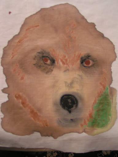
 This is the beginnings of the page I made for Gayle. Her theme is All Creatures Great and Small. I wanted to do an animal that is native to Montana so I chose the grizzly bear. I had a photo from a calendar that I used as inspiration. I thought just the face coming out of the page would give a bigger impact and give a sense of the size of grizzlies. I painted this with a combination of walnut ink and Jacquard paint.

 Then I thread sketched the bear. I used about ten different shades of brown for this. Even with two stitch and tear sheets behind the page, it still distorted quite a bit. But except for a few wrinkles here and there, I got it flattened back out again. The shape of the page makes her look a little like a cone head, don’t you think?

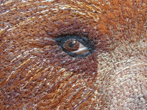
 Here’s a close up of the eye. I left the white part of the eye unstitched so that caused a bit of distortion.

 Here’s another close up.

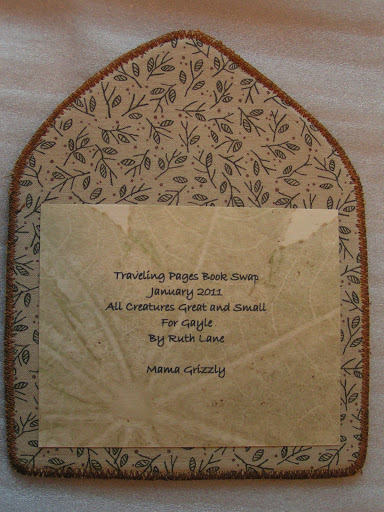
And here’s the back. I hope you like it, Gayle. This is the last page I have to do for this swap. Next, after I get my last two pages, I’ll be putting the book together.

Design Focus Friday – Form

 Last week we talked about form as it relates to a two dimensional work and how to imply form on your picture plane. Usually, I work in 2D more than 3D but I would like to do more 3D work. The sketch above shows what I plan to do with my Traveling Pages to make all 13 pages into a book form. As my theme is trees, the covers will resemble bark and the “posts” on the book will be red twig dogwood branches.

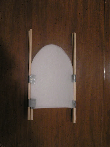
 When you’re thinking about form in three dimensional work, sometimes it helps to make a model. I used some leftover heavy interfacing, chopsticks and duct tape. All things I had around the house. The model is about half the size of the actual pages. The photo above shows how the book will look when closed. I’ll have to make sure that the red twig dogwood branches aren’t too “bushy” on top or it won’t close well. Although I will probably always display it open. I won’t be using duct tape to secure the real book together (although it has a certain chic). I plan on using a heavy thread (like button thread) to attach all the pages to the posts as shown in my sketch in the first photo.

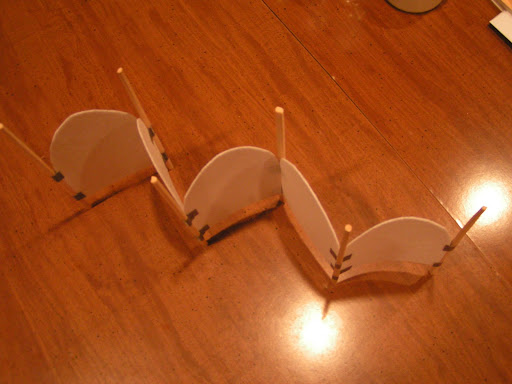
 Here is it standing up. All the front side of the pages will be on one side and then when you turn the book around, all the back pages will be on the opposite side.

Here’s a view from the top. I think this form will be perfect for my pages. I still have two pages to receive and I need to finish up my covers but I plan on finishing the book by the end of February. This model is so cute that I want to cover the pages and make a smaller book too. Hopefully, I’ll have time to do that.

Have you worked in 3D? What have you made? How did you determine your pattern and if it would work? Did you have to think about stability? How did you merge the need for stability and structure with the aesthetic? Leave me a comment and let me know, as I’d love to hear how you are using form in your work.

Another Watercolor and Rice Paper Collage

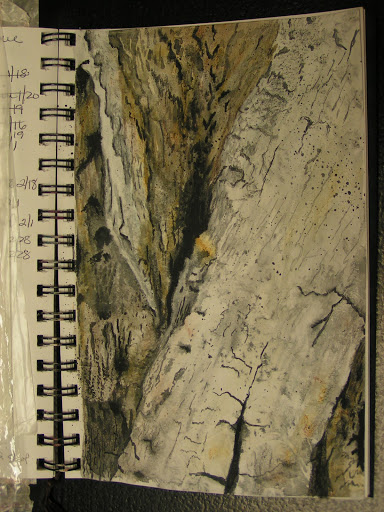
 Here’s another rice paper collage with watercolor similar to last Friday’s post. But this time I pasted down the rice paper first with no paint underneath. I then just added watercolor on top with my Neocolor II crayons and then added water. I really love the textures that develop with the base of rice paper. This one is much more subtle as I used less rice paper. This is based on a photo I took, can’t remember when I took it but it was probably at Glacier National Park. Another one of my favorite surfaces – bark (again, I know!).

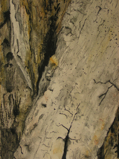
Here’s a close up. I could keep adding more to this painting as there are so many little details when you look closely at bark. But I decided I like it the way it is so I stopped. I love the organic lines and the diagonals of the various bark pieces on the tree. I am doing a series of these surfaces in paint first as inspirations for embroideries after my hand embroidery class. What are your inspirations? Do leave a comment and let me know.