Design Focus Friday – Texture

I rarely use pattern in my work to create texture but I think my friend Vicki does a brilliant job of using pattern in her kaleidoscope quilts. With just solid pieces of fabric, these quilts would still be a kaleidoscope but I think that the choice of patterned fabric really makes the piece sing. 

If you look at Vicki’s quilts from a distance, the kaleidoscopes do have texture from the patterns in the fabric. On closer inspection, you can see the individual motifs in the fabric.

I am not planning on making this kind of quilt but I do love the result of Vicki’s hard work. Do you use patterned fabrics in your work? If so, do you think about how this adds visual texture to your pieces? If you don’t use patterned fabrics in your work, can you think of a way to add these in? How would that change your working method? Or how your piece looks when created?

Let me know how you use visual texture in your work and leave a link so we all can see.

Photos used with permission of Vicki Welsh.

Flour Paste Resist Tutorial

Here’s the promised flour paste tutorial. Put plastic over your surface on which you will be working. This is very messy so lots of plastic, much wider than your fabric. Pin the top edge of the fabric. You can see it in this photo but I have pinned the edge that is closest to the bucket of flour paste. Mix 1 cup cold water and 1 cup flour in a tub. Use cold water as to make the paste a better consistency. For this silk scarf, I used two recipes of flour paste. I forgot to take a photo before I put flour paste on but you get the idea.

  
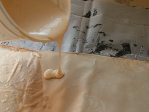
I just pour the paste straight out of the container on to the fabric. Pour along the top edge where you pinned the fabric down. It takes quite a bit so pour generously (more than this photo).
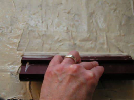
Then use a squeegee or some flat tool to scrape a layer of flour paste over the entire piece of fabric. This process stretches the fabric and is why you only pin the top edge.

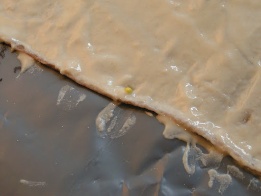
 Here’s better photo of a generous pour of flour paste.

 Once you have your entire surface covered with flour paste, pin the bottom edge and ends of fabric. Make sure you have covered all your edges well. I have this on my “new” print table that I made by stapling a large piece of black felt to the table. Therefore, I can pin right through the plastic and into the felt.

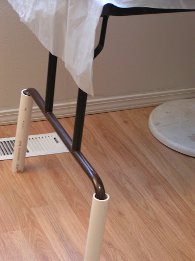
 If your table is too low, just add four pieces of PVC pipe. Works a charm to prevent your back from bothering when working.

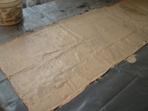
 Then let the piece dry for at least 24 hours. I had the fan going on this and it only took 12 hours to dry. It should all be the same color with no translucent looking spots when it is dry. If you look closely, you can see that almost all the pins have been pulled up due to shrinkage. If you don’t pin it down, the entire piece will curl up and be a big mess. Ask me how I know!!

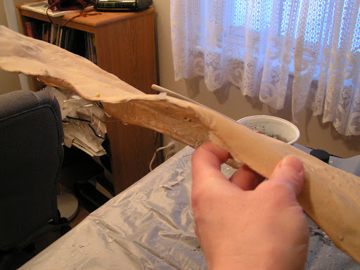
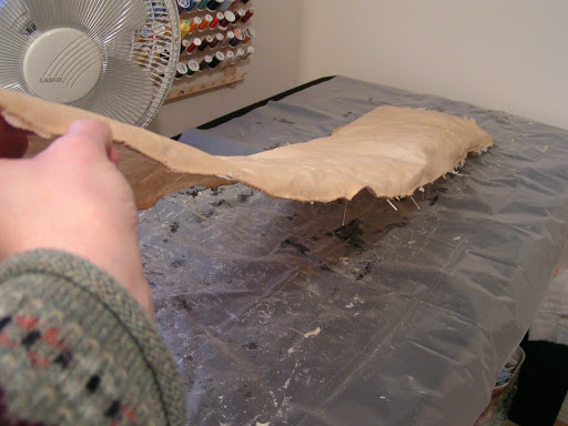
 This is how stiff it is when the flour paste is dry. This is an 8mm silk scarf – now turned into a flour paste plank.

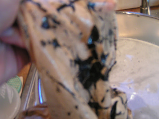
 Here I am holding the end of the scarf. If you haven’t tried this technique, it seems really bizarre.

 Next, you need to crack the flour paste. The more you bend, roll or push on the fabric, the more cracking you will get.

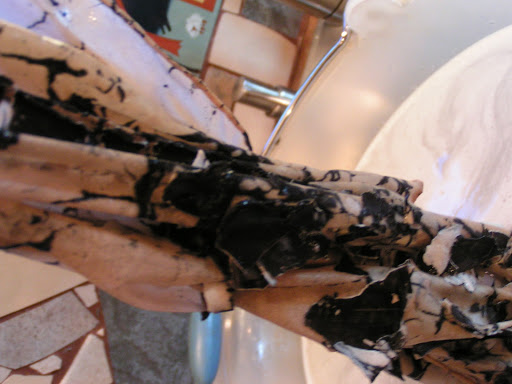
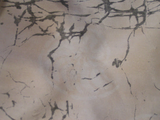
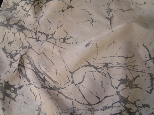
 These are just a few photos showing the cracked flour paste.

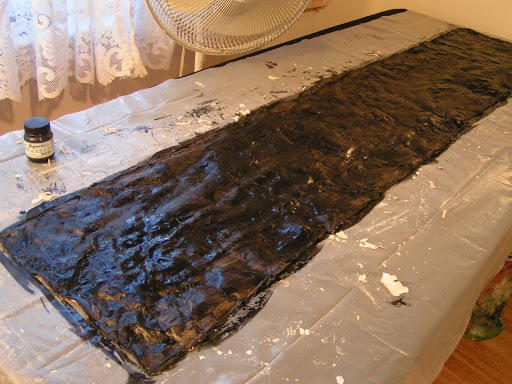
 Then you can either use fabric paint or thickened dye. I used Jacquard Textile paint mixed with half water and half paint. Paint over the entire surface making sure that your paint is covering all the flour paste resist.

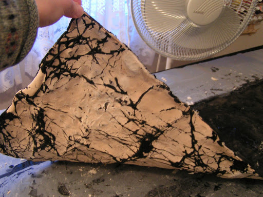
 Here’s a peak on the back after painting. This is about how it will look when you wash it out. If that isn’t enough crackling, carefully (you’ll get paint all over yourself) crack it some more and add more paint. Let paint dry for 24 hours. Most textile paints are supposed to be heat set but it doesn’t work to iron this mess. You could try it on the back but both times I’ve tried it, the paint was pretty well set after 24 hours dry time. If you’re using dye, batch like you normally do.

 Then fill a bucket with cold water. You don’t want to put the water directly in the sink because you won’t want this flour paste/paint gunk going down your sink. I just rolled the scarf up into a roll and dunked it in the water. It starts loosening almost immediately and you can peel it right off. Just let the gunk settle to the bottom of the bucket.

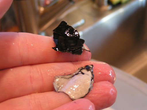
 Can you see the black stuff peeling off in pieces?

 Here’s what it looks like.

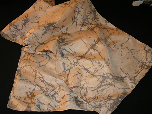
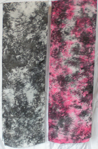
 Once you’ve got as much gunk off as possible, wash with mild detergent in the washing machine. Then iron and you’ll have a lovely crackled effect. I just love the look of these. I have to try some more with different colored paint. Don’t forget to pour the water and flour paste gunk outside. Do not pour it down your sink unless you have a crush on your plumber!

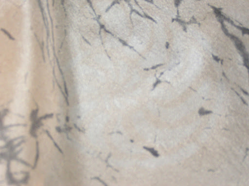
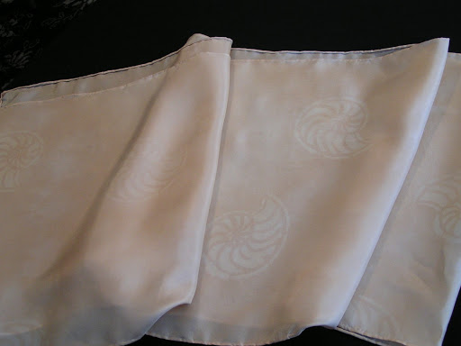
 Here’s a few close ups. Can you see the discharged ammonite?

 Here’s another look.
 I get carried away.
Because I really like this effect. I certainly did not come up with this idea and I got all instructions from Jane Dunnewold’s latest book. If you give it a try, let me know and show us some photos. If you have any questions, don’t hesitate to ask.
Finished UFO

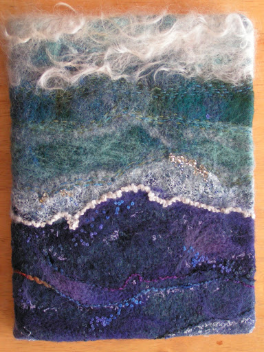
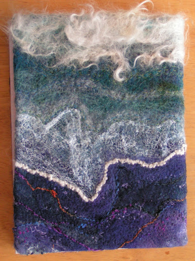
 I have had this water/sea themed piece around for over a year and it might be two. I finally got around to making it into a notebook cover. This was spurred on because I’m going to try and get some of my work on consignment in a shop in Missoula. I needed a sample notebook cover so here it is. This is the front.

 And here’s the back. I just bought a school type notebook from Wally World. It can be easily replaced.

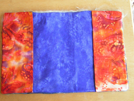
 Here’s the inside. I decided for a pop of complementary color. Plus the orange fabric had purple in it and the lining is purple.

Here’s the inside of the cover without the book in place. That’s the only time you can see the purple which this photo made a bit more blue than it is in real life. I am also working on finishing up more barrettes, scarves and perhaps a felted vase. If I do get accepted, I’ll have to be very busy when I get back from my class and get pieces done to sell.

Design Focus Friday – Texture

 Textures range from the smoothest polished mirror to the roughest mountain range as seen from an airplane. The term is often misused to refer only to rough surfaces but this is not correct. All surfaces have texture. You as a designer recognize that different textures can affect interest in different ways. Some surfaces are inviting and some are repellent and so are the textures that suggest those surfaces. Using different textures can increase interest in a composition by adding variety without changing color or value relationships.

 Visual texture refers to the illusion of the surface’s texture. It is what tactile texture looks like (on a 2D surface). The textures you see in a photograph are visual textures. No matter how rough objects in the photograph look, the surface of the photograph is smooth and flat. Most textures have a naturalistic quality; they repeat a motif in a random way. A motif is any recurring thematic element or repeated figure in design. It could be an object, shape, color, direction, etc. With a texture you may be aware of the repeating motif but you are more aware of the surface.

Tactile means touch. Tactile texture is the actual (3D) feel of a surface. This is of paramount importance to three-dimensional design but of only moderate interest in two-dimensional design. The actual surface texture needs to either be felt, or seen with light raking across its surface to make the texture visible.

A recognizable motif regularly repeated produces a pattern. Pattern requires repetition — in design as in life (a pattern of behavior). The more regular the repetition, the stronger the pattern will be. The most noticeable patterns occur when you see the group before the individuals — notice the organization first (the checker board). All of the motifs in a pattern have surfaces, so there is always texture. But there is not always pattern — only when you notice it. Texture and pattern are related. When you look closely at a tree you can see the pattern of leaves that make its surface. When you back away you lose awareness of the leaves and notice the texture the leaves make on the tree. Farther away still and you can see the pattern of the trees making up the forest and finally the texture of the forest. In this way pattern changes to texture as you loose sight of the individual motifs. This is easy to do with natural patterns, but you have to get quite far away from a checker board grid to see it as texture. Patterns are generally more noticeable than textures. This makes them a stronger visual element for controlling attention.

·        How could you use tactile texture in a traditional quilt design to enhance the composition? Visual texture?

·        If you switch to black and white, how different do the various textures look?
·        How can you use tactile associations to communicate with the viewer of your work? How many memories can you remember of touch such as warmth, softness, bristly etc.?

• How do different types of fibers or fabrics affect your composition? Do different textures of fabric make you relate to the work in a different manner?

• Can you create depth using a visually patterned cloth? Motion? Focal point?

• How can you depict different textures from your home environment?

• What methods do you use that increase texture in your work? Can you think of other methods that would increase the tactile or visual textures in your work?

Let me know how you use texture in your work. I’d love to see photos so leave me a link in the comments!

Discharging Scarves

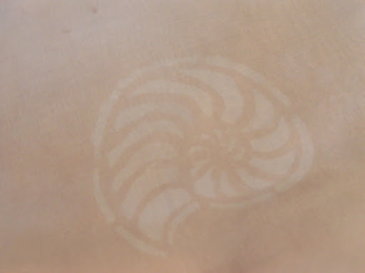
 I am working on the next layer of complexity on my recently dyed scarves. This one was the walnut ink one so I used Jacquard Discharge paste through my ammonites stencil. It worked great.

 I took Jane Dunnewold’s advice in her most recent book and ironed the discharge paste when wet. The instructions say to let it dry. But it worked fine and took less time that way. These look like watermarks. This scarf is currently getting the flour paste treatment. Since I got quite a few questions on that technique, I am working on a tutorial on how for that. Hope to have it completed soon.

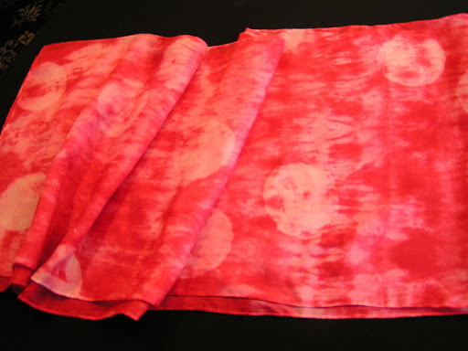
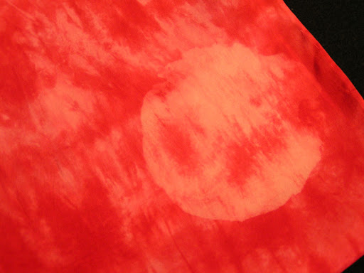
 This one I discharge some circles through a cardboard stencil that was part of some packaging.

 Here’s a close up. The red only discharges part way especially if it is really dark red.

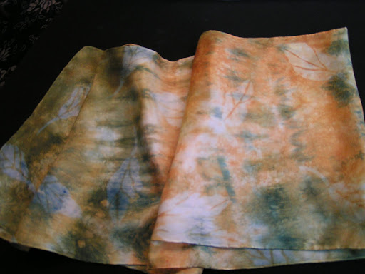
 This one I used three different leaf stencils to discharge. Again, they look like watermarks and are pretty subtle. But that was just the effect I wanted.

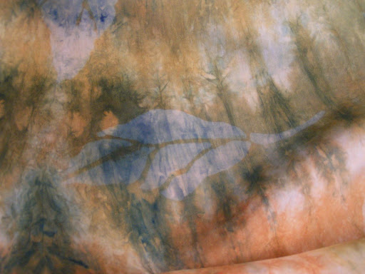
Here is a close up of one of the leaves. These will be getting more layers and I have a bunch more scarves to discharge. More later!