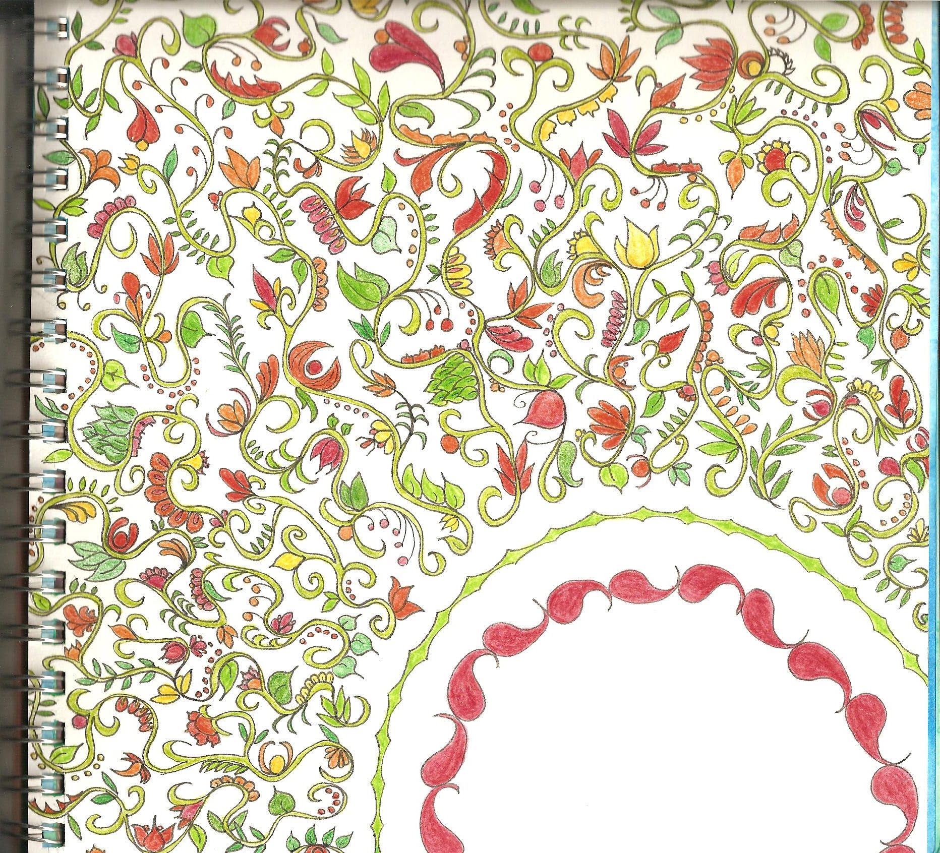
Besides circles, I have octagons for my class homework. The octagons are drawn on to graph paper first. Then the grid of octagons is to be used in a design.
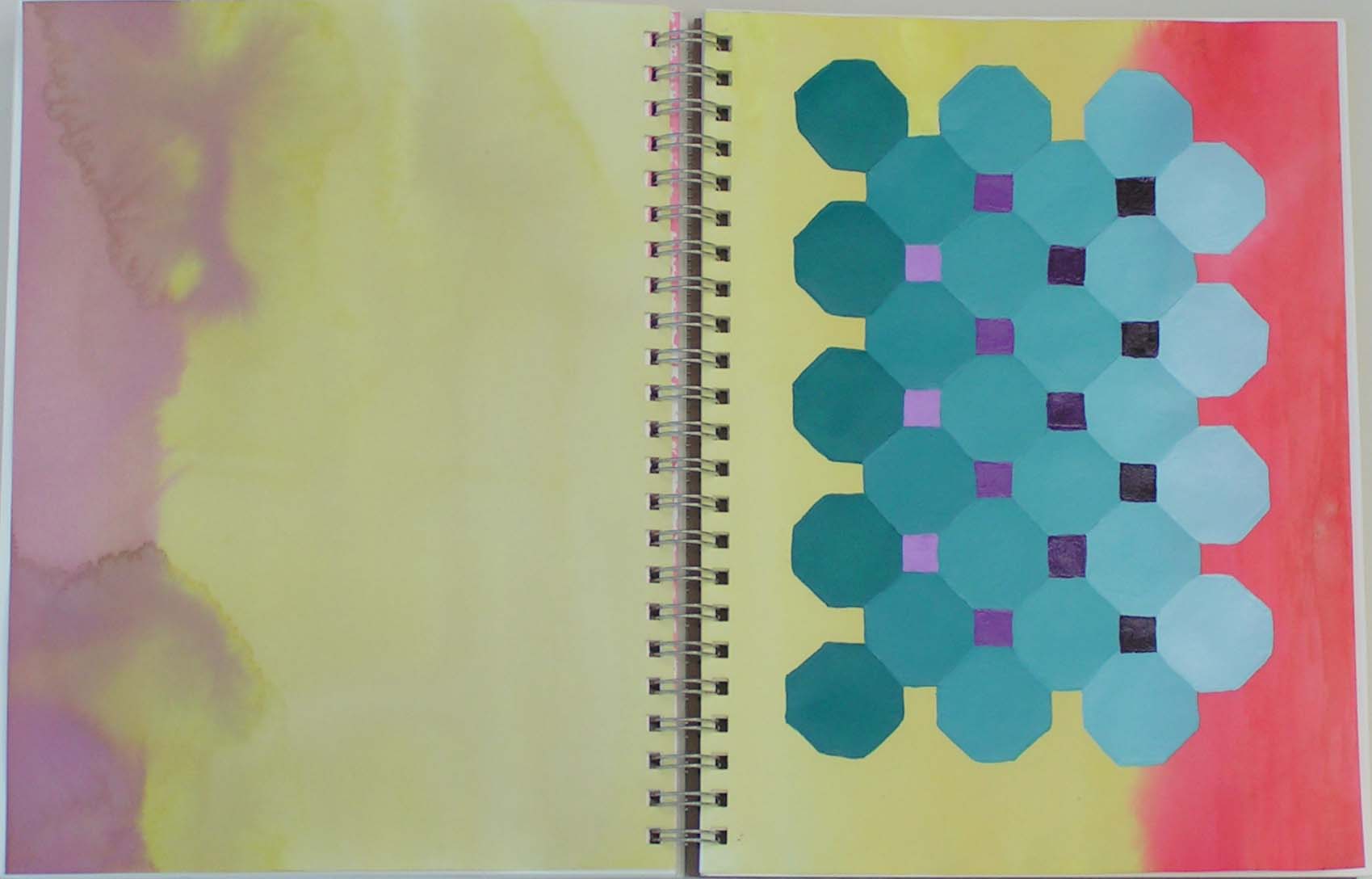
This is the first ones I did. I was trying to use a “tetrad” color scheme of yellow, red orange, blue violet and blue green. I really didn’t care for the result. The octagons just seemed to be floating and the yellow was taking over the entire design.

So I removed the opposite page and used colored pencils to bring the blue green and blue violet out on to the background with cross hatching. I still don’t love it but I think it helped the design. Looking at it again, I might need to deepen the values on the cross hatching and add in more blue violet.
![]()
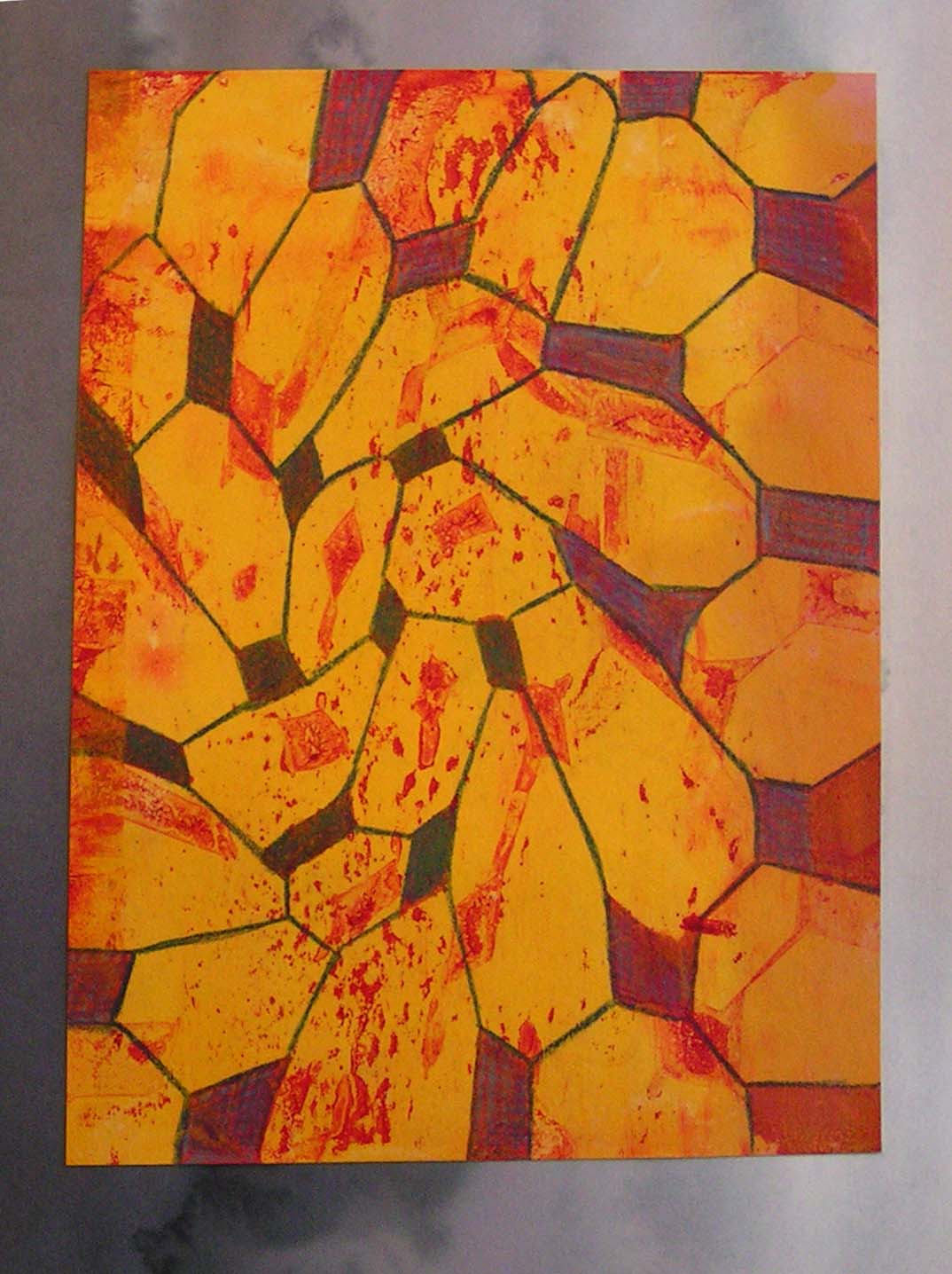
Next I enlarged the octagon patterns from small to large. I used acrylic paints and added a lot of glazing liquid to get transparency. There a many layers on this one.

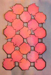
The next step was to “distort” the octagons. So I scanned them into the computer and used Photoshop to distort the patterns. The one above was “twisted” and “pinched” in Photoshop and then I printed it out. I used the dark red cut out design on the gelatin plate to get a print. I liked the color on the paper so much I decided to glue it down as a design too.
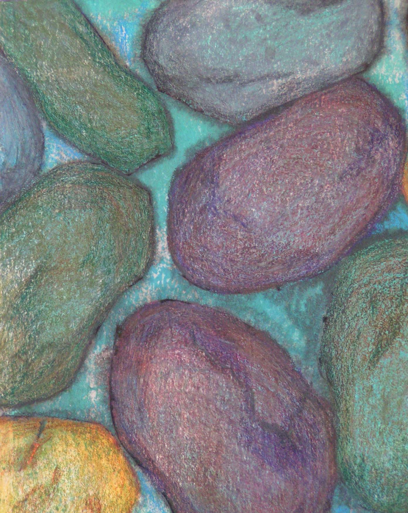
Here’s the gelatin plate print. I added in some colored pencils to give the octagons more definition.
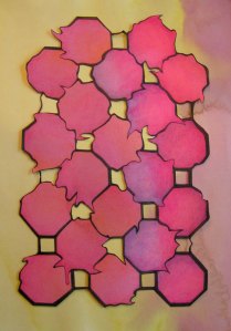

This is a another distorted octagon design that used “liquefy” in Photoshop. I drew it on to a magenta and violet background, used permanent black marker for the outlines and colored in with colored pencil. It was blah on the background so I decided to cut it out and put it on a different colored background. Here are the three choices, purple, yellow or turquoise? Which do you prefer?
It’s been fun playing with octagons. I don’t usually use such repetitive patterns in my work but I enjoyed it. Hope you have a wonderful weekend!