One By Machine, One By Hand

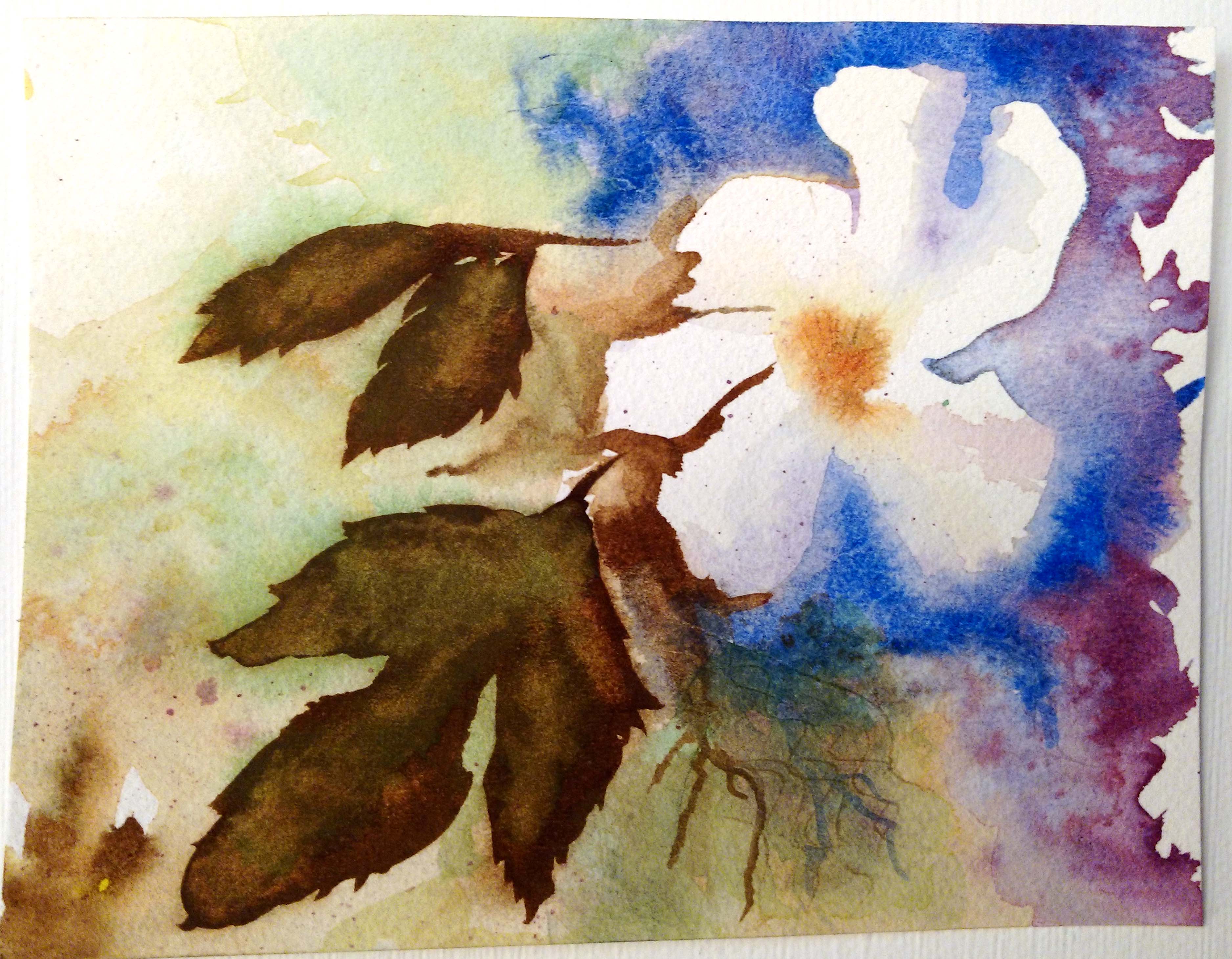
I didn’t get as many color studies done this week but I still got a hand stitched one and a machine stitched one completed.


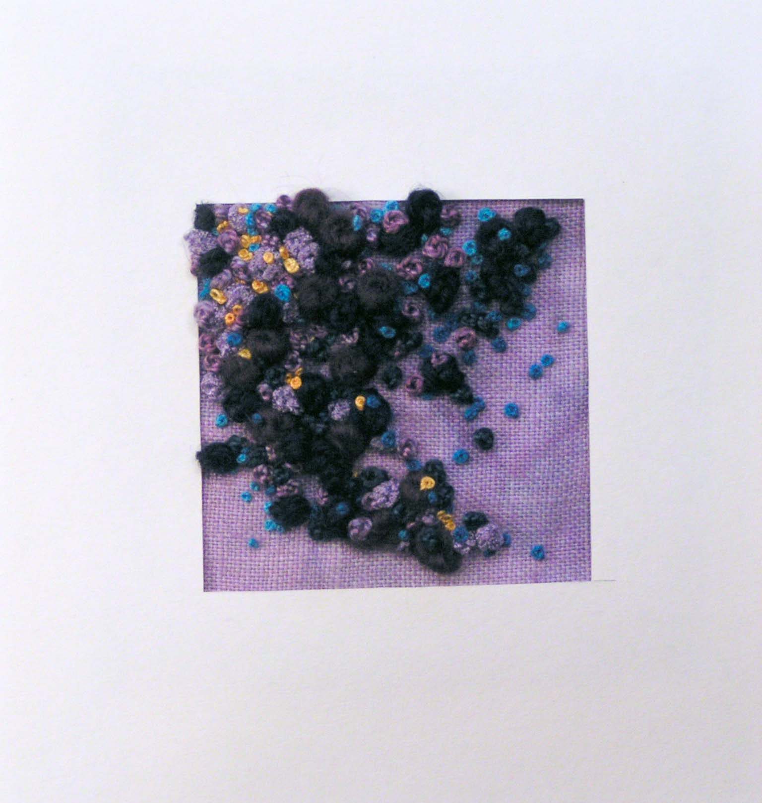
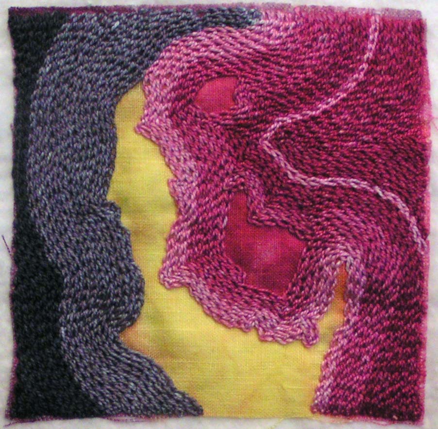
The hand stitched one is violet, blue and yellow orange. You can’t really tell from the photo but the darkest large French knots are violet and blue. They look very similar in the photo. I had to make a little frame for this one otherwise it looked silly.

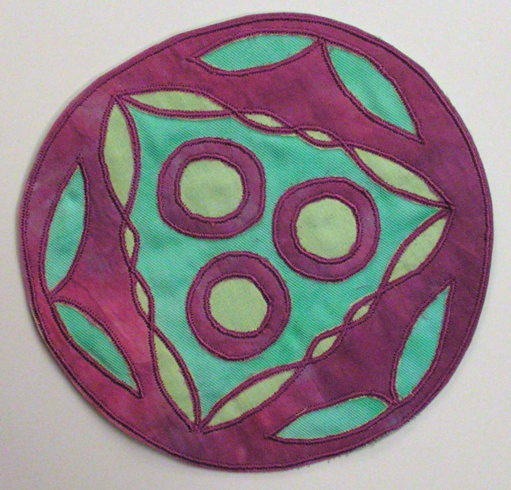
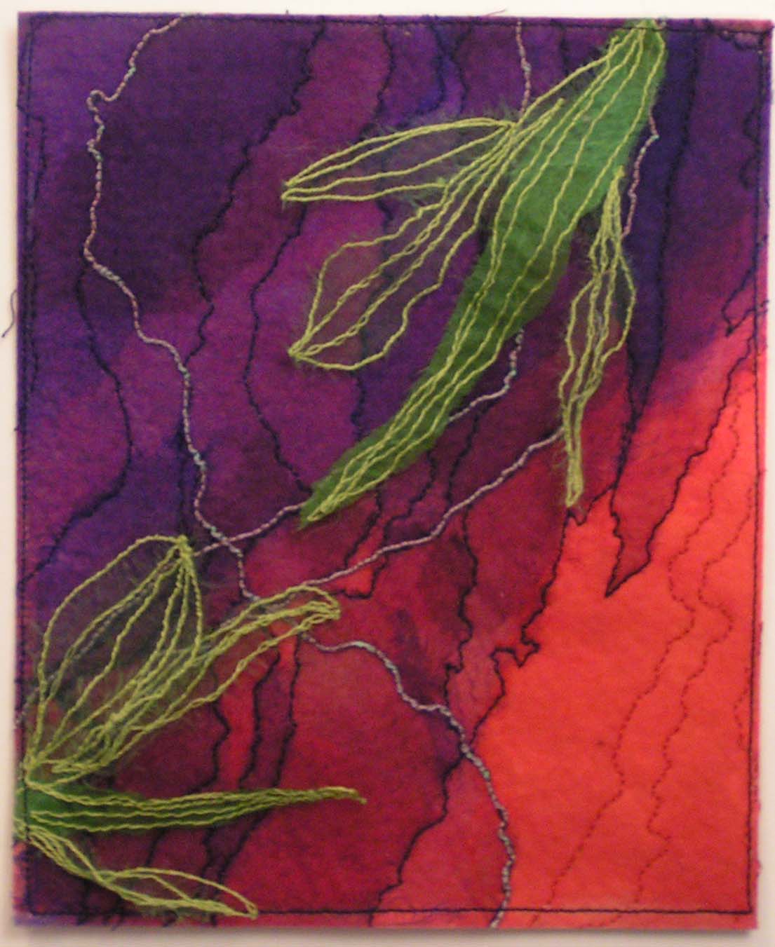
This is the one completed on the sewing machine. It is cut back applique and supposed to be yellow, green and red violet. But I didn’t think about putting the yellow cotton organdy over the green fabric so now it reads yellow green. I should have made the back fabric yellow instead of green. I used one of my circle designs from my circles studies in Level 3 Art and Design. So anyone that was asking what I would do with all the work and designs from Level 3, here’s an example.

Continuing Color Studies

I have worked on more color studies for my Level 3 Stitch class this week. I try to have several ready to go for machine stitching and for hand stitching. Then when I get a spare moment, I am ready to stitch.

This one is full of machine stitching. I had a bit of difficulty with cable stitch on my machine. I found that the extra bobbin case I had wasn’t working. Luckily, I had another one and the second one worked fine. Once I figured that out, the cable stitch went much better.

And here’s another machine stitched one with cable stitch but it looks so different, doesn’t it?

Here is one reason that I don’t normally try to stitch straight lines with hand stitch. My lines never end up very straight.

This one has a bit more texture with the cheesecloth.

This one was fun too with loads of chain stitching. Most of these colors are way out of my usual choices but it is interesting to see who they work together.

Hope you have a great weekend.

Experimental Watercolor Practice

I have been working through some of the exercises in Ann Blockley’s book Watercolour Workshop. I finally purchased watercolor paints in tubes. I got a set of QOR watercolors by Golden. It has definitely been a learning experience. The wetness of the watercolors makes a huge difference in the results and how dry or wet they are on the paper.

Here is one of the first ones I tried. I keep getting the sky blotchy by dropping water or other paint on it before it’s dried. I added a bit of oil pastels to the foreground of this one. I am trying out different techniques that she suggests in the book. All of these pieces are a quarter of a sheet of 9″ x 12″ watercolor paper. I am trying some new paper as well, cold press and rough.

This one was not an exercise in Ann Blockley’s book but a warm up with different colors. It has at least three layers of paint. I have a hard time leaving any white when I’m painting.

I liked the leaf technique for this one. The flower is a bit wonky looking but this one turned out OK.

This one is only partially completed. I have done the first layer and have let it dry. Now I need to work into it a bit to give it a few more details. I should have left white areas in the tree foliage but again, didn’t manage to do that. At least I have a few lighter areas. I need a lot more practice but I do feel that I’m learning something with each one.

Hope you’re having a great day!

Packing for Exhibition and a Sketch

I spent most of the day packing all my stuff up for my last art and design class and exhibition. I was trying to keep the amount down but I am not sure how well I succeeded.

Here’s the pile of stuff I am taking. Of course this doesn’t include any clothing or personal items. Just art stuff. The pile is at least four feet tall. Hopefully, everything will fit into the truck!

Here’s a sketch I drew last week. It is of a succulent plant that is in my window. I wanted to highlight just the plant. And I used a water soluble graphite pencil for this one. I like the smooth tones it gives you when you wet it down with a brush.

Thanks for stopping by!

River Rocks Complete

I finished up the river rock painting. I sprayed it with fixative (Thanks Paula!) and then did more painting on top.

So here’s the piece with water added. I had to do several layers to get the shadows and the highlights working better. But I’m pleased with the outcome. Painting water is hard!

This ruffed grouse was in the choke cherry tree behind our house. My brother-in-law got a great photo that I used to sketch by. He or she has some beautiful feathers and after sketching him/her, I can see why the name is Ruffed Grouse. He/she definitely has a ruff around his/her neck. And this bird is hefty! It’s in the same family as chickens and he/she did look like a chicken in the tree.

Have a great weekend!