Besides circles, I have octagons for my class homework. The octagons are drawn on to graph paper first. Then the grid of octagons is to be used in a design.
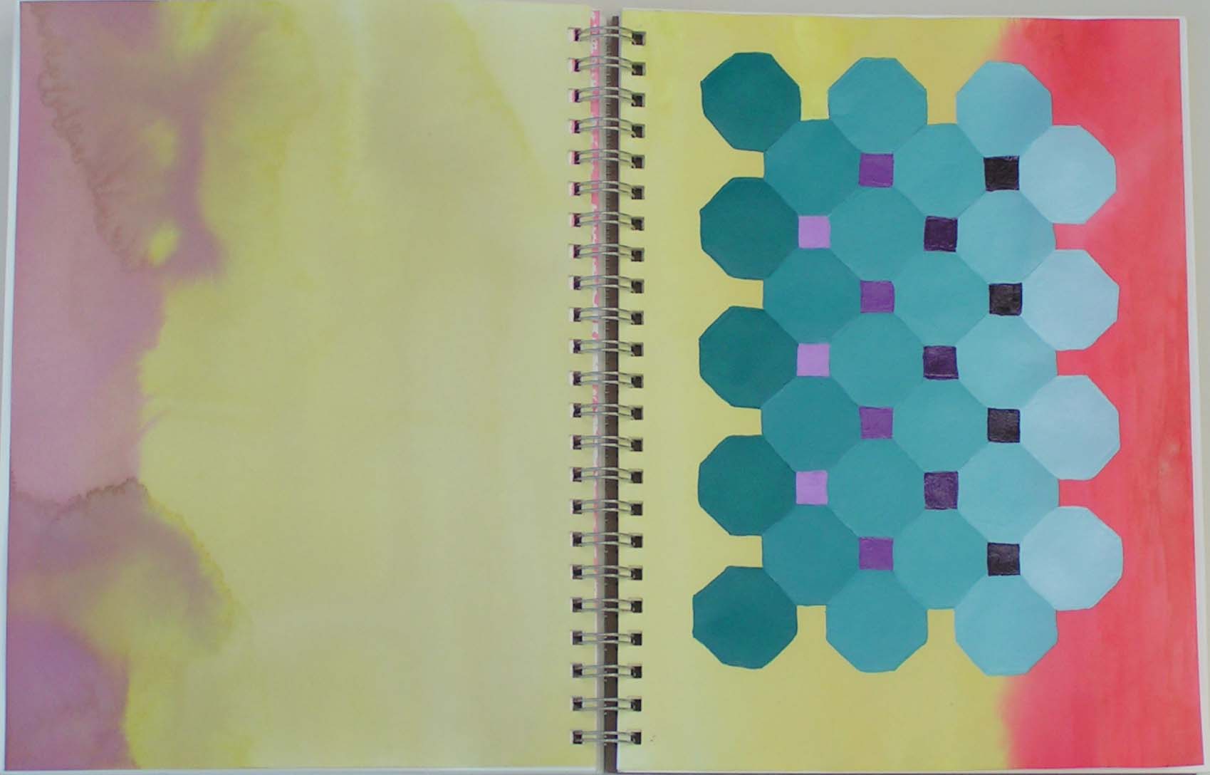
This is the first ones I did. I was trying to use a “tetrad” color scheme of yellow, red orange, blue violet and blue green. I really didn’t care for the result. The octagons just seemed to be floating and the yellow was taking over the entire design.

So I removed the opposite page and used colored pencils to bring the blue green and blue violet out on to the background with cross hatching. I still don’t love it but I think it helped the design. Looking at it again, I might need to deepen the values on the cross hatching and add in more blue violet.
![]()
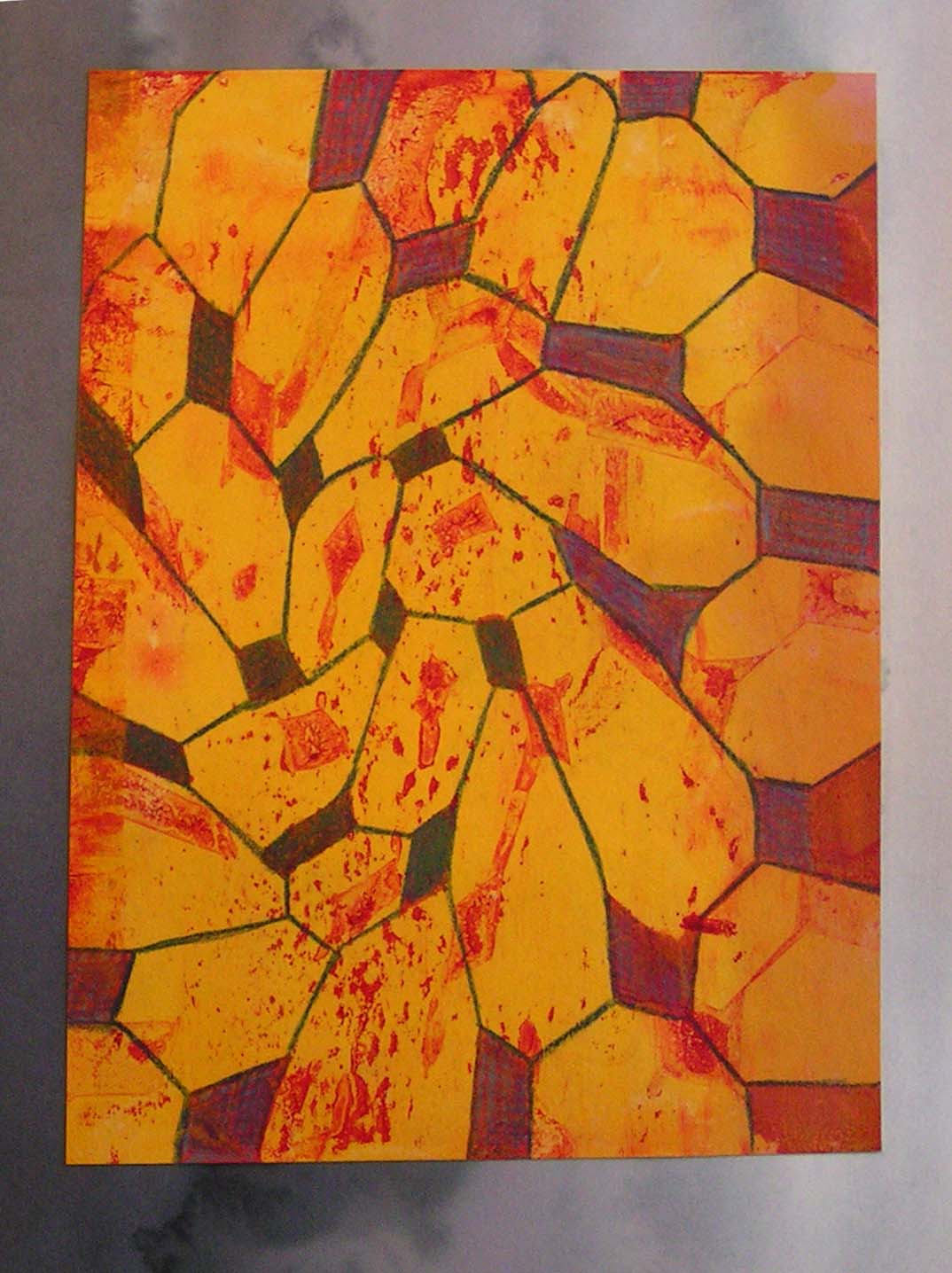
Next I enlarged the octagon patterns from small to large. I used acrylic paints and added a lot of glazing liquid to get transparency. There a many layers on this one.

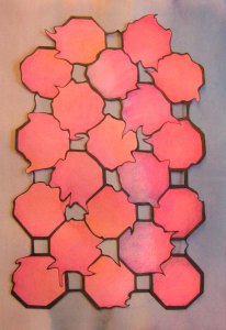
The next step was to “distort” the octagons. So I scanned them into the computer and used Photoshop to distort the patterns. The one above was “twisted” and “pinched” in Photoshop and then I printed it out. I used the dark red cut out design on the gelatin plate to get a print. I liked the color on the paper so much I decided to glue it down as a design too.
Here’s the gelatin plate print. I added in some colored pencils to give the octagons more definition.
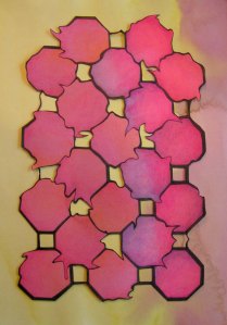

This is a another distorted octagon design that used “liquefy” in Photoshop. I drew it on to a magenta and violet background, used permanent black marker for the outlines and colored in with colored pencil. It was blah on the background so I decided to cut it out and put it on a different colored background. Here are the three choices, purple, yellow or turquoise? Which do you prefer?
It’s been fun playing with octagons. I don’t usually use such repetitive patterns in my work but I enjoyed it. Hope you have a wonderful weekend!

nice! I like the way that you tried the different variations!
Thanks Louise!
This is my favorite shape. But I admit I love the third pic which Is blurred but isn’t distorted like the following ones. Doesn’t make sense but I do like abstract.
Thanks Marilyn, that’s my favorite one at the moment. We’ll see if I can get that last one to be a pleasing composition.
I like the gelatin plate print.
The last three images were a poser. I instinctively went for the bright one on the right, but after a bit more studying I prefered the one in the middle.
Thanks Lyn! In person, I think the bright blue actually looks the best but it would work with any of the three. I haven’t made my final decision.
I love the gelli print, that worked incredibly well. From the bottom 3 the middle and right ones are most interesting, have you tried cropping the edges? I think loosing some of the background colour might make them less balanced and more interesting…
Thanks Teri! The print wasn’t actually all that good to start. Adding in the colored pencil really helped. Actually, I almost posted all the variations of moving the octagons on the paper in different angles. I am not happy with the way it is currently. The problem with cropping is that goes in that size notebook, so somehow it needs to fit that size. I could crop but then it would show the page behind it. So that would have to be worked into the design. I’ll keep working on it and think about cropping.
I love the turquoise one most. What a lot of different options you have made, amazing.
Thanks Jifke! It seems there are always many decisions to be made when creating your own designs.
Fascinating what you can do with repeats of a single shape. I really like the twisted and pinched version – it has quite an organic feel. Would be interesting to see this scaled up.
Thanks Kim, yes it was fun playing with a repeating pattern. Haven’t done much of that before. It would be cool in 3 dimensional felt too. 🙂