Negative Space Painting

I got a book from the library today Watercolor Painting Outside the Lines by Linda Kemp. I did a bit of negative space painting on a recent monotype print and liked the results. So I thought I would do some further investigation and try something a bit more complex. I’m still working on a winter theme so decided to try some frost.

I worked on this all day today. You start with the lightest color and then paint the negative spaces increasing the darkness/value of the colors for each layer. So there are four layers of color here. The paint has to be dry in between so I sped up the process by using a heat gun and iron to dry the paper in between layers of paint. It’s an interesting way to paint and you have to keep thinking “backwards” so you don’t paint the wrong bit. But again, I like the results and I think I will try some more of these. Perhaps a winter landscape next time.

Experimenting with Acrylics

I wrote a post about creating some painted Tyvek samples on the Felting and Fiber Studio here. I decided to combine the tyvek pieces I had with a variety of acrylic mediums and paint. Since they are both plastics, I thought they might be a bit more integrated than trying to add tyvek to fabric. I always have an issue with the fact that it looks like I just plopped the tyvek on top and called it good. The tyvek never really feels integrated into a piece. So this was an attempt to try something different with tyvek. I made 5 samples but they aren’t dry and I can’t move them to take a good photo. But I did take a photo on my cell phone that turned out better than the photos from my regular camera.

I used light modeling paste mixed with orange paint and then pushed the tyvek down into the modeling paste. It squeezed up through the holes in the tyvek and the result is definitely interesting. I will have to see if it needs something more after it dries. I could always add more paint or perhaps brush the high points with oil paint sticks. It definitely has texture.

This is one of my samples that the photo was bad so I “solarized” it in Photoshop. Pretty cool effect. Maybe I can print this out and use it in a collage.

I painted this “stripe” painting for my first session of my art and design class. The one on the left is the original. It sat in my studio for a year. But now I have had some time to add a bit more to it. The end result is on the right. I like it better but can’t decide if it is finished or not. What do you think?


Back to Trees

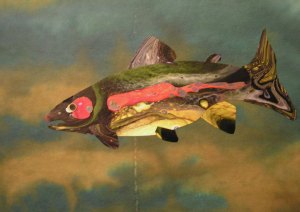
If you know me, this shouldn’t surprise you. I finished most of my homework and now I am creating more pieces in my favorite category, trees. The instructions are to work any other ideas, don’t let the outline limit you and add to it freely. So that’s what I’m doing. I wanted to try another collage with the acrylic skins. I was thinking of doing a pheasant but then I looked at one of the skins and saw a tree. So a tree it became.

This is the tree after I cut it out. I used a grey and green skin that had a tree trunk shape and one branch that I saw from the paint pouring. I cut those out and then added roots and more branches. It looked OK but it definitely needed some darker values in the tree. So I decided to add more paint. I glued it down first and then added paint on top.

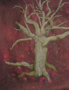
This is after adding some darker paint for more contrast. Now that I am looking at it on the computer, I am wondering if I need to change the background color slightly at the bottom to make the tree feel more grounded. It kind of seems like it’s floating. What do you think?

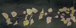
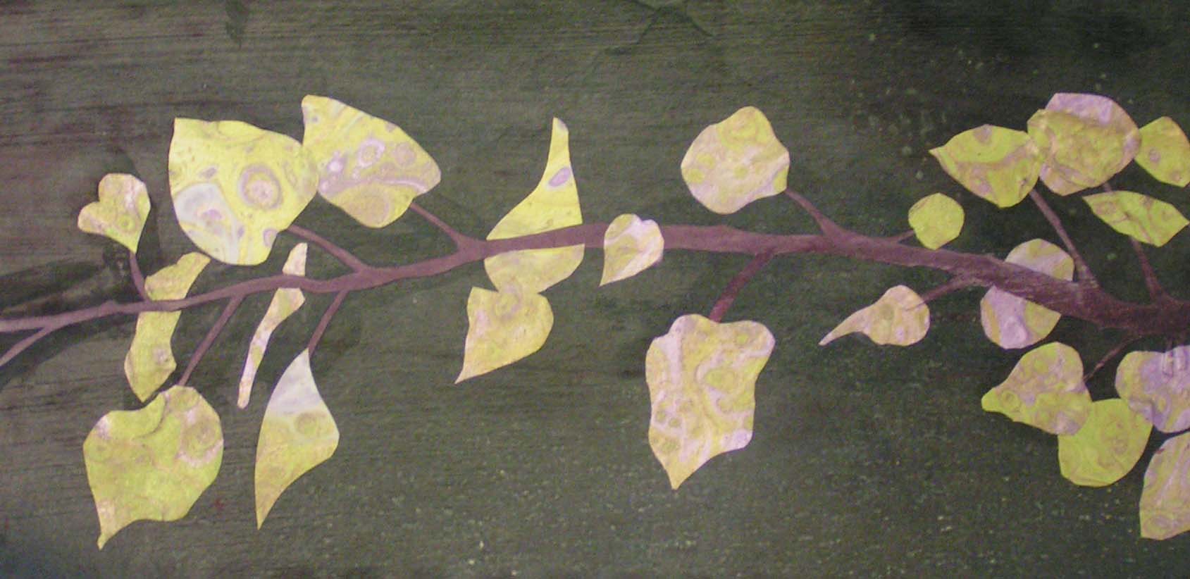
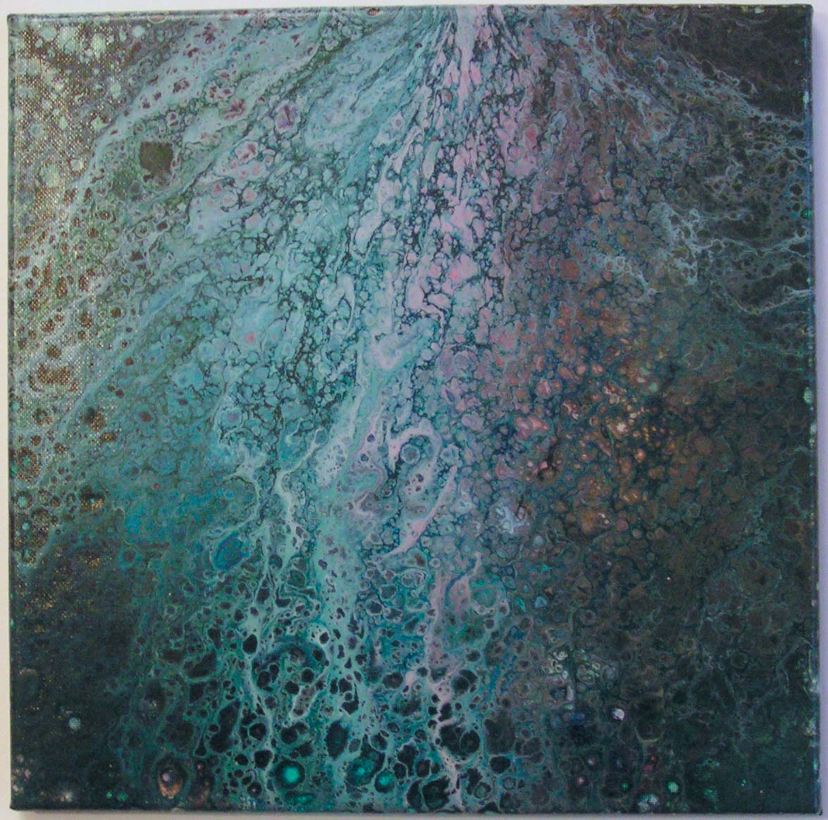
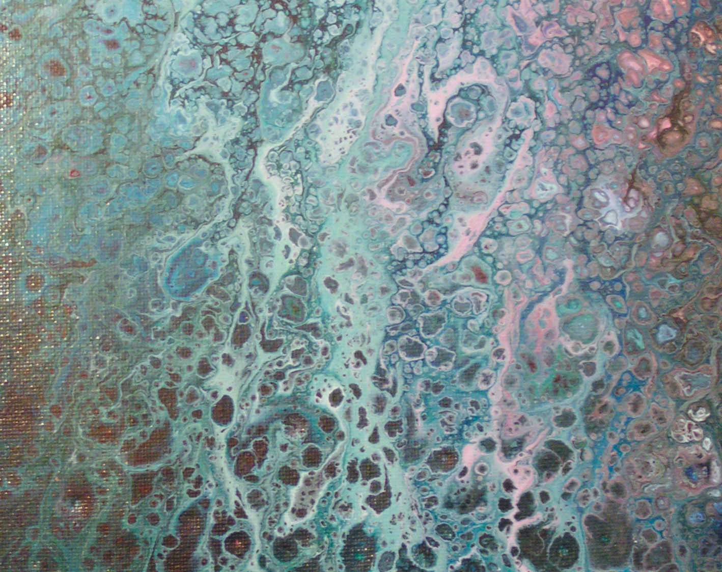
Then I decided to use one of my sketches of an aspen branch. I enlarged the design on the copier and then cut out a branch from purple paper. The skin I was going to use was green and purple so I thought a purple branch would be perfect. From a distance, it doesn’t even look purple now. Sorry for the quality of the photos, it’s getting really dark here early in the afternoon and this branch was really hard to photograph.

Here’s a slightly closer view. This one took a long time cutting out and pasting down all the leaf bits and the branch. But I really like the result. I am also learning what works for gluing down the skins and what causes them to bubble up.

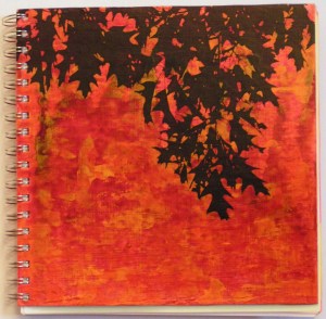
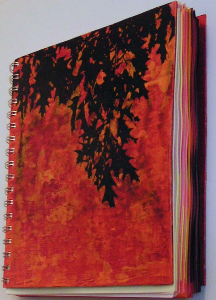
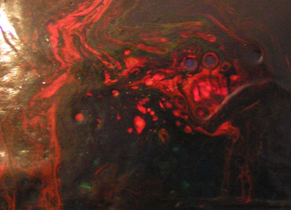
And I finally finished a notebook cover I had been working on for over a month now. It has probably 8-10 layers of paint and then a transfer of the leaves from a laser copy.

I filled the notebook cover with a range of value painted paper from yellow to red violet. I’m sure that it won’t stay that way but I needed some paper in the notebook cover. The insides and back of the covers are painted too. Thanks for stopping by and I hope you have a great weekend.


Columbia River Redband Trout

My friend Deb and I did some more paint pouring last weekend. I made a bunch of acrylic skins but then, what to do with them? I had one that I thought looked like a fish. So I looked up fish native to Montana and chose one to create out of acrylic skins.

Here’s a very poor photo of a sketch I made to get the shape and where the colors belonged.

Here are the two skins that I used to create the fish. I definitely see a fish in the one on the left. That’s where the idea came from. I wish I had made a few more fish colors now.

Here he is on white. I really like how he turned out. Now to decide on a background.


These are some painted papers that I already have. Which one do you like? I haven’t decided yet. I might try to pour a painted background for him. If so, I’ll need to get the right size canvas or board to pour on. If I use the paper, I think I might use a layer of pouring medium or glazing liquid on the paper to make it a little shinier. Not sure I like the contrast of the matte paper against the really shiny fish. Now what to do with 20 other acrylic skins in odd color shades?

Paint Pouring

My friend Deb and I tried some paint pouring last weekend. If you look on YouTube, there are a bunch of paintings about paint pouring. Basically, you mix paint with a pouring medium and silicone. Then you pour different colors together and spread them on a canvas. We were trying to achieve the same effect on paper.

This is one of the better efforts on paper. It really didn’t work very well at all. We tried different “recipes” and still with limited success. So we thought we would try it on a canvas (the way it is supposed to be done).

And this is what we got! It’s amazing. The “cells” were bigger when it was first poured but they tend to shrink down. And there were many colors in this pour so it’s surprising how blue green it feels overall.

Here’s a close up. It is a really fun process although it seems to waste a ton of paint. We are going to try some different pouring mediums this weekend which are less expensive and instead of pouring on to paper, we are going to create acrylic skins. Basically, that is a sheet of dry acrylic paint. So we’ll be pouring on plastic, letting it dry and then peeling it off. Hopefully, our results will overall be better this time.

Thanks for stopping by! Hope you have a good weekend.