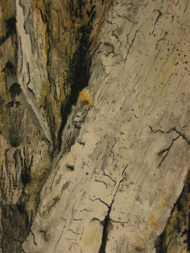
Value is the range of lightness and darkness within a picture. Value is created by a light source that shines on an object creating highlights and shadows. It also illuminates the local or actual color of the subject. Value creates depth within a picture making an object look three dimensional with highlights and cast shadows, or in a landscape where it gets lighter in value as it recedes to the background giving the illusion of depth. Contrast of value separates objects in space, while gradation of value suggests mass and contour of a contiguous surface. If values are close, shapes will seem to flatten out, and seem closely connected in space; none will stand out from the others. If values contrast, shapes will appear to separate in space and some will stand out from the others.
Categories of Values
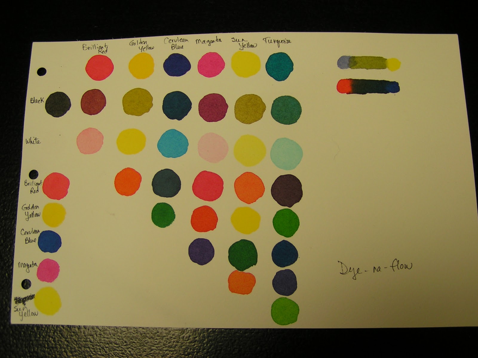
• Tint is adding white to color paint to create lighter values such as light blue or pink.
• Shade is adding black to paint to create dark values such as dark blue or dark red.
• High-Key is where the picture is all light values.
• Low-Key is where the picture is all dark values.
• Value Contrast is where light values are placed next to dark values to create contrast or strong differences.
• Value Scale is a scale that shows the gradual change in value from its lightest value, white to its darkest value black.

Value Patterns/Sketches
A value pattern is the key to creating a pleasing visual path for the eye to follow as it views a composition. The value pattern is the careful choice of arrangement of all the values of a piece of artwork by an artist in order to guide the eye and unify all the objects/figures in the piece.
When organizing your composition it is important that you spend some time before beginning to think about the arrangement of the lights, darks and mid-tones in your composition. This planning stage will give you a better chance of making a focused and entertaining composition. To avoid having to rework you composition, it is important that we do not begin without some understanding of where we are going. It is much easier to change the value pattern than to change the piece once we are already in the midst of working. Most good artists do not overlook the planning stage and it is the fastest and most effective way to move past strictly replicating photographs.
Start with a drawn format box that has a shape and dimension that comes close to the actual paper you are using. A value pattern is not a drawing or a finished sketch. It is simply an organization of the lights, darks and mid-tones of the planned painting. The major shapes of the painting are put in but details are kept to a minimum. Look at the reference sketch, photograph, or nature scene and put all the values into only three categories. The lights will be everything that is the lightest values you are looking at, but they are not exclusively white objects. An objects local color does not matter in its’ lightness or darkness. Depending on the mood, time of day or effect you are trying to create the lights can be any value as long as it is lighter than the mid-tones and darks. Normally the mid-tones are the values that fall in the middle of the value scale again remember that these will be relative to the desired effect or lightness or darkness of the source material. The darks are the darkest objects in the painting. For designing purposes, you should merge your values into only three ranges. This helps to clarify the value arrangement, and simplify the designing process. Once the painting begins the nuances of value will interpreted within the value pattern, but the goal is to keep the integrity of the pattern. At this point in the process color is not the major consideration, remember that each color has a complete range of value. Keep your concerns to the relative value of the major shapes and choose your colors later.
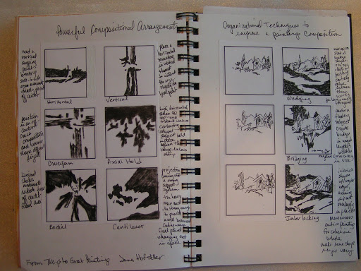
Use a soft pencil to cover all areas of the format box that are going to be the mid-tones leaving the lights as white paper. Remember to leave the white paper or white area as a well placed, well designed shape. It is at this point that you begin to think in terms of the quality of the shapes of your painting. Does each major shape conform to the definition of a good shape? Next you must consider the placement of the dark areas. As a good starting point you should make sure that the majority of your lights and darks are in close proximity where the center of interest in your painting is going to be. Again the dark shape needs to be analyzed for its quality as a shape or shapes. A key element in the arrangement of values in the painting is that all of the three values should be unequal in size. I think to begin with it is best for you to keep the mid-tones the greatest portion of the painting with the lights and darks splitting the remaining portions of the painting into unequal pieces. Make sure that you assign each shape in the value pattern a value. This is important because areas that are not resolved now will definitely be a problem later.
After you have made the value pattern you can look at it to see if it reads well and has a good design. Are the major shapes interesting? A good shape has a different dimension in length and width, has movement, has a variety of edges, is attached to the surrounding shapes in the composition and has a slight gradation of color or value from one edge to the next. Is the center of interest in a good location? Is the movement of the composition headed where you want the viewer to look? Does the space division complement your compositions intention? Are the value areas too equal in size, shape, and direction? Is the center of interest where most of the main activity of the composition is going to happen? Is the value arrangement appropriate for the mood, time of day or type lighting you are looking for? This type of analysis of the value pattern will give you the needed feedback for design modifications. If you need to make changes then go ahead. It is easy to make the changes now and not so easy once started.

Once you get comfortable with using value patterns you can begin to design compositions based on what you want to compose not what you see. By learning to reverse the values of the major shapes and changing their proportions you can create works of artistic expression and free yourself from the total dependence on the scene you are looking at. You can change the mood or feeling of your composition by adjusting the values of the major shapes in the work. The process of learning to invent and rearrange value patterns will take some work and initial struggle but the rewards will be fantastic. Soon you will be inventing your own shapes, taking more chances and creating better and more satisfying works. Although the process seems like it will create overly tight compositions in fact the opposite is true. By having a familiarity with the subject and a solid plan for the composition you can approach the work with a more loose and free attitude.
Questions to get you started:
• How many value patterns can you make based on one scene? How does the value pattern affect the mood of the composition?
• Can you take a UFO and change the value pattern? Does this improve your composition?
• What happens if you reverse the values in your composition?
• Of your value patterns created, which is the most interesting? Why?
• How can you use value patterns in an abstract composition? Does this strengthen your abstract composition?
• Can you find value patterns in other’s compositions that you really like? Where are your eyes drawn to? Is this because of value changes?
• How does the percentage used of each value affect your composition? Do you prefer lighter or darker value patterns? Why?