Design Focus Friday – Center of Interest or Focal Point

We’ve made it through all of the elements of design and today we start with the first principle of design, the focal point. How do you get someone’s attention with your work? Without an audience’s attention, any message or artistic value is lost. To attract the viewer’s eye, a center of interest or focal point is needed. This emphasized element can attract the eye and encourage the viewer to look further.

Ways to achieve emphasis:

1. By contrast – one element in the design differs from the others – can be contrasting values, contrasting styles within the composition, contrasting shapes or sizes, contrast in color, hard edges vs. soft edges, the actual size of the work itself may draw the eye. This is called emphasis by contrast. The element that contrasts with, rather than continues, the prevailing design scheme becomes the focal point.

2. By isolation – one element by being alone, by itself, gets our attention. The contrast is achieved by placement of the focal point in an isolated manner.

3. By placement – If many elements in a design point to one item, our attention is directed there, and a focal point results.

4. By content – a human form or any living thing draws the eye, letters or words can give emphasis, the meaning or story behind your work may be the emphasis.

5. Absence of focal point – A focal point is not always necessary. You may wish to emphasize the entire surface over individual elements i.e. Andy Warhol or traditional quilts.

illustration from about.com

The focal Area is roughly 25% of a work of art and should overlap the center of the piece. The placement of this area should be one of the first things you think about when beginning your creation. The rule of thirds says that most designs can be made more interesting by visually dividing the page into thirds vertically and/or horizontally and placing our most important elements within those thirds. Take this concept a step further, especially in photographic composition, by dividing the page into thirds both vertically and horizontally and placing your most important elements at one or more of the four intersections of those lines.

Questions to get you started:

1. How can I use each of the elements of design to create a focal point? Line? Shape? Form? Texture? Color? Value?

2. What happens if the focal point is in the center of the piece? Does this make the piece stronger or weaker? What happens if you crop the piece to move the focal point to a different area?

3. After you’ve put in your focal point, stand back and look to see if it catches your eye. Are there other contrasting elements that could enhance your focal point/area?

4. Looking at other art, ask, where is my eye attracted? What draws it there? What elements did the artist use to develop the focal point?

5. Can you create a focal point in a composition by contrasting realistic and abstract elements?

Design Focus Friday – Value Scales

Have you used a value scale when you work? It’s a tool that shows the range of values from white to black. It can help you see the values more easily in your work. There are lots of value scales online that you can print and use to help clarify values. Or you can draw your own. Hold the value scale in front of your work, squint your eyes and match the values in your work to the values on the scale. On what part of the scale are most of your values located? Are they all towards the center? Do you need to add values from either end of the scale?

Another useful tool is the value finder. It is a square of mid value grey with a hole in the middle. Hold it over your work over different colors. Is the color lighter or darker than the grey? The white value finder works the same but can be used for seeing and understanding lighter values.

Have you tried either of these tools? Do have trouble sorting out the value of colors in your work? If so, try one of these to see if it helps. Leave me a comment and let me know what tools you use to determine values.

Value scale and finder from toadhollowstudio.com

Design Focus Friday – Value

How do you use value in highlighting the center of interest in your work? Value changes draw the eye. So
if you have a very dark area adjacent to a very light area, that contrast will become a focal point. Squint your eyes when looking at your work and see where the highest contrast in value is in the piece. Is that the focal point? Or do you need to change the values so that the higher contrast area is at the focal point?

Is there an overall feeling of harmony and balance when looking at the value changes? Is there a place in the work that your eye is drawn to that it shouldn’t be? Look at that area closely and see if a value is too dark or light in that area and taking away from the center of interest or focal point.

Do the values provide a smooth visual flow through the piece? Is your eye stopped by a big block of a darker value? Is the value pattern causing your eye to be drawn off to the side away from the center of interest? How can you change the value pattern to present a suggestion of motion in the design?

Take a look at what you’re working on now and ask yourself about the value pattern and how it is affecting the design. Leave a comment and tell us your conclusions.

Playing with Gelatin Printing

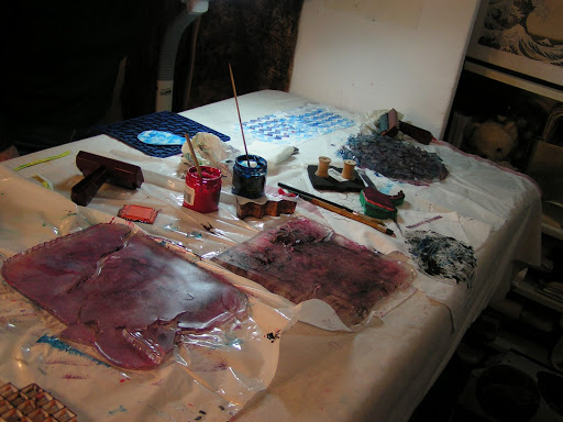
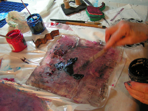
 When my local surface design group met last month, we played with gelatin printing. It was messy but fun. Louise made up the gelatin plates ahead of time and we used printing inks to print.

 Here’s one of the plates after I tore it up a bit. I like the organic lines that you get after the plate starts to deteriorate.

 Here’s Bunny adding some ink to the plate.

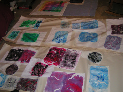
 Here are a few of our prints. I’m not sure what I’ll do with these but I can always make postcards out of them if nothing else comes to mind.

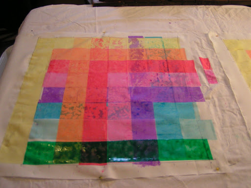
 The other project we tried was screen printing a color grid. You just set up your screen with a 2″ rectangle to be screened and then you screen the various colors on top of one another to see how they mix. We goofed up at the beginning putting the yellow in the wrong places but figured it out eventually.

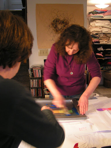
 Here’s Carole putting paper over the wet parts and getting ready to screen a horizontal line across.

Here’s the outcome. The paper covers seem to soak up some of the colors but it was a fun experiment.

Design Focus Friday – Value

Last week at my local surface design group meeting, we took a variety of photos and looked at the value patterns. This is a photo from Glacier National Park. To me, it looks a little bland. There are not many really dark values in the photo. It has quite a few mid tone values but if I was going to use this as an inspirational source, I would add some darker values especially to the left hand side.

This photo has some interested value changes and shapes. The center of attention, the chipmunk is a bit too centered but I like how the shadows make the photo more interesting.

If you’re having trouble distinguishing the values in your work or in a photo source, then use a photo editing software and switch your photo to black and white. Don’t you think more value changes would improve this photo?

You can really see the values much easier this way. By eliminating color, you see only the values and you can tell if changes in value need to be made before beginning a piece from the inspirational photo source.
Do you pay attention to the values in your work? Do you have any tips or tricks that work for you? Leave a comment and let me know how value affects your work.