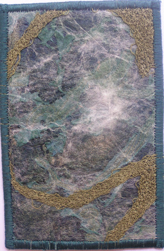
How do you use value in highlighting the center of interest in your work? Value changes draw the eye. So
if you have a very dark area adjacent to a very light area, that contrast will become a focal point. Squint your eyes when looking at your work and see where the highest contrast in value is in the piece. Is that the focal point? Or do you need to change the values so that the higher contrast area is at the focal point?
Is there an overall feeling of harmony and balance when looking at the value changes? Is there a place in the work that your eye is drawn to that it shouldn’t be? Look at that area closely and see if a value is too dark or light in that area and taking away from the center of interest or focal point.
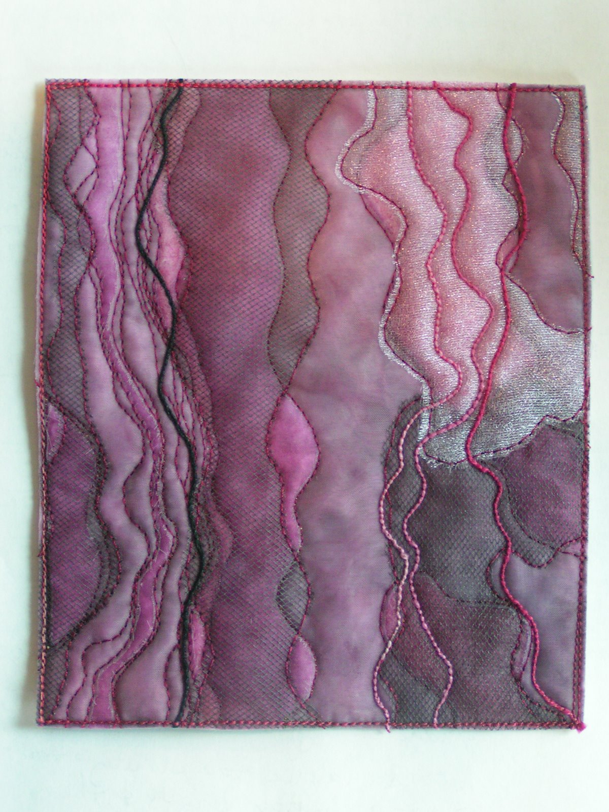
Do the values provide a smooth visual flow through the piece? Is your eye stopped by a big block of a darker value? Is the value pattern causing your eye to be drawn off to the side away from the center of interest? How can you change the value pattern to present a suggestion of motion in the design?
Take a look at what you’re working on now and ask yourself about the value pattern and how it is affecting the design. Leave a comment and tell us your conclusions.

I am bad with values, I guess that is why my work is naive folk art;) I will have to think about that when I make a piece, especially the flow of the colors.Debbie