
Last week at my local surface design group meeting, we took a variety of photos and looked at the value patterns. This is a photo from Glacier National Park. To me, it looks a little bland. There are not many really dark values in the photo. It has quite a few mid tone values but if I was going to use this as an inspirational source, I would add some darker values especially to the left hand side.
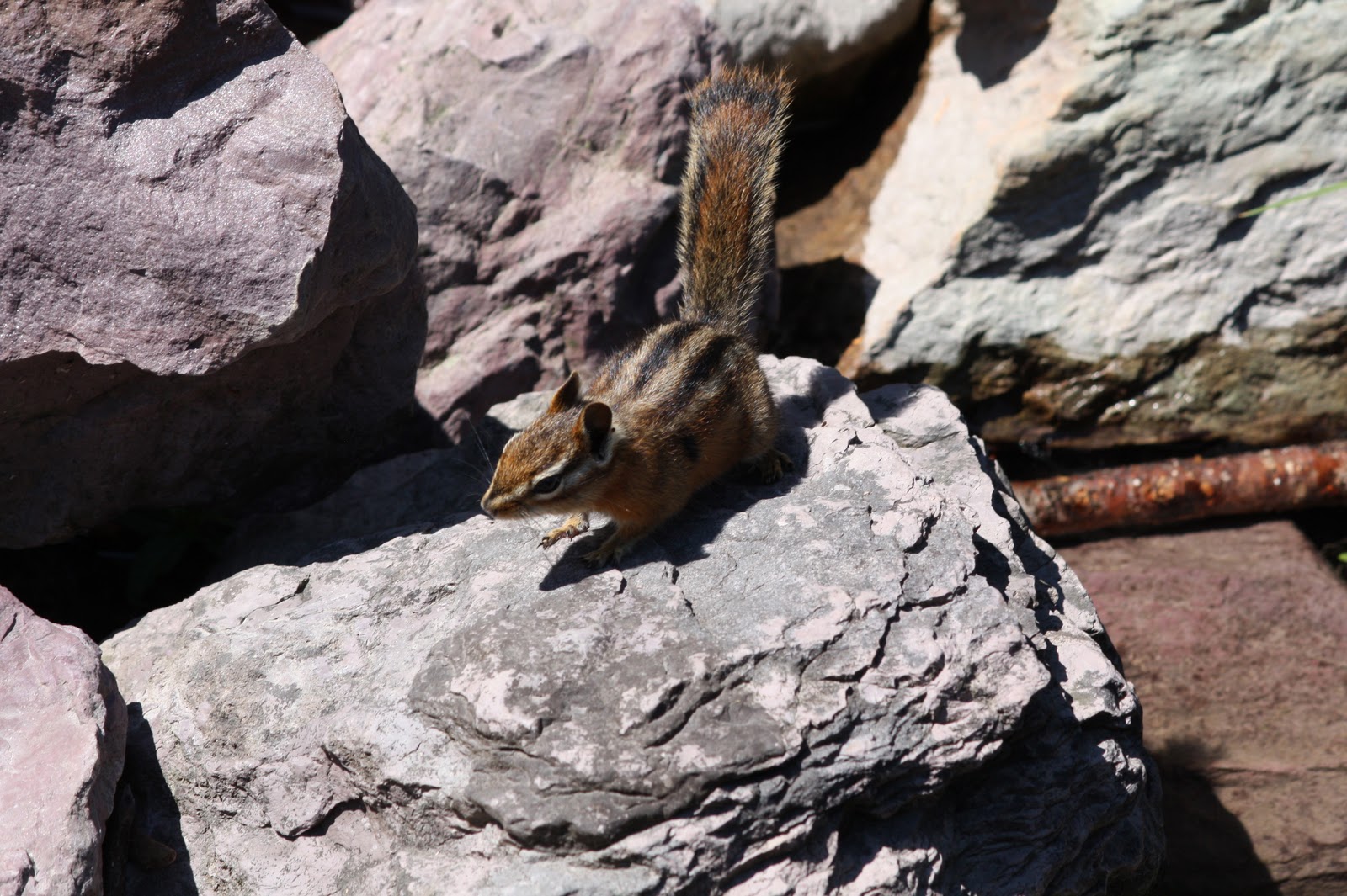
This photo has some interested value changes and shapes. The center of attention, the chipmunk is a bit too centered but I like how the shadows make the photo more interesting.

If you’re having trouble distinguishing the values in your work or in a photo source, then use a photo editing software and switch your photo to black and white. Don’t you think more value changes would improve this photo?

You can really see the values much easier this way. By eliminating color, you see only the values and you can tell if changes in value need to be made before beginning a piece from the inspirational photo source.
Do you pay attention to the values in your work? Do you have any tips or tricks that work for you? Leave a comment and let me know how value affects your work.

Sometimes I put photos through the filters and get interesting effects that way, some work well when working with fabrics and I want a simpler look.Debbie
These two posts have been interesting Ruth. No, I have never done the B/W thing, but thanks to your advice, I'll try it. I am enjoying your colour explorations.
To instantly get a handle on value in a composition, I just squint. Not good for the wriknkles, but it blurs the composition down to the major shapes and values. The thing to remember is that dark values come forward while lighter values recede.