The Story of the Traveling Pages Tree Book

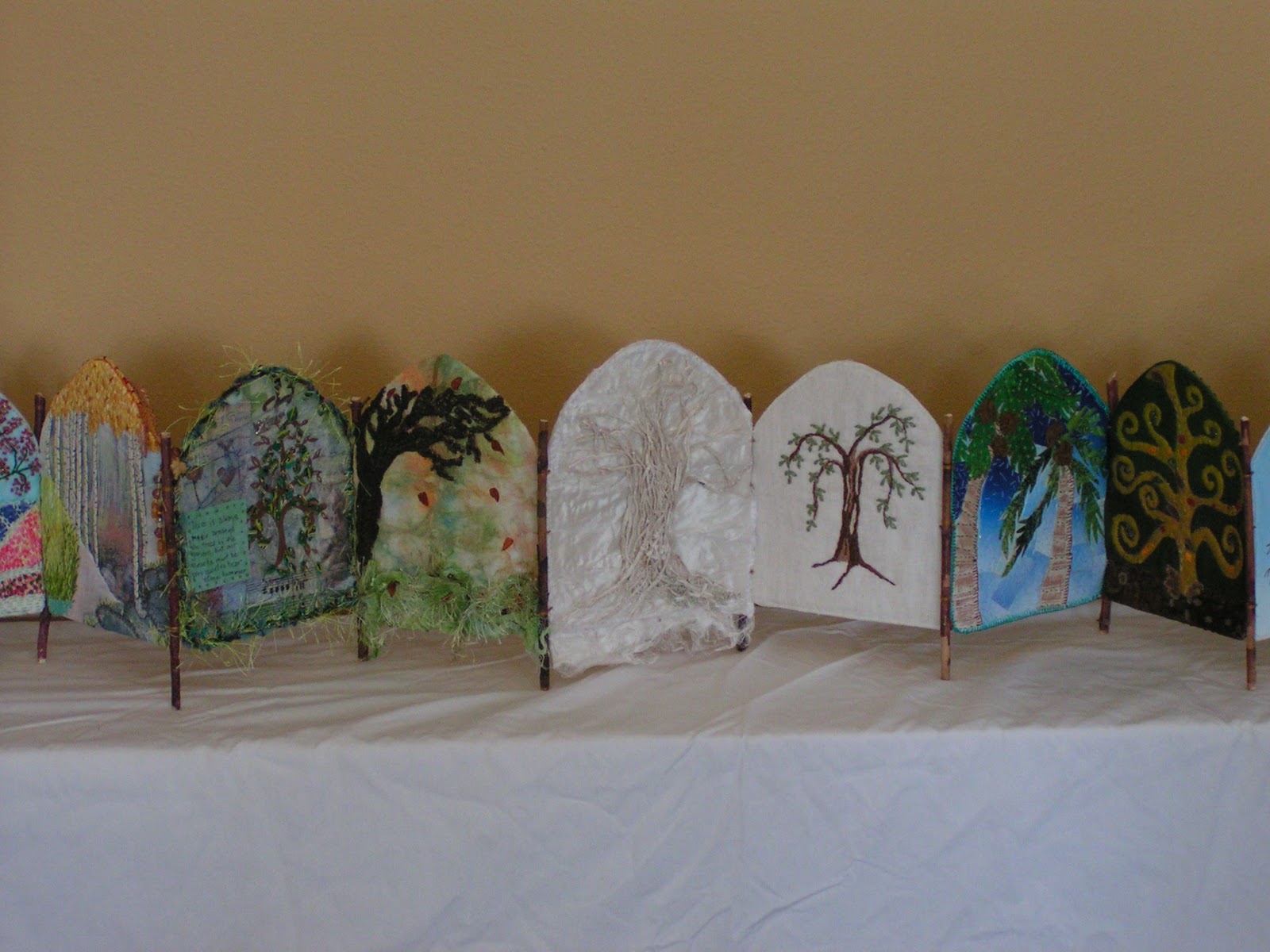
It’s finally complete! I finished construction on my tree book for the The Story of the Traveling Pages Swap. I was still missing two pages but thought there was little chance I would receive them. I guess if I do I can decide at that point what to do.

I am pleased with the results. It was a bit of a pain sewing the sticks on but once I figured out what I was doing it worked out pretty well.

I used a button thread to give strength. I sewed a few stitches on the edge of two pages to hold the pages together and then I added the stick and did a sort of lasing technique (ala Girl Scouts).

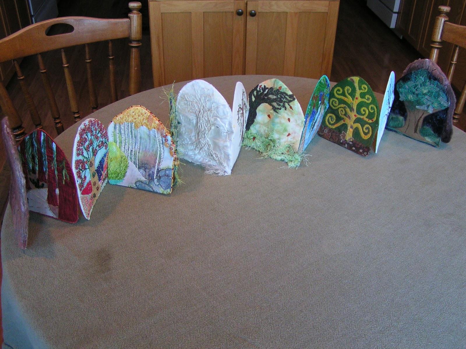
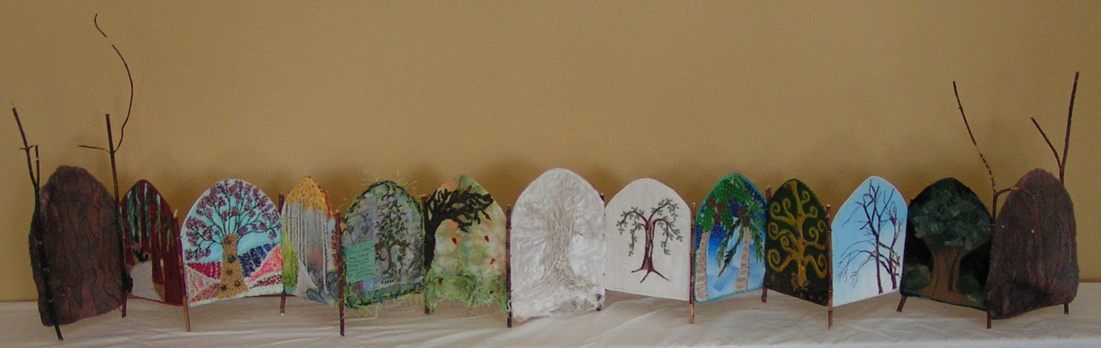
And I really think it’s amazing how different the pages all are but how well they went together. I put them in chronological order by month.

I went a little overboard on the front and back twigs but I really liked the “twigginess” of it.

Here’s a photo of the book nearly closed.

So what do you think? Didn’t it turn out great? Go check out the Traveling Pages Book Swap blog to see how everyone’s books are turning out.

Design Focus Friday – Color Studies

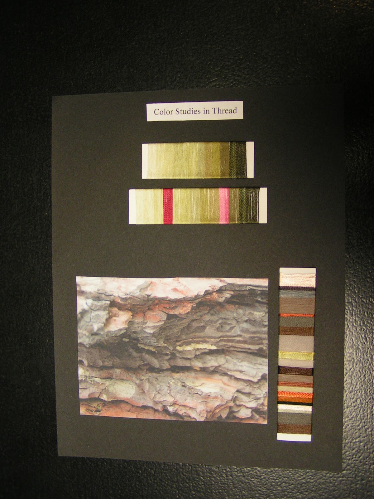
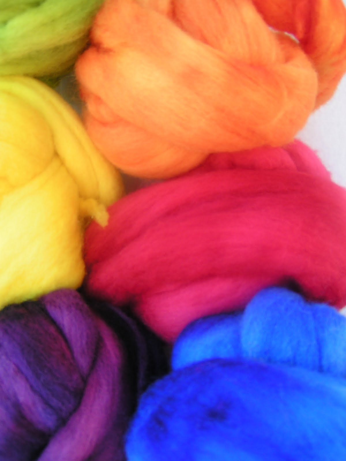
This week I’ve been working on my thread color studies for my hand stitch class homework. I’ve tried some thread color studies in a previous class I took as well. The threads on the top are some of the ones that I dyed in the class as well and are an analogous color scheme. I am using these same threads in the homework assignment of chain stitch as a filler stitch. I will show that to you later. The second thread set down is the same color scheme but add two complementary thread.  This is an excellent way to try out different color schemes and it only takes a small amount of thread.
The second part of the homework is to find an inspirational photo and amazingly enough I chose bark. Then I found threads in similar colors and put them on the card in similar proportion to the photo. I had a bit of difficulty finding very many greyed down browns. Most of the brown threads I have are tending toward red. I do love the orange coming out in this bark photo. It sets off the browns so nicely. 
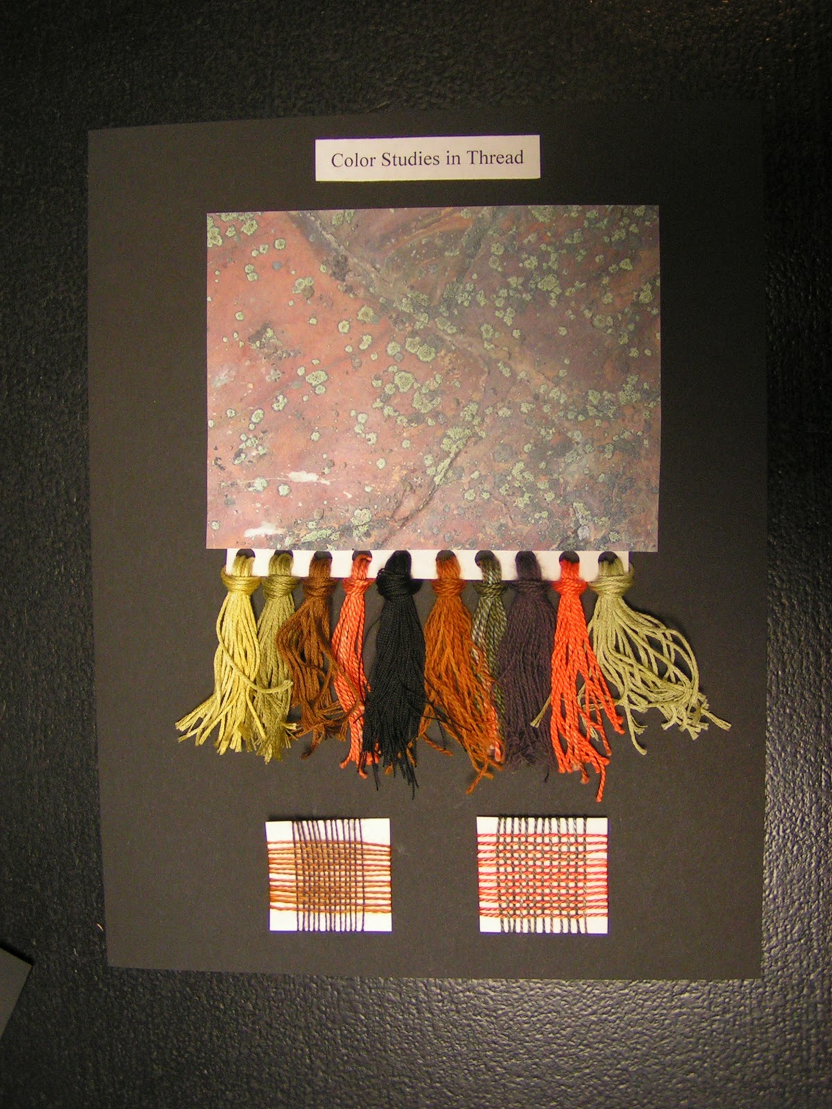
Here’s my second sheet of threads. This one, I did a fringed sample of threads to go with this photo of lichen on a very orange/red rock. I have to say I liked doing the wrapped samples better than the fringed samples but they do look more impressive on the page. The last part of the homework was to do a couple of woven samples with your threads. You can’t see these very well (you can double click the photo to enlarge) but I thought this method was really helpful. It gives a much better idea of how the colors will blend together when close together. Colors do change when viewed together and many times a thread that you thought might really pop, blends in too much. The weaving samples only took a few minutes and it really shows you how the colors work with each other.
Here is the full page spread how it will be in my notebook that I turn back in for my grade. One of the things that I tried to do in this class was to use colors that I wouldn’t normally use as much. Of course I use green a lot but the orange was definitely a change for me. I have to say that after working with the orange in several samples and using it in my color studies that it’s beginning to grow on me. Are there certain colors that you use all the time? How about colors that you avoid? Maybe you could try a few color studies either with thread, paints, paper or fabric (whatever you have handy) of colors that you don’t normally use. Spread your wings and try a different section of the color wheel, it’s fun!

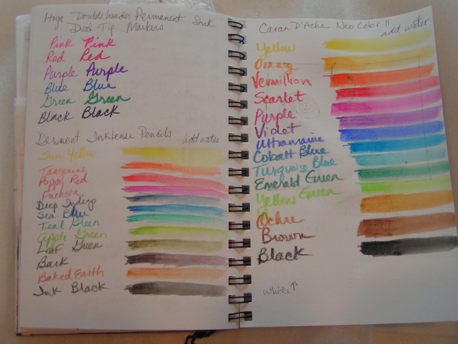
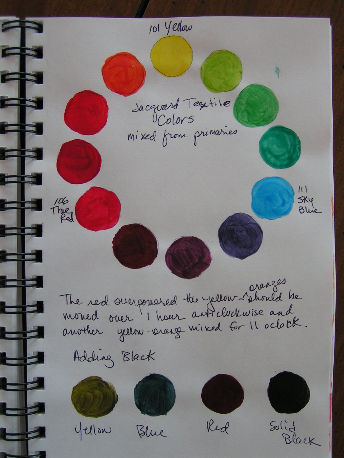
I also painted a few color wheels today in preparation for my local group meeting tomorrow at my house. We are going to paint color wheels using the Dye-na-flow paints I got for Christmas. I purposely got two of each of the primaries so that I could see the difference when mixing the paints. The example above shows the difference between using yellow, magenta and turquoise as compared to yellow, scarlet and ultramarine. Sorry that the photo isn’t the best but you can definitely tell a difference in the purples and the greens. I don’t see as much difference in the orange section but it is slightly different. These samples were painted with Caran D’Ache Neocolor II’s. I really think it’s beneficial to paint a color wheel with the various paints you have. If you put it on a nice piece of paper (these are done on watercolor pager) or in your journal, you’ll have it for future reference when you’re using your paints.

Next week, I’m going to be doing more paint mixing, checking out tints, shades and tones. What have you been doing with color? Do leave a comment and let me know.

Fabric Book Update

I have been working out the logistics for putting my fabric book pages together from the Traveling Pages Swap. I am going to make an accordion style book. Right now I have the pages pinned together and this shows the backs of the pages.

Here’s the fronts. It’s not very sturdy with just the pins holding it. I am planning on adding twigs for legs at all the page junctures.

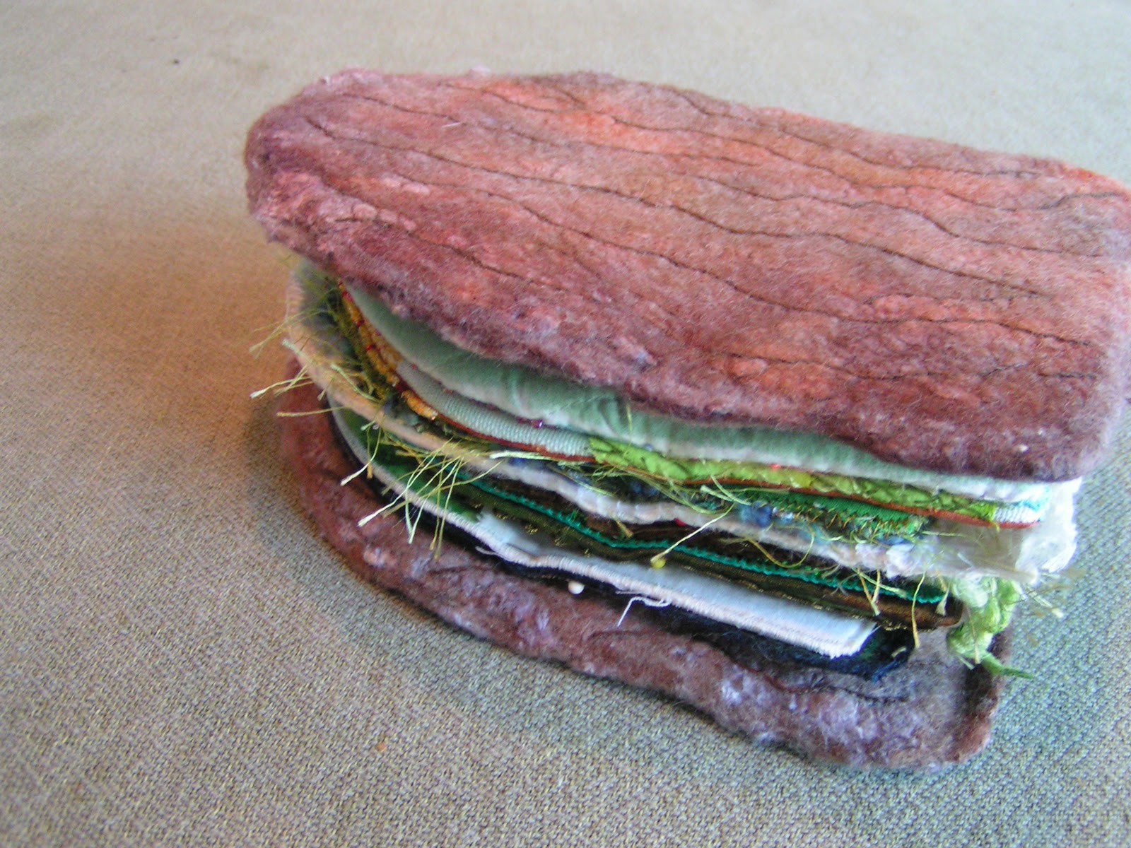
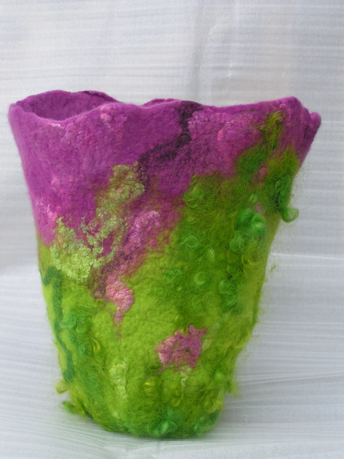
Here it is all folded up with the bark covers that I wet felted and then hand stitched with stem stitch.

I think it kind of looks like a burger with little lettuce bits sticking out. I’ve got to cut the sticks to size and then start assembling. It should be a bit fiddly so I’m not really looking forward to the process. Hopefully, it will go more smoothly than anticipated!

Design Focus Friday – Color

This month we’re going to focus on color. Don’t you just love to play with color? I think though that sometimes you might shy away from learning about color theory. It just sounds too technical and too much work. Many artists have spent a lifetime learning about color theory but you don’t need to get overwhelmed. Just jump in and start trying some of the ideas suggested here. It will be fun – I promise!

Color occurs when light in different wavelengths strikes our eyes. Objects have no color of their own, only the ability to reflect a certain wavelength of light back to our eyes. As you know, color can vary in differing circumstances. For example, grass can appear gray in the morning or evening or bright green at noon. Colors appear different depending on whether you view them under incandescent, florescent or natural sunlight. Colors also change according to their surroundings.

There are three properties of color which are hue, value and intensity. Hue refers to the color itself. Each different hue is a different reflected wavelength of light. White light broken in a prism has seven hues: red, orange, yellow, green, blue, indigo and violet. Remember Roy G. Biv? White light occurs when all the wavelengths are reflected back to your eye, and black light occurs when no light is reflected to your eye. This is the physics of light.

Color value refers to the lightness or darkness of the hue. Adding white to a hue produces a high-value color, often called a tint. Adding black to a hue produces a low-value color, often called a shade. Value can be used for emphasis. Variations in value are used to create a focal point for the design of a piece.

Intensity, also called chroma or saturation, refers to the brightness of a color. A color is at full intensity when not mixed with black or white – a pure hue. You can change the intensity of a color, making it duller or more neutral by adding gray to the color. You can also change the intensity of a color by adding its complement (this is the color found directly opposite on the traditional color wheel). When changing colors this way, the color produced is called a tone.

Certain colors have an advancing or receding quality, based on how our eye has to adjust to see them. Warm colors such as red, orange or yellow seem to come forward while cool colors such as blue and green seem to recede slightly. In the atmosphere, distant objects appear bluish and the further away an object appears, the less colorful and distinct it becomes. You can use this tendency to give an illusion of depth, by using more neutral and grayish colors in the background. 

Various color schemes can be used in your work. A monochromatic color scheme involves the use of only one hue. The hue can vary in value, and black or white may be added to create various shades or tints.

An analogous color scheme involves the use of colors that are located adjacent on the color wheel. The hues may vary in value.

A complementary color scheme involves the use of colors that are located opposite on the color wheel such as red and green, yellow and purple, or orange and blue. Complementary colors produce a very exciting, dynamic pattern. 

Or how about triadic? This color scheme involves the use of colors that are equally spaced on the color wheel. The primary colors of yellow, red and blue could be used together in a color scheme to produce a lively result. 
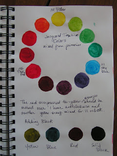
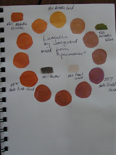
I am certainly not a color expert. (Most of this information came from this website.) That’s one of the reasons I’m doing these design focused posts, to help me learn more about color as well as design. One of the things I try to do is when I get new painting/color supplies, is to make a color wheel and mix the different colors together. I am always surprised by what comes out. One yellow is not the same as another yellow. One yellow may tend more toward the orange/red side of the color wheel, while another may tend toward green/blue. These different yellows will yield absolutely different results when mixed with other colors. I recently got some Golden acrylics. I mixed green and red and got purple. It wasn’t the color I was expecting. Try mixing your colors beforehand and making a sample of each mixture in your journal. If  you don’t keep a journal, just use a sheet of paper and keep it with your paints.
I found an excellent resource about color, books about color and just why it is important to learn more about color. Check out Roz Wound Up in this post. Here’s another one that has tons of information and links about color. There’s enough information there to keep you busy for a while.

When you’re thinking about color this month, ask yourself a few of these questions:

• How can you use color to evoke different emotions? Do you connect certain emotions to certain colors?

• What does using a monochromatic color scheme do to your composition? Complementary? Analogous? Or Triadic?

• How do you choose your color scheme? Is it affected by the subject of your composition? The mood you want to achieve? What is the impact of choosing a color scheme that is the opposite of your normal choice?

• What would your composition look like with all the same values? How can you use value changes to improve your focal point?

• Have you tried mixing various fabric paints to see what colors you can achieve? What colors do you achieve when you mix two colors together? What happens if you add black to your colors?

I’d love to hear what you’re working on and how you use color theory in your work. Leave a comment and give us a link to your favorite colors. Next week, I’ll hopefully have some thread color studies completed to show you.
Silk Screens

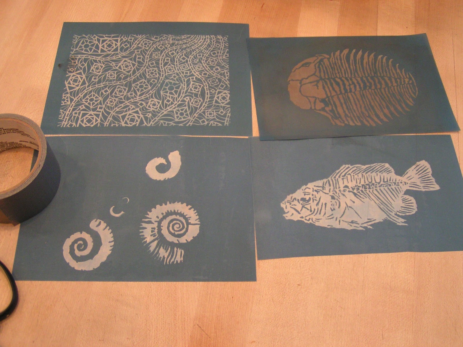
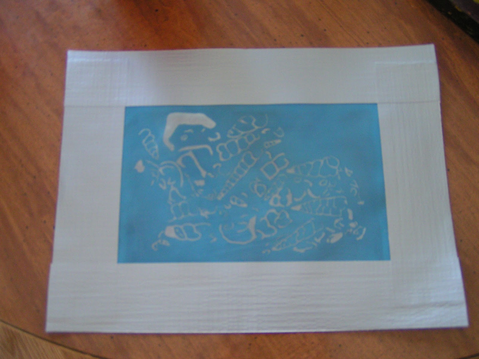
 When my local surface design group got together, we made silk screens. We used a combination of methods but it worked really well. We used PhotoEZ and a Yudu machine.  We tried to use the supplies that came with the Yudu machine but it didn’t work and took a really long time. With the PhotoEZ, you just need your design on a transparency, you put both on the Yudu machine and ‘burn’ the screen for 4 1/2 minutes. We used the high resolution screens. Then you soak them in the sink for 5-10 minutes and gently rub away the part that wasn’t exposed to light. And look at the screens I made! It was really exciting to see my designs become a silk screen. Today, I used duct tape to put around the edges so I would have a well space to put thickened dye.

 Here’s one screen with the duct tape around it.

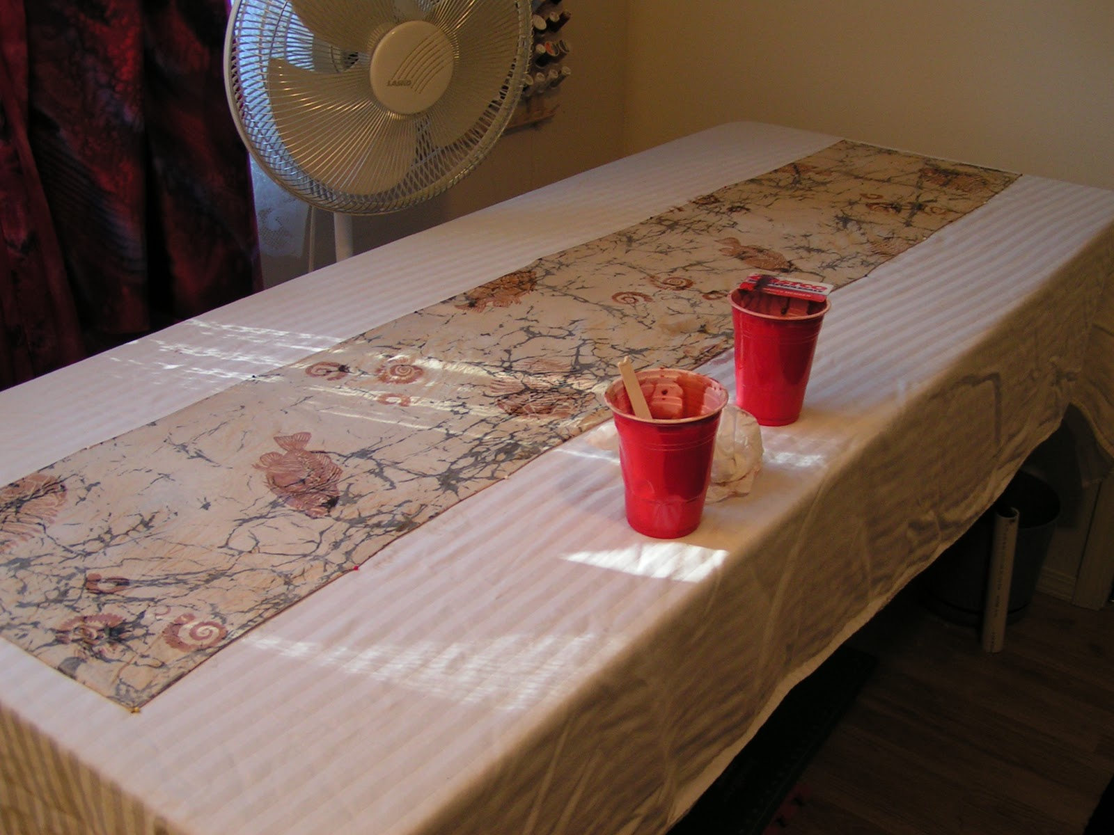
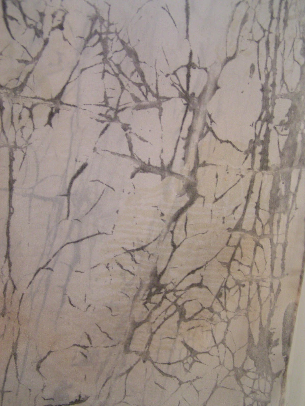
 Then I got busy using my new print table and my new silk screens. I used thickened acid dyes with presoaked (in acetic acid and water) scarves. I did both of my flour paste resist scarves. One I used brown and the other I used ecru.

 This is the brown one. I thought that I had made the brown a bit too red at this point.

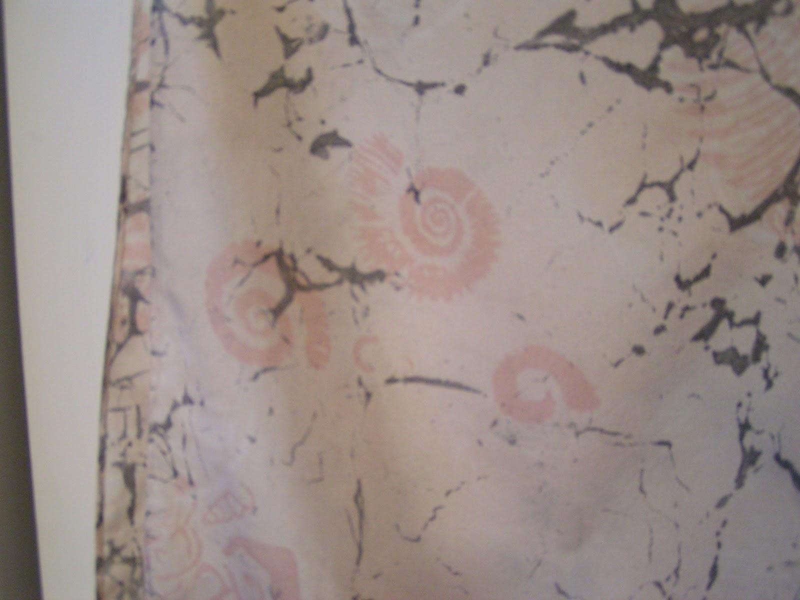
 But once dry, the color works fairly well. The scarf on the right is the one with the ecru screen printing. It is really subtle, that is to say, you can hardly see the silk screening. But I actually like it that way.

 Here’s a close up of the brown silk screens.

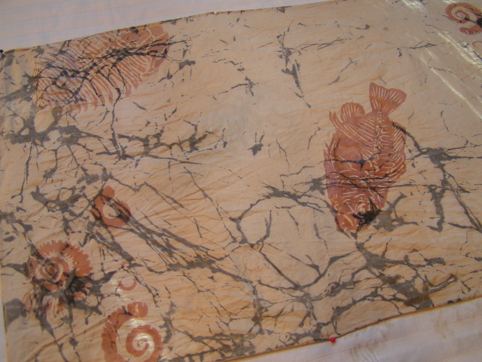
 My fossil fish.

 This is the trilobite screen on the right side. Can you see it?

Here’s an ammonite

 Then I used the silk screens to do some discharge on this brown scarf. I always forget to test ahead of time and I always get a surprise as to what color remains after discharging.

These turned orange. Here’s a better photo of the trilobite. I had a blast and I really liked doing the silk screening with the PhotoEZ screens. It was simple and fairly quick. I will definitely have to order more of these. The only problem is how expensive they are, nearly $10 per sheet. The lower resolution ones are less expensive but we thought with the complexity of the designs we were using that the higher resolution would be better. If you haven’t tried these, you don’t need a Yudu to burn the screens. You just need a light source. It takes a bit longer but if you have a sunny day, it works in the sun as well. So give it a try, it’s great fun.