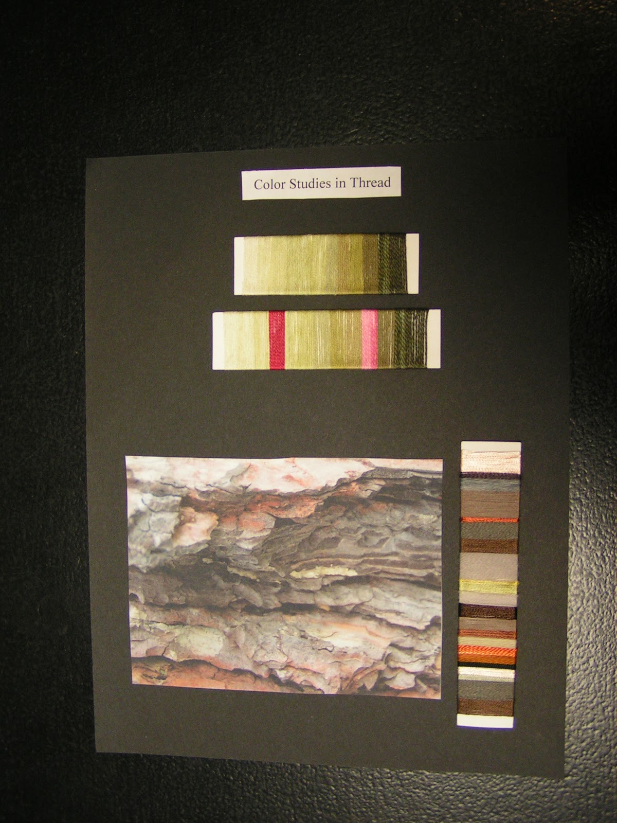
This week I’ve been working on my thread color studies for my hand stitch class homework. I’ve tried some thread color studies in a previous class I took as well. The threads on the top are some of the ones that I dyed in the class as well and are an analogous color scheme. I am using these same threads in the homework assignment of chain stitch as a filler stitch. I will show that to you later. The second thread set down is the same color scheme but add two complementary thread. This is an excellent way to try out different color schemes and it only takes a small amount of thread.
The second part of the homework is to find an inspirational photo and amazingly enough I chose bark. Then I found threads in similar colors and put them on the card in similar proportion to the photo. I had a bit of difficulty finding very many greyed down browns. Most of the brown threads I have are tending toward red. I do love the orange coming out in this bark photo. It sets off the browns so nicely.

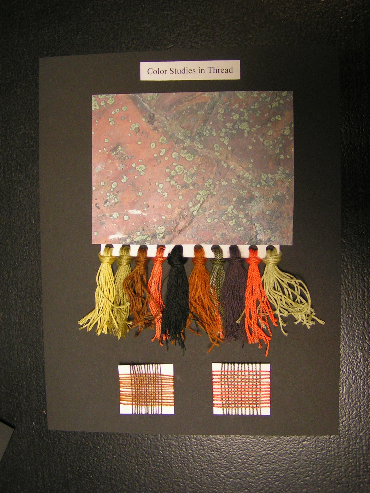
Here’s my second sheet of threads. This one, I did a fringed sample of threads to go with this photo of lichen on a very orange/red rock. I have to say I liked doing the wrapped samples better than the fringed samples but they do look more impressive on the page. The last part of the homework was to do a couple of woven samples with your threads. You can’t see these very well (you can double click the photo to enlarge) but I thought this method was really helpful. It gives a much better idea of how the colors will blend together when close together. Colors do change when viewed together and many times a thread that you thought might really pop, blends in too much. The weaving samples only took a few minutes and it really shows you how the colors work with each other.

Here is the full page spread how it will be in my notebook that I turn back in for my grade. One of the things that I tried to do in this class was to use colors that I wouldn’t normally use as much. Of course I use green a lot but the orange was definitely a change for me. I have to say that after working with the orange in several samples and using it in my color studies that it’s beginning to grow on me. Are there certain colors that you use all the time? How about colors that you avoid? Maybe you could try a few color studies either with thread, paints, paper or fabric (whatever you have handy) of colors that you don’t normally use. Spread your wings and try a different section of the color wheel, it’s fun!

I also painted a few color wheels today in preparation for my local group meeting tomorrow at my house. We are going to paint color wheels using the Dye-na-flow paints I got for Christmas. I purposely got two of each of the primaries so that I could see the difference when mixing the paints. The example above shows the difference between using yellow, magenta and turquoise as compared to yellow, scarlet and ultramarine. Sorry that the photo isn’t the best but you can definitely tell a difference in the purples and the greens. I don’t see as much difference in the orange section but it is slightly different. These samples were painted with Caran D’Ache Neocolor II’s. I really think it’s beneficial to paint a color wheel with the various paints you have. If you put it on a nice piece of paper (these are done on watercolor pager) or in your journal, you’ll have it for future reference when you’re using your paints.
Next week, I’m going to be doing more paint mixing, checking out tints, shades and tones. What have you been doing with color? Do leave a comment and let me know.