Finished UFO

 I have had this water/sea themed piece around for over a year and it might be two. I finally got around to making it into a notebook cover. This was spurred on because I’m going to try and get some of my work on consignment in a shop in Missoula. I needed a sample notebook cover so here it is. This is the front.

 And here’s the back. I just bought a school type notebook from Wally World. It can be easily replaced.

 Here’s the inside. I decided for a pop of complementary color. Plus the orange fabric had purple in it and the lining is purple.

Here’s the inside of the cover without the book in place. That’s the only time you can see the purple which this photo made a bit more blue than it is in real life. I am also working on finishing up more barrettes, scarves and perhaps a felted vase. If I do get accepted, I’ll have to be very busy when I get back from my class and get pieces done to sell.

Design Focus Friday – Texture

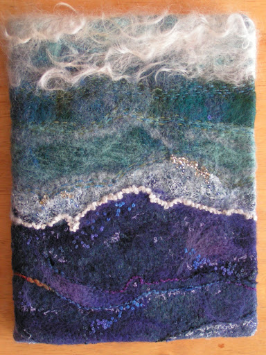
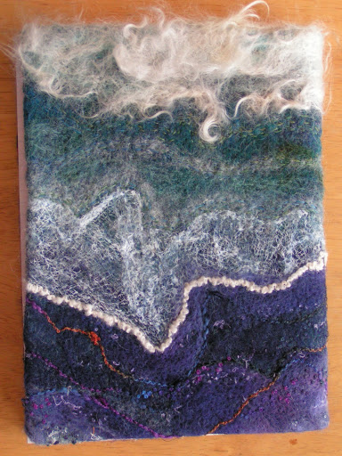
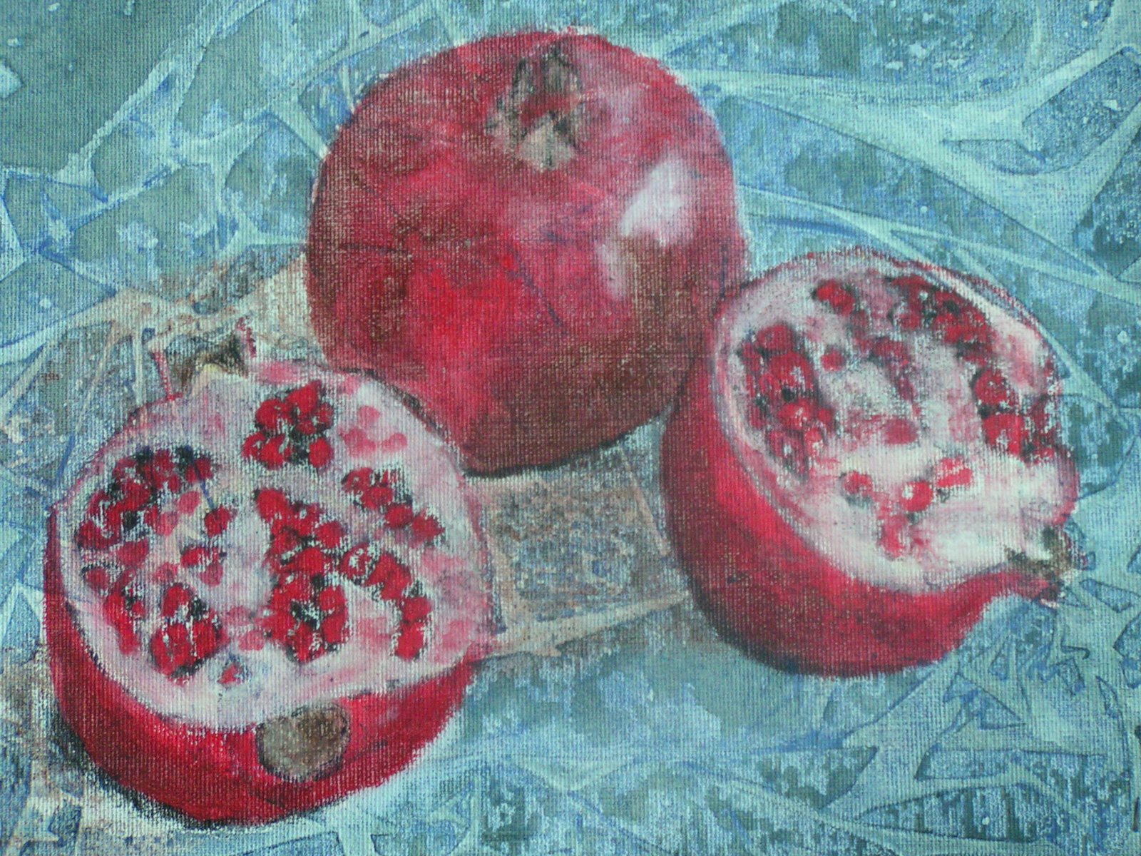
 Textures range from the smoothest polished mirror to the roughest mountain range as seen from an airplane. The term is often misused to refer only to rough surfaces but this is not correct. All surfaces have texture. You as a designer recognize that different textures can affect interest in different ways. Some surfaces are inviting and some are repellent and so are the textures that suggest those surfaces. Using different textures can increase interest in a composition by adding variety without changing color or value relationships.

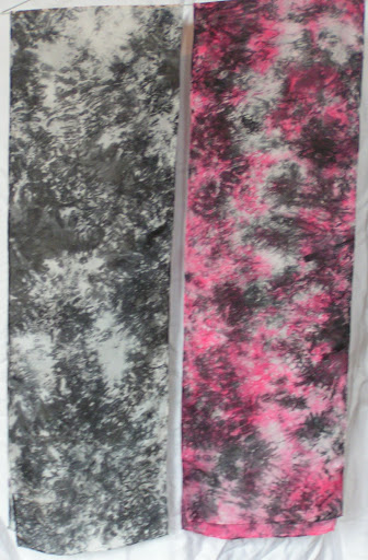
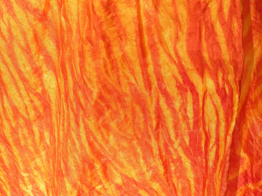
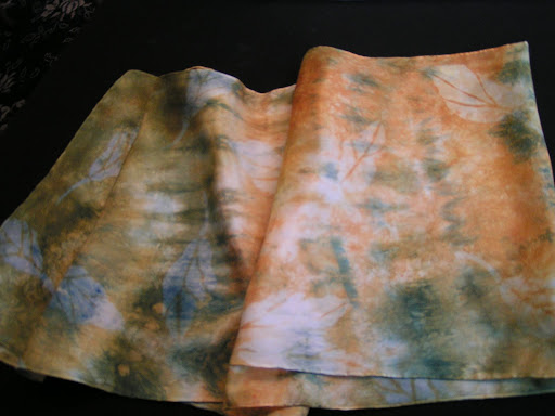
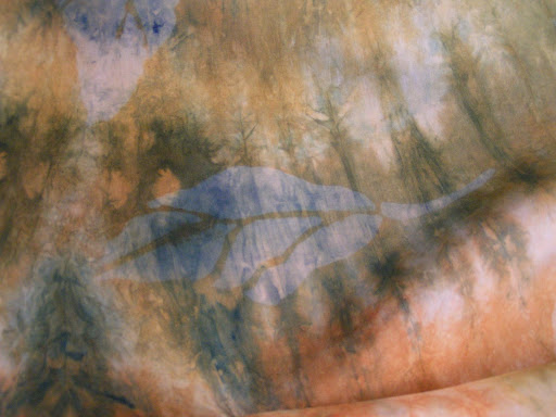
 Visual texture refers to the illusion of the surface’s texture. It is what tactile texture looks like (on a 2D surface). The textures you see in a photograph are visual textures. No matter how rough objects in the photograph look, the surface of the photograph is smooth and flat. Most textures have a naturalistic quality; they repeat a motif in a random way. A motif is any recurring thematic element or repeated figure in design. It could be an object, shape, color, direction, etc. With a texture you may be aware of the repeating motif but you are more aware of the surface.

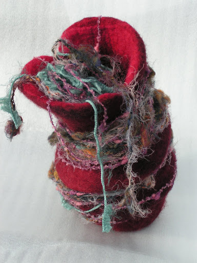
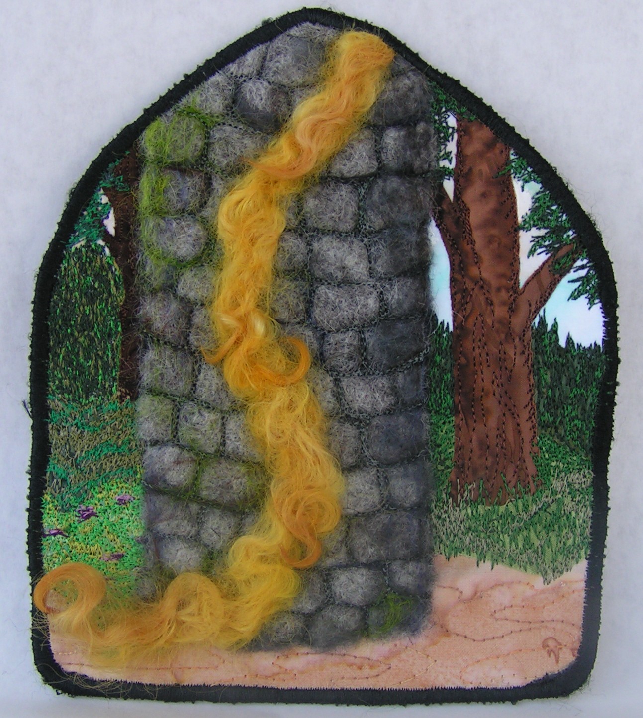
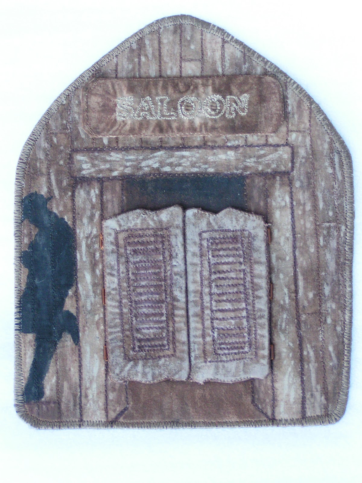
Tactile means touch. Tactile texture is the actual (3D) feel of a surface. This is of paramount importance to three-dimensional design but of only moderate interest in two-dimensional design. The actual surface texture needs to either be felt, or seen with light raking across its surface to make the texture visible.

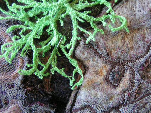
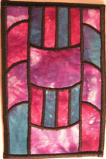
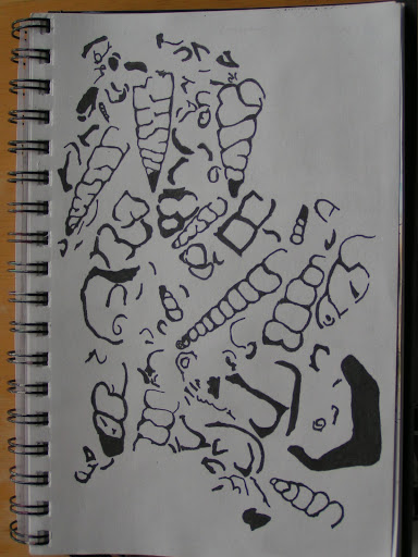
A recognizable motif regularly repeated produces a pattern. Pattern requires repetition — in design as in life (a pattern of behavior). The more regular the repetition, the stronger the pattern will be. The most noticeable patterns occur when you see the group before the individuals — notice the organization first (the checker board). All of the motifs in a pattern have surfaces, so there is always texture. But there is not always pattern — only when you notice it. Texture and pattern are related. When you look closely at a tree you can see the pattern of leaves that make its surface. When you back away you lose awareness of the leaves and notice the texture the leaves make on the tree. Farther away still and you can see the pattern of the trees making up the forest and finally the texture of the forest. In this way pattern changes to texture as you loose sight of the individual motifs. This is easy to do with natural patterns, but you have to get quite far away from a checker board grid to see it as texture. Patterns are generally more noticeable than textures. This makes them a stronger visual element for controlling attention.

·        How could you use tactile texture in a traditional quilt design to enhance the composition? Visual texture?

·        If you switch to black and white, how different do the various textures look?
·        How can you use tactile associations to communicate with the viewer of your work? How many memories can you remember of touch such as warmth, softness, bristly etc.?

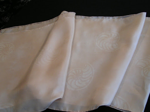
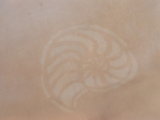
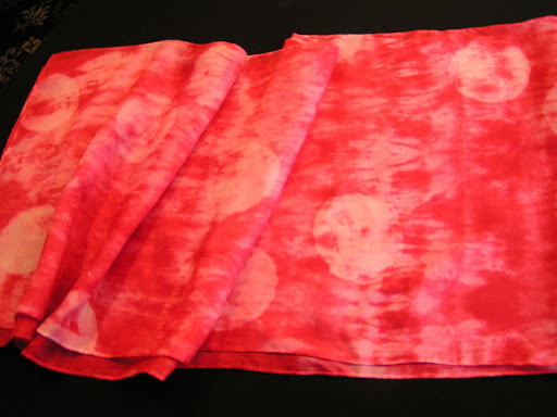
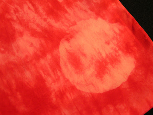
• How do different types of fibers or fabrics affect your composition? Do different textures of fabric make you relate to the work in a different manner?

• Can you create depth using a visually patterned cloth? Motion? Focal point?

• How can you depict different textures from your home environment?

• What methods do you use that increase texture in your work? Can you think of other methods that would increase the tactile or visual textures in your work?

Let me know how you use texture in your work. I’d love to see photos so leave me a link in the comments!

Discharging Scarves

 I am working on the next layer of complexity on my recently dyed scarves. This one was the walnut ink one so I used Jacquard Discharge paste through my ammonites stencil. It worked great.

 I took Jane Dunnewold’s advice in her most recent book and ironed the discharge paste when wet. The instructions say to let it dry. But it worked fine and took less time that way. These look like watermarks. This scarf is currently getting the flour paste treatment. Since I got quite a few questions on that technique, I am working on a tutorial on how for that. Hope to have it completed soon.

 This one I discharge some circles through a cardboard stencil that was part of some packaging.

 Here’s a close up. The red only discharges part way especially if it is really dark red.

 This one I used three different leaf stencils to discharge. Again, they look like watermarks and are pretty subtle. But that was just the effect I wanted.

Here is a close up of one of the leaves. These will be getting more layers and I have a bunch more scarves to discharge. More later!

Future Silk Screens

 I worked this week on finishing up my fossil sketches.

 This one will be for a background type of silk screen for an all over pattern effect.

 These two were a bit tedious to draw and get all the black filled in but I think they will make good silk screens.

 I then scanned the sketches into the computer as black and white photos. Then I put them into PSE (Photoshop Elements) and cleaned them up a bit. Do you think my fossil fish looks mean?

 This one I reversed the colors in Photoshop. You an do this by opening your photo, clicking on filter, then adjustments and then click invert. Worked like a charm! Any stray bits of black I painted over with the paintbrush tool using white.

 I couldn’t decide if I liked the positive or negative so I think I will make a screen both ways.

 Here’s the all over fossil pattern. I cleaned up stray bits of black with the paintbrush again on this one.

Here’s my trilobite. I really like how this turned out. I can’t wait to make the silk screens and try them out on my scarves. I ordered some PhotoEZ sheets but I won’t get time to finish these until I get back from my hand embroidery class. Our next meeting with my local surface design group we are going to make silk screens and try out a Yudu machine. I’m getting prepared for that get together. I have to print these on to transparencies and then I’ll be all set. Hope you have a good weekend and thanks for stopping by!

Design Focus Friday – Form

 The latest book I am reading to continue my learning journey into design is Dynamic Color Painting for the Beginner by Diane Edison. As I was trying to come up with something else to say about form, I was struck by what she wrote about making a preparatory sketch for a painting. She suggests that to make a three dimensional drawing that you draw the value patterns. When you look at your subject you need to look at the shapes that the values make. You need to notice every tone and shadow and what shape each makes and draw those. She says that as you draw the shapes you will see that the patches of color follow the contour of the object, and so including them in your sketch will help you create the illusion of three dimensions.

 But what really struck me was her use of the term “visual trust”. Diane states that “Drawing in this way, following the shape of the colors as well as the outline of the object, is much like a puzzle requiring visual trust. I describe this the term ‘visual trust’ as accepting what you see, without question. By this I mean that sometimes the first thing you see without question is most likely correct.”

 Diane reveals that many times our brains tend to name things in a sort of intellectual interference and we tend to disregard what we really see and instead try to self correct as we draw. But this isn’t the way you should draw. To draw well you need to rely on what you see, not what you think you see or expect to see.

 Diane infers that to paint or draw from observation demands a willingness to believe the unbelievable. This means that you are seeing a different point of view, one that you can not easily imagine.

Do you trust what you see when you draw? I find it really takes practice to see those small value changes as shapes and to draw those shapes. You can’t think your drawing into existence, you have to look closely and trust your pencil or paintbrush to draw or paint what you really see.

What do you think? Do you have “visual trust” when you draw? How does that apply to your fiber art?

Coming up in February, we’ll be talking about texture. Yippee! This is one of my favorite elements of design and it’s why I love fiber. So let me know what you think about “visual trust” and how that affects form in your work and I’ll see you next week.