Level 1 Hand Stitch Class

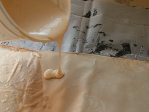
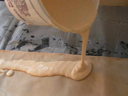
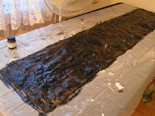
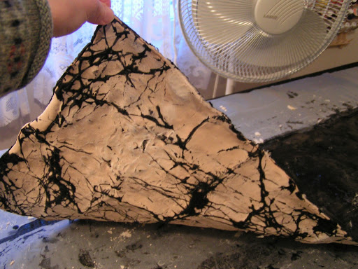
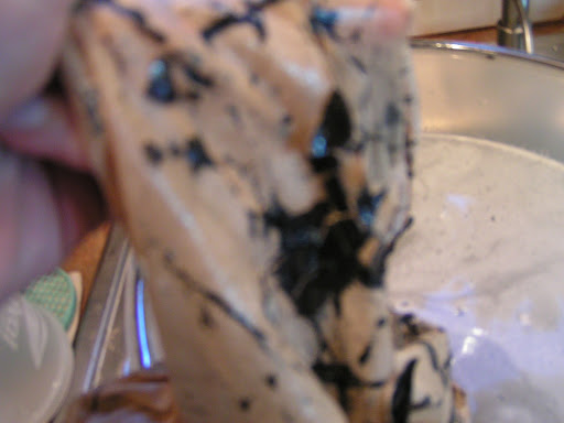
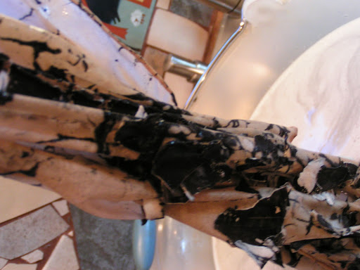
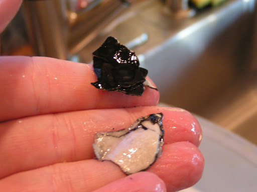
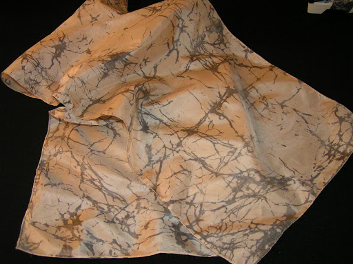
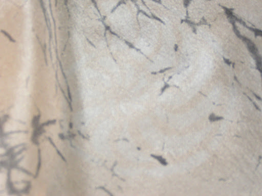
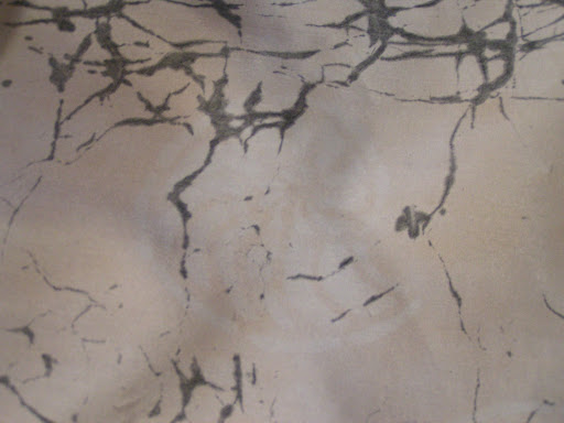
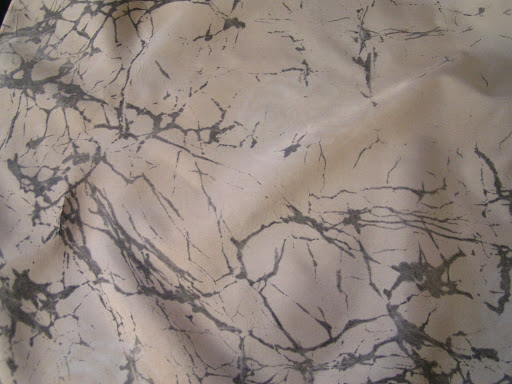
 I had a wonderful time at the Level 1 Hand Stitch course that I took at the Gail Harker Creative Studies Center. The first day we dyed threads and fabrics with Procion MX dyes. I hadn’t used this type of dye before since I usually use acid dye, so I was glad to get this experience.

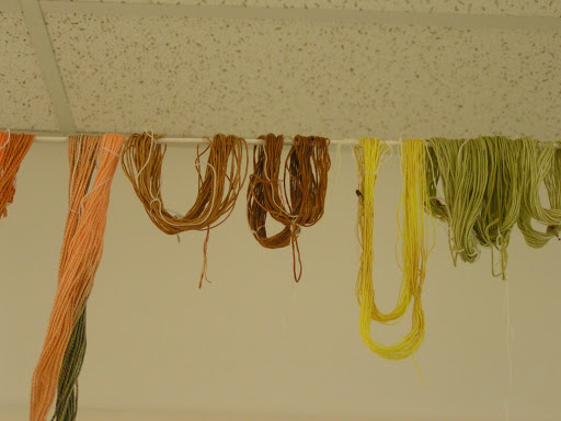
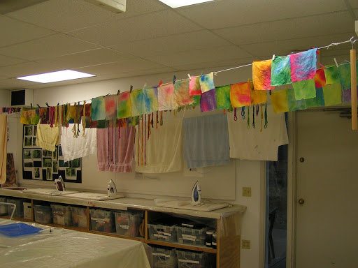
 Here are a few of my threads hanging on the line drying.

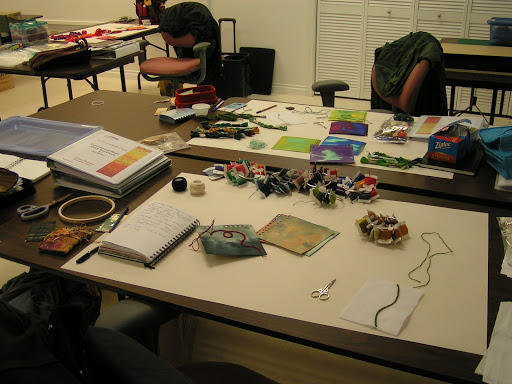
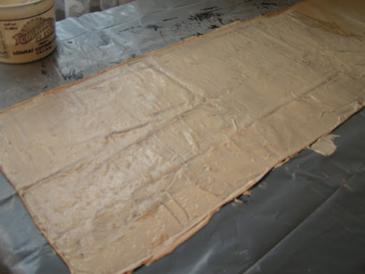
 Here is my work station on the second day. It looks fairly neat but you should have seen it by the 5th day. I had threads, projects and stuff strewn everywhere.

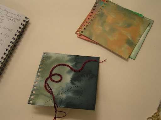
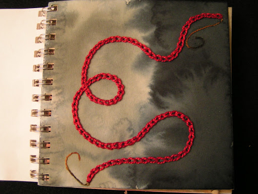
 Here is our first project in our sketchbooks. It is chain stitch. I have been doing chain stitch for years and  learned that I had been doing it incorrectly all this time. Who knew?

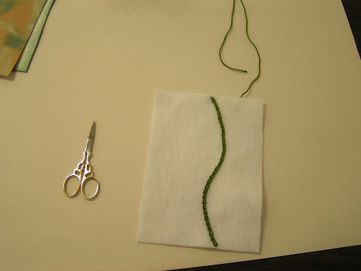
 Here is another chain stitch sample on felt.

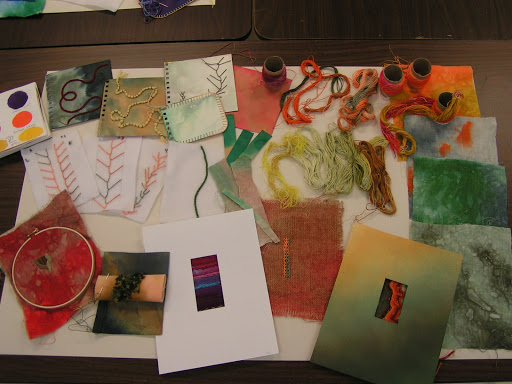
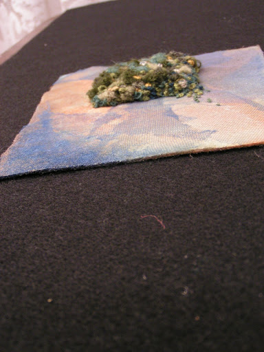
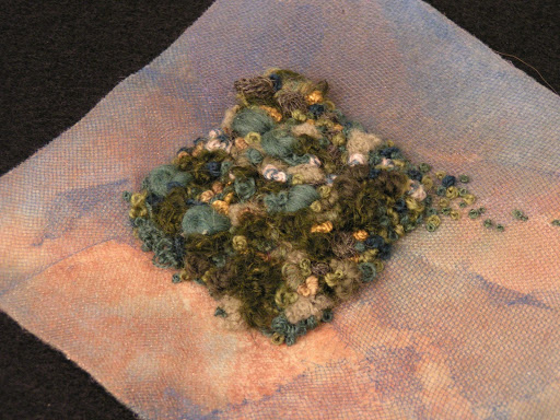
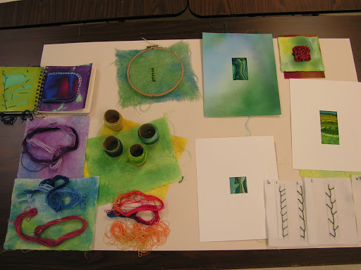
 Here is a collection of the work that I did during the five day course. I had many unfinished samples at this point.

 This is Bobbi’s work. Wonderful colors!

 Here is Nancy’s work. I love that page in the middle with bright yellow and deep blue.

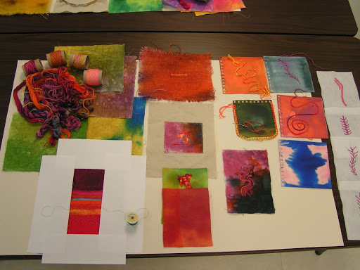
 This is Marie’s work. Here colors are wonderful as well. I really liked her feather stitch sample, the one on the bottom left.

 This is Sarah’s work. She used quite a few pale backgrounds because she wanted her stitches to show up more.

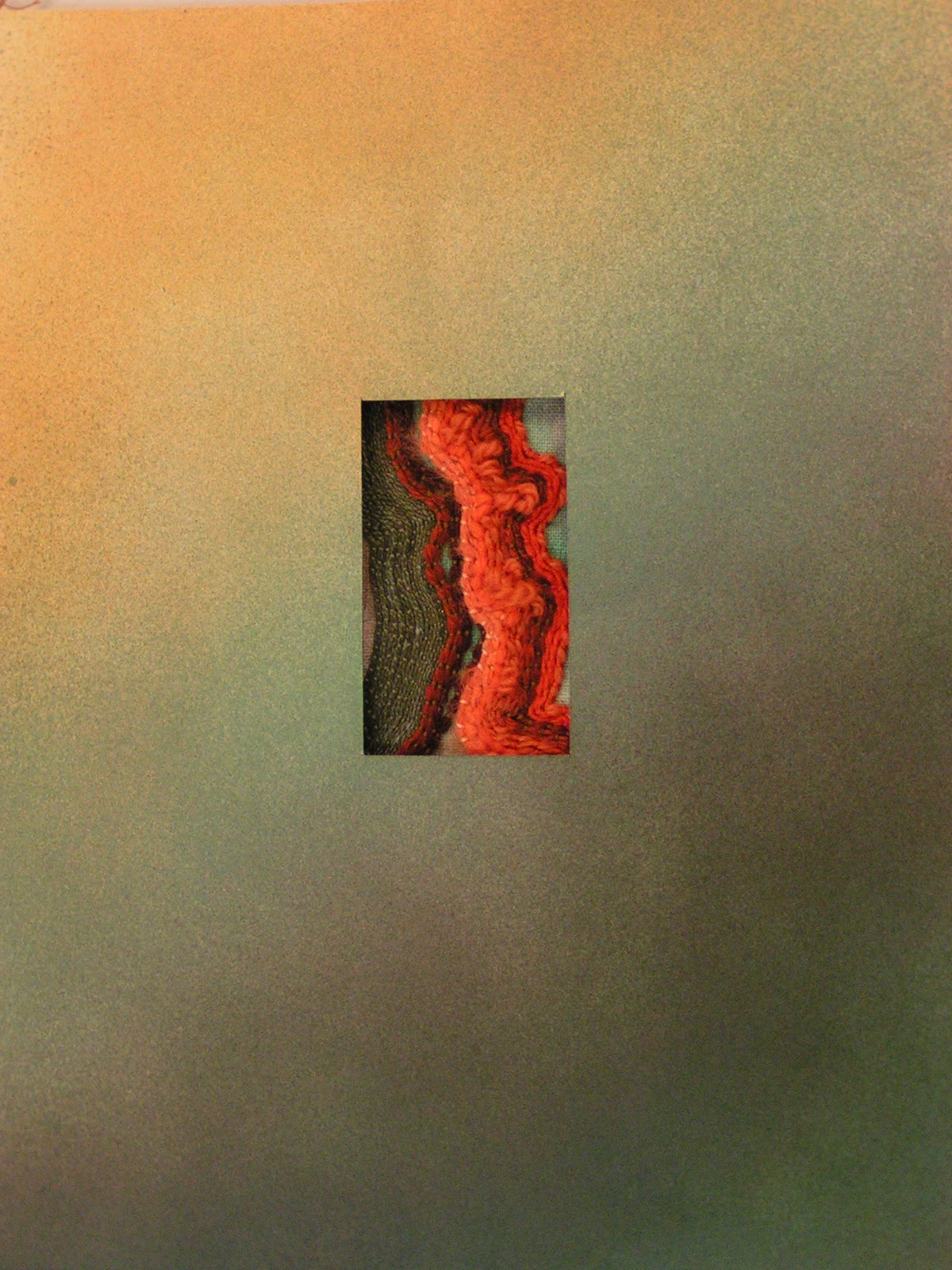
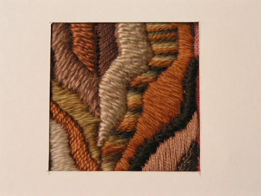
 This is the one sample that was fully complete at the end of the course. It is a couched thread sample.  The oranges are really not a color I am comfortable using so I was trying to stretch my color horizons a bit. When I started this piece, I thought it was going to be hideously ugly. But I am really pleased with the result. It was good to try a different color combination and work through the design process becoming more comfortable with the color choice as I went along. I need to take a closer photo of the stitches as you can’t see them all that well. But you can click on the photo to make it larger.

 Here’s Gail taking photos of all our work at the end of the class. The thing I like about Gail’s classes is that she really works to teach you design as you learn about stitching (or whatever you’re doing). I always learn so much from her and she really encourages everyone to go their own direction. If you are in the northwest, I would strongly recommend taking her classes. And she is also going to start having online classes, so if you aren’t close, you can take classes online soon. Click on the link in the first paragraph to take a look at the class offerings. They are well worth the investment.

I still have quite a bit of homework to complete to get my certificate for this course. I will show you all the samples once I’ve got everything completed.

Design Focus Friday – Texture

 Last week we talked about visual texture and using pattern in your work to achieve texture on a 2D surface. Today we’re going to talk about tactile texture. This is what I love in fiber art. All that fiber and woolie goodness. This is a French Knot sample that I did for my Level 1 Hand Stitch class. We were supposed to do a square that was 1 1/2″ x 1 1/2″ filled with French knots and “messy” French knots. Mine overflowed a bit. But I had the best time making some of the biggest French knots I’ve ever made from yarn. You can see from this shot that it looks almost like the stitches have been padded underneath. They haven’t. It’s all knots. Now this is my kind of texture.

 The background piece is hand painted felt with sheers, netting and tulle fused on top. I used a variety of yarns, threads and floss to make my knots from tiny ones up to humongous ones. And I love the texture. What do you think? Did I go overboard?

 Here’s another sample from class. It’s satin stitch done with a variety of weight cotton threads as well as some wool threads. Look at how the stitches themselves lend texture to the piece. The different weight fibers also tend to lead your eye through the piece. I hadn’t really thought about using threads in this way before. This is another small piece less than 2 inches square. The design is based on wood grain. I have such a hard time just drawing a design out of my head. We were asked to sit down and draw four different designs and then choose your favorite. I didn’t like any of mine but luckily we had a break after that. I went to break and saw the wood grain design on the break table and oi la! It always helps me to design from an inspirational source. How about you?

 This is one of my pages from our stitch sketchbook. I had never hand stitched on paper before and sometimes felt like I was in Occupational Therapy but I found it enjoyable. Don’t you like the texture of the chain stitch sitting on the surface of the paper? I’m working on more stitches to go into the book and I’ll show you the entire book later when it’s finished. The page is painted with Procion MX dyes. We painted the pages with the same dyes that we used to dye our threads.

When I think of visual texture and patterns, I usually think of commercial fabrics similar to the ones I mentioned in last weeks post. But when I was thinking about what I do with texture, I realized that the flour paste resist technique on this scarf is visual texture. It is not a repeating pattern but is a pattern and it does give texture to the scarf visually. These natural and organic patterns are my favorites.

The other thing I have a tendency to forget is that texture doesn’t always mean woolie (felting on the brain) but can be smooth. Do you prefer a certain texture in your work? Do you use mainly visual or tactile texture? What could you do differently with texture in your next piece? Let me know what you like about texture. I’d love to hear how you use texture in your work.

Design Focus Friday – Texture

I rarely use pattern in my work to create texture but I think my friend Vicki does a brilliant job of using pattern in her kaleidoscope quilts. With just solid pieces of fabric, these quilts would still be a kaleidoscope but I think that the choice of patterned fabric really makes the piece sing. 

If you look at Vicki’s quilts from a distance, the kaleidoscopes do have texture from the patterns in the fabric. On closer inspection, you can see the individual motifs in the fabric.

I am not planning on making this kind of quilt but I do love the result of Vicki’s hard work. Do you use patterned fabrics in your work? If so, do you think about how this adds visual texture to your pieces? If you don’t use patterned fabrics in your work, can you think of a way to add these in? How would that change your working method? Or how your piece looks when created?

Let me know how you use visual texture in your work and leave a link so we all can see.

Photos used with permission of Vicki Welsh.

Flour Paste Resist Tutorial

Here’s the promised flour paste tutorial. Put plastic over your surface on which you will be working. This is very messy so lots of plastic, much wider than your fabric. Pin the top edge of the fabric. You can see it in this photo but I have pinned the edge that is closest to the bucket of flour paste. Mix 1 cup cold water and 1 cup flour in a tub. Use cold water as to make the paste a better consistency. For this silk scarf, I used two recipes of flour paste. I forgot to take a photo before I put flour paste on but you get the idea.

  
I just pour the paste straight out of the container on to the fabric. Pour along the top edge where you pinned the fabric down. It takes quite a bit so pour generously (more than this photo).
Then use a squeegee or some flat tool to scrape a layer of flour paste over the entire piece of fabric. This process stretches the fabric and is why you only pin the top edge.

 Here’s better photo of a generous pour of flour paste.

 Once you have your entire surface covered with flour paste, pin the bottom edge and ends of fabric. Make sure you have covered all your edges well. I have this on my “new” print table that I made by stapling a large piece of black felt to the table. Therefore, I can pin right through the plastic and into the felt.

 If your table is too low, just add four pieces of PVC pipe. Works a charm to prevent your back from bothering when working.

 Then let the piece dry for at least 24 hours. I had the fan going on this and it only took 12 hours to dry. It should all be the same color with no translucent looking spots when it is dry. If you look closely, you can see that almost all the pins have been pulled up due to shrinkage. If you don’t pin it down, the entire piece will curl up and be a big mess. Ask me how I know!!

 This is how stiff it is when the flour paste is dry. This is an 8mm silk scarf – now turned into a flour paste plank.

 Here I am holding the end of the scarf. If you haven’t tried this technique, it seems really bizarre.

 Next, you need to crack the flour paste. The more you bend, roll or push on the fabric, the more cracking you will get.

 These are just a few photos showing the cracked flour paste.

 Then you can either use fabric paint or thickened dye. I used Jacquard Textile paint mixed with half water and half paint. Paint over the entire surface making sure that your paint is covering all the flour paste resist.

 Here’s a peak on the back after painting. This is about how it will look when you wash it out. If that isn’t enough crackling, carefully (you’ll get paint all over yourself) crack it some more and add more paint. Let paint dry for 24 hours. Most textile paints are supposed to be heat set but it doesn’t work to iron this mess. You could try it on the back but both times I’ve tried it, the paint was pretty well set after 24 hours dry time. If you’re using dye, batch like you normally do.

 Then fill a bucket with cold water. You don’t want to put the water directly in the sink because you won’t want this flour paste/paint gunk going down your sink. I just rolled the scarf up into a roll and dunked it in the water. It starts loosening almost immediately and you can peel it right off. Just let the gunk settle to the bottom of the bucket.

 Can you see the black stuff peeling off in pieces?

 Here’s what it looks like.

 Once you’ve got as much gunk off as possible, wash with mild detergent in the washing machine. Then iron and you’ll have a lovely crackled effect. I just love the look of these. I have to try some more with different colored paint. Don’t forget to pour the water and flour paste gunk outside. Do not pour it down your sink unless you have a crush on your plumber!

 Here’s a few close ups. Can you see the discharged ammonite?

 Here’s another look.
 I get carried away.
Because I really like this effect. I certainly did not come up with this idea and I got all instructions from Jane Dunnewold’s latest book. If you give it a try, let me know and show us some photos. If you have any questions, don’t hesitate to ask.