Carved Books

I have been working on these carved books as part of my homework for Level 3 Art & Design. Part of our homework was to study various artists that use “cut paper” in their work. I came across Guy Laramee and was inspired by his work. I bought several large reference books/dictionaries from the thrift store. I thought of it as saving them from the landfill. I have never done any “book art” before. So first I carved the books and then I added a variety of paint, acrylic mediums, oil paint sticks. I then further enhanced them with faux leather, burned with a wood burning tool and added free motion machine stitching.

This is the first one that I created. So many people told me that it looked like burned wood that I decided I should do my next one as a fallen tree trunk.

I needed some practice with the wood burning tool so I used the bottom book to try that out as a sample. It looked OK so I covered it with faux leather as well and will use it as a display for the top book.
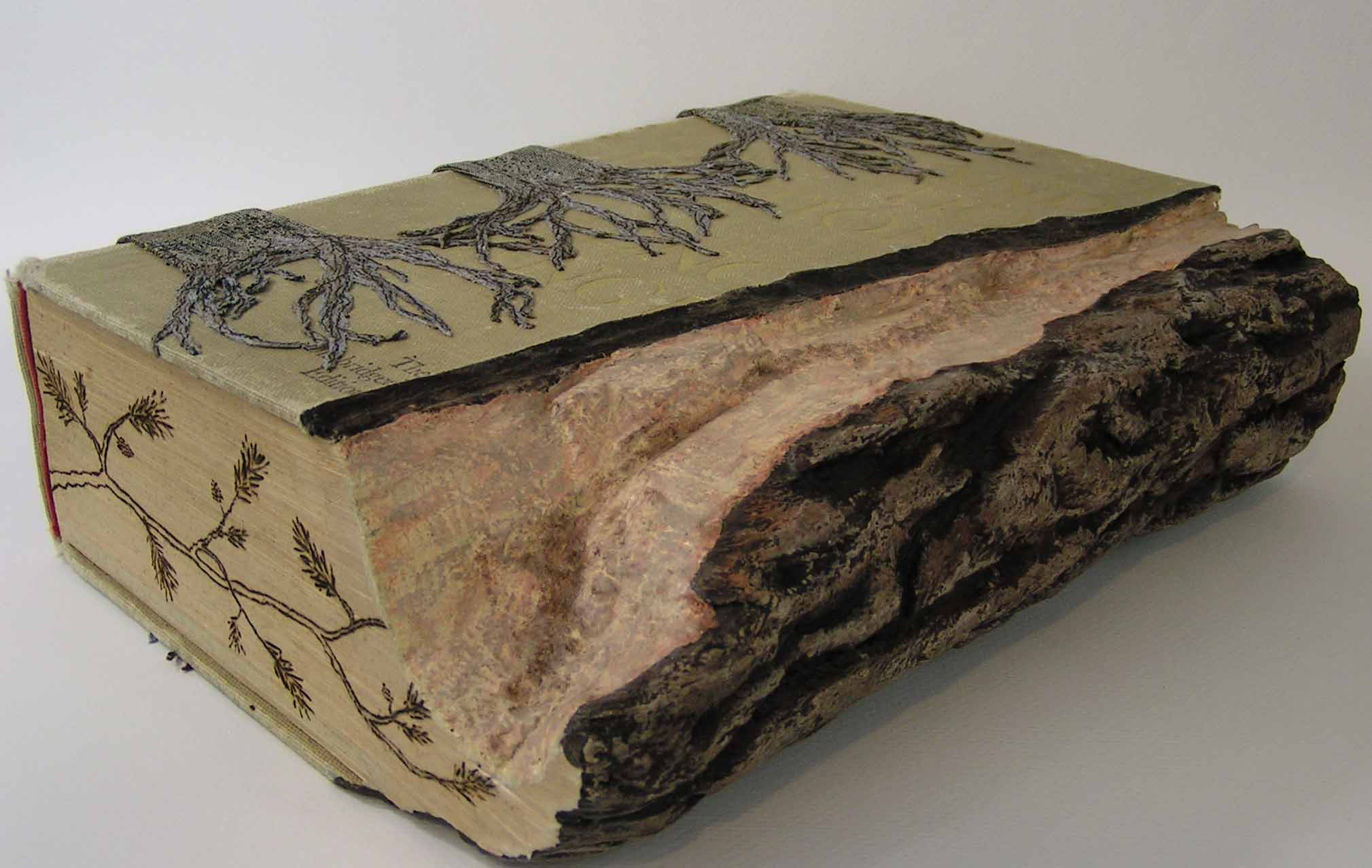
Here’s my tree trunk book. These were definitely something that I hadn’t tried before and I really enjoyed embellishing them. The carving part, not so much. So these are probably the last carved books I will create. These are some of the photos that I took a couple of weeks ago. I finally got through most of them and edited etc. Nice to have that chore done 🙂

Thanks for stopping by and enjoy the rest of your weekend.

Aspen Alpenglow

I have been doing some research online about various printmaking techniques. I want to try a reduction linocut but I didn’t have time to do that today. But I did learn about monotypes and decided to try one today. I started with an already gelli printed paper that looked vaguely landscape and cold.

I then placed the colored paper face down on a printing plate coated with open Golden paint in Alizarin Crimson Hue. I then drew on the back side of my paper to give the tree shapes. I used my finger to suggest a horizon line with dark mountains. It was actually pretty ugly when I pulled up the print. But most of the sites talked about enhancing or embellishing with further techniques over the monotype. So I decided I would try to paint the negative spaces and push some of the trees into the distance. I used blue watercolor for this and it worked great. I then added just a few more details with the water color and called it done. The camera had a hard time with the photo, it looks better in person and I’m pleased with the results. I will definitely have to try some more of these.

Birthday Cards

I spent nearly all day today photographing my artwork from my art and design course. I set up the fancy lights and the tripod for the camera. I felt like a took a gazillion photos. I will show you some of them as I get them edited. I did need to get some birthday cards made so I can show you those.

Here’s the first one. It’s a piece of screen printed paper made with deconstructed screen printing.

Here’s one with a pine cone that I stenciled on to screen printed paper. This is one of my own stencils.

The last one is some paper that I created when I was using up paint from my palette. Hopefully, everyone will like their birthday cards. My cards are never very “birthday” like but hopefully people appreciate that they are getting a one of a kind card. Have a good weekend!

Mr Turkey

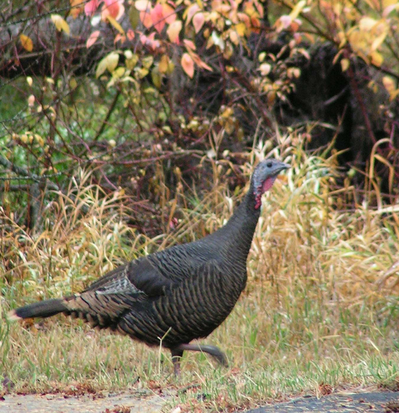
I was out taking photos of my final class project and this guy strolled by. He looked so good against the fall colors that I snapped a few photos.

And here he is from the other direction. He was making all kinds of noise, I think he had lost the rest of his family and was calling for them.

I worked on my final project for class all day today. It is nearing completion and although it was looking pretty grim in the middle of the process, I am liking it better now. It was one of those projects that I had to keep adding layer upon layer upon layer. Have a great weekend!

Texture Pieces and Another Box

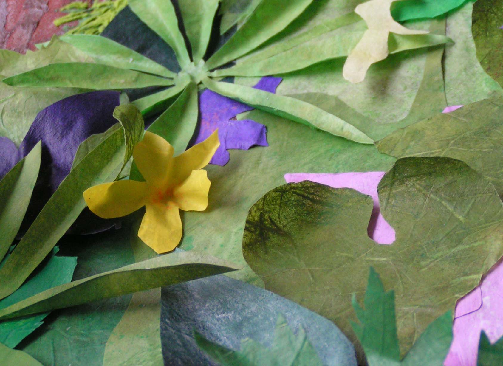
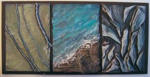
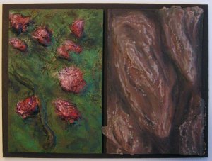
I created these textures pieces quite a while ago and I can’t remember if I showed you these or just part of them. We are now considering what pieces we will exhibit and which of these pieces go together. Part of my homework is to cut black foam core board to mount these pieces.

The photos aren’t the best because the light was going when I took these. But you get the idea. The colors on a lot of these are off. For example, the aspen leaves look like they are on black but that is really dark blue.

I finished my second box. It’s fairly simple but I wanted to highlight the yupo paper that is covered with ink. I had to find a little light to go inside. I tried a battery operated tea light but it made a round circle of light on the top of the box. So I went to the hobby store and bought a miniature “ceiling light” that is battery operated. It’s an LED light but it’s inside a white globe so the light is more diffuse.

Here’s the box in the dark. The yupo paper is green but in the dark it just glows yellow to the camera’s eye. But I think you get the idea.