I found a book in the library that seemed interesting, so I thought I would try a few techniques recommended in the book. The book is Experimental Landscapes in watercolour by Ann Blockley. I really enjoyed the book and although I have done most of the techniques in the book, I never thought of combining them in the way that she does. The methods are using a variety of materials such as thread, bits of cheesecloth, thin plastic and salt in the wet paint. They looked like a real mess when I was doing them and it took a bit to get them looking like I wanted but I was fairly well pleased with the results. It will take a bit more experimentation and practice to get really good results. I actually used thinned down acrylic paints instead of watercolors. I don’t have anything but watercolor pencils and crayons and they won’t work for this method.
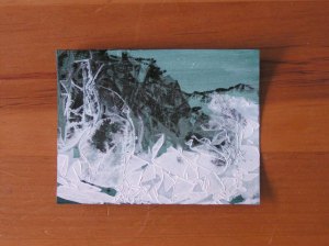
This is the first one I tried. The background had already been painted blue and then mono printed with black ink to suggest mountains and trees. This piece is small, about 4″ x 6″. I then added a very liquid wash of white acrylic paint and covered that with crinkled up thin kitchen plastic. The result is on the left. Then I looked at if for a while to figure out what I would do. I saw a tree and frozen bits of grass on the left side so I covered any white to better emphasize these aspects as needed. Then I used blue on the mountains to create some distance. I added some other blues and grays in the foreground to make it look like perhaps there are rocks under the snow. I also added a bit of green and white to the evergreens to give them a bit more definition. This process gives a much more abstract feel than direct painting.


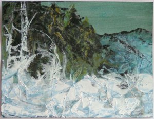
Here’s the next one that I did. I had used cheese cloth to try to replicate teasels that she had demonstrated in the book. But I used a bit too much of a wadded up piece of cheesecloth. I should have just used one layer. Now I know. But I decided I could still use sepia ink to create the teasel look. Then I added in a little definition to the floral bits that kind of look like roses. And I add more color into the background to give it a bit more interest.

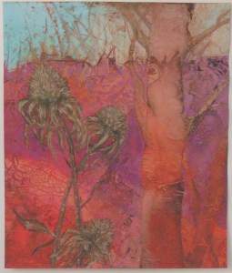
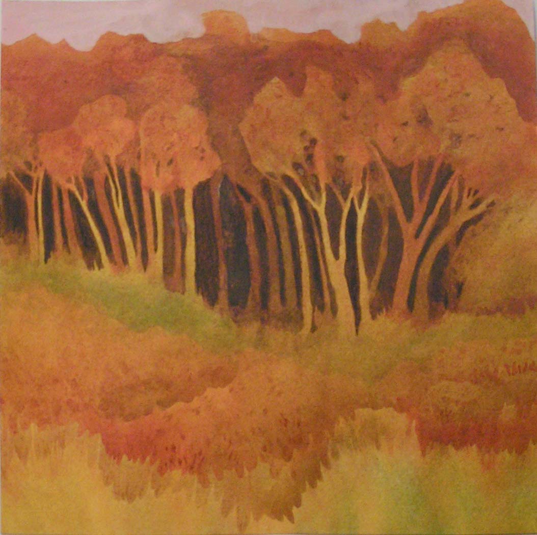
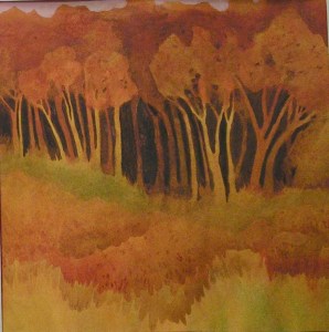
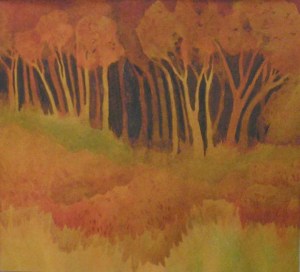
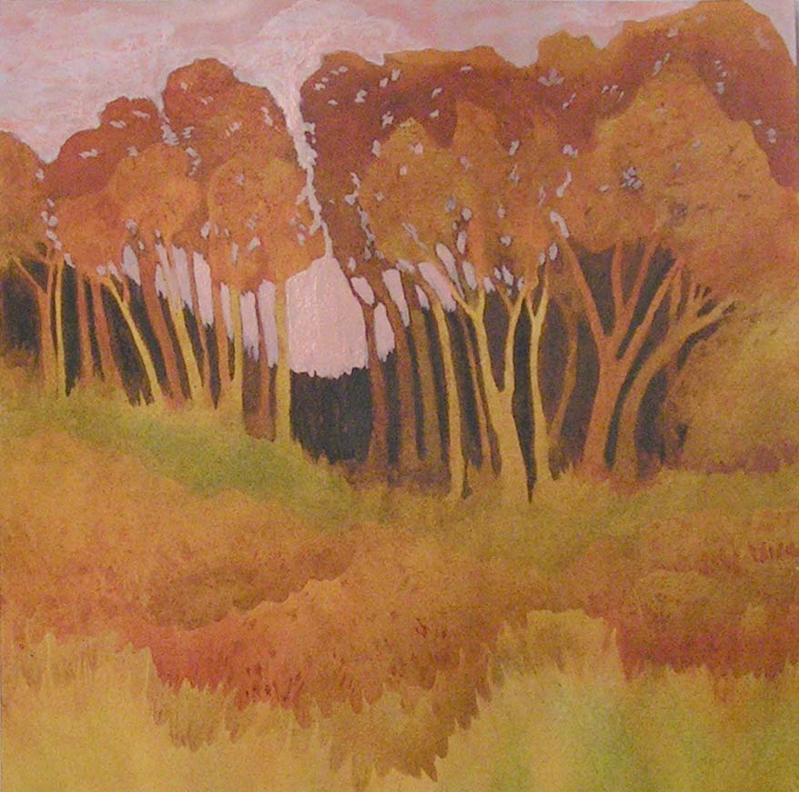
This last one I used stronger colors. For the tree shape on the right, I used a strip of sheer fabric that had some horizontal textures that I thought would make a good tree. It was laid down into the wet paint and then covered with plastic and let dry. I used a lot of thread on the left hand side for texture. On the left center bottom, if you look closely, you can see my inspiration for the focal point. It looked like a cone flower to me. I worked on the background first to try to make it look like red twig dogwoods in the late fall or early winter. I used negative painting with purple to achieve that and to bring out the tree. There were many times on this one, where I had about decided to give up. There were several very ugly stages. But I kept working on it, added the cone flowers to the foreground starting with sepia ink pens and then adding several layers of paint on top of that to give them more depth. I like the result and it definitely isn’t something I could have painted directly.
I have a couple more in the process. The hard part is finding something to inspire you to keep going because they are pretty messy after the first step. I have ordered Ann Blockley’s most recent book so that I can try more of these.