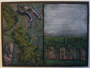
I have been doing some research online about various printmaking techniques. I want to try a reduction linocut but I didn’t have time to do that today. But I did learn about monotypes and decided to try one today. I started with an already gelli printed paper that looked vaguely landscape and cold.

I then placed the colored paper face down on a printing plate coated with open Golden paint in Alizarin Crimson Hue. I then drew on the back side of my paper to give the tree shapes. I used my finger to suggest a horizon line with dark mountains. It was actually pretty ugly when I pulled up the print. But most of the sites talked about enhancing or embellishing with further techniques over the monotype. So I decided I would try to paint the negative spaces and push some of the trees into the distance. I used blue watercolor for this and it worked great. I then added just a few more details with the water color and called it done. The camera had a hard time with the photo, it looks better in person and I’m pleased with the results. I will definitely have to try some more of these.