River Rock Painting

I had another experimental painting that I used textured gesso and then applied paint.

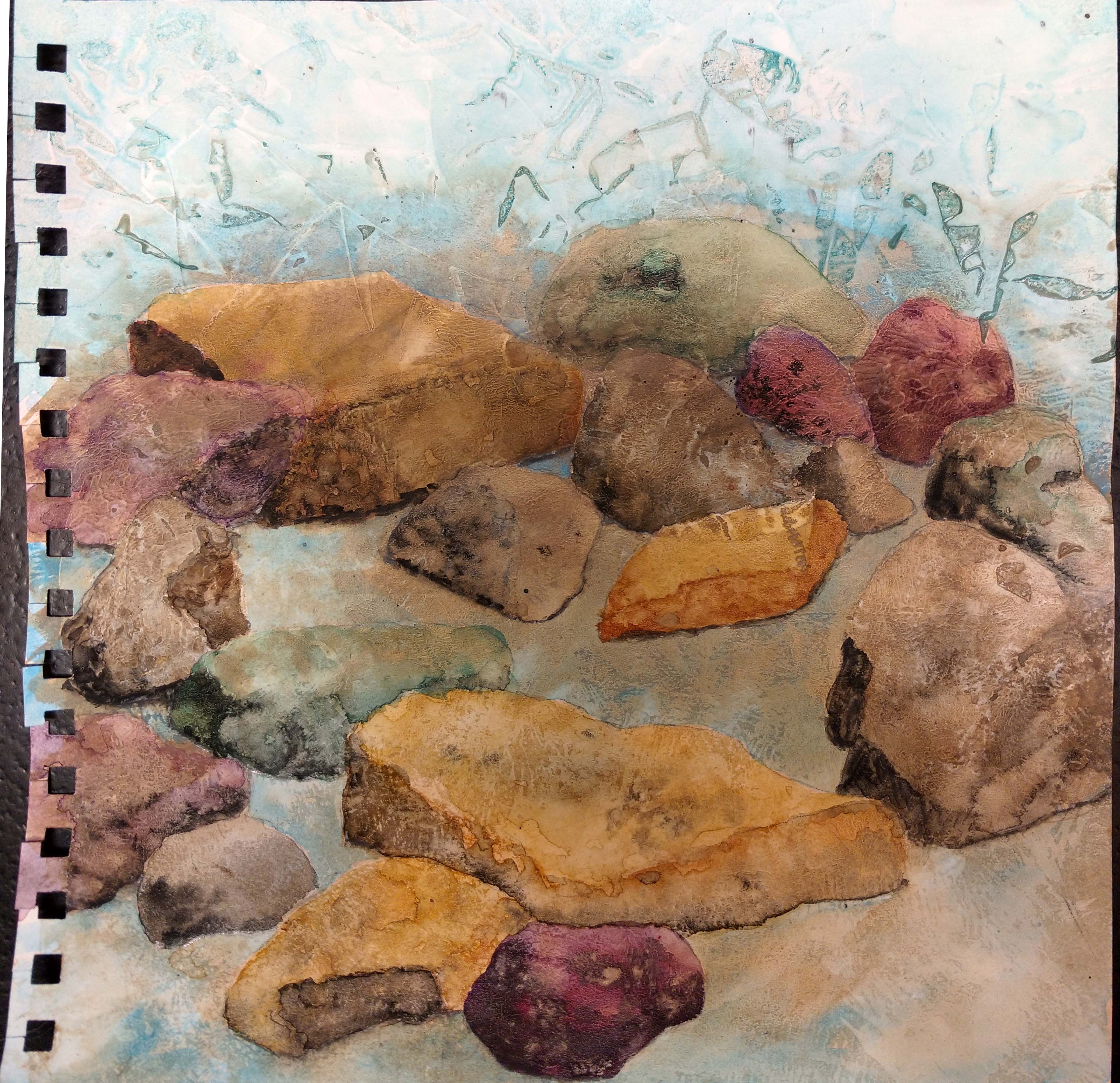
It looks pretty boring here for sure. But some of the textures looked like rocks. So I sketched in the rock shapes with pencil.

I then added water colors to create the rock shapes. So far so good. The gesso textures really helped to give the rocks some character. But now I decided I needed to add water and make it look like a river bed with water flowing over and around the rocks. Uh oh, now I would need to figure out how to paint water. I watched several Youtube videos and printed out some photos of river beds in Montana. The rock colors are similar to what we have here.

I photocopied my rocks and then worked out how I wanted the water to flow over the rocks. So far so good. But I needed some underwater rocks. These needed to look more hazy and not as defined as the surface rocks.

So here are the added underwater rocks. I just made them sort of fuzzy shapes with indistinct edges. Since this is all in water color over a base of acrylic paint, the watercolor comes right off if you get it wet. So I needed to spray it with a fixative so that I could continue to work over the top and add the water flowing. Of course, I don’t have any spray fixative. I tried to find it in four local stores and no luck. So I ordered it off of Amazon. Now I have to wait until next week to finish this piece. I guess that gives me more time to study flowing water and how to paint it!

Thanks for stopping by and have a good weekend.

Experimental Landscapes

I found a book in the library that seemed interesting, so I thought I would try a few techniques recommended in the book. The book is Experimental Landscapes in watercolour by Ann Blockley. I really enjoyed the book and although I have done most of the techniques in the book, I never thought of combining them in the way that she does. The methods are using a variety of materials such as thread, bits of cheesecloth, thin plastic and salt in the wet paint. They looked like a real mess when I was doing them and it took a bit to get them looking like I wanted but I was fairly well pleased with the results. It will take a bit more experimentation and practice to get really good results. I actually used thinned down acrylic paints instead of watercolors. I don’t have anything but watercolor pencils and crayons and they won’t work for this method.

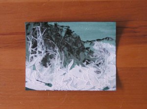
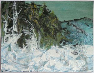
This is the first one I tried. The background had already been painted blue and then mono printed with black ink to suggest mountains and trees. This piece is small, about 4″ x 6″. I then added a very liquid wash of white acrylic paint and covered that with crinkled up thin kitchen plastic. The result is on the left. Then I looked at if for a while to figure out what I would do. I saw a tree and frozen bits of grass on the left side so I covered any white to better emphasize these aspects as needed. Then I used blue on the mountains to create some distance. I added some other blues and grays in the foreground to make it look like perhaps there are rocks under the snow. I also added a bit of green and white to the evergreens to give them a bit more definition. This process gives a much more abstract feel than direct painting.

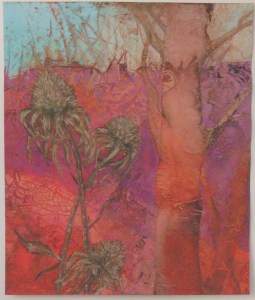
Here’s the next one that I did. I had used cheese cloth to try to replicate teasels that she had demonstrated in the book. But I used a bit too much of a wadded up piece of cheesecloth. I should have just used one layer. Now I know. But I decided I could still use sepia ink to create the teasel look. Then I added in a little definition to the floral bits that kind of look like roses. And I add more color into the background to give it a bit more interest.

This last one I used stronger colors. For the tree shape on the right, I used a strip of sheer fabric that had some horizontal textures that I thought would make a good tree. It was laid down into the wet paint and then covered with plastic and let dry. I used a lot of thread on the left hand side for texture. On the left center bottom, if you look closely, you can see my inspiration for the focal point. It looked like a cone flower to me. I worked on the background first to try to make it look like red twig dogwoods in the late fall or early winter. I used negative painting with purple to achieve that and to bring out the tree. There were many times on this one, where I had about decided to give up. There were several very ugly stages. But I kept working on it, added the cone flowers to the foreground starting with sepia ink pens and then adding several layers of paint on top of that to give them more depth. I like the result and it definitely isn’t something I could have painted directly.

I have a couple more in the process. The hard part is finding something to inspire you to keep going because they are pretty messy after the first step. I have ordered Ann Blockley’s most recent book so that I can try more of these.

Collage Party

Last week, my art group went to Paula’s house and worked on a layered collage. We used a variety of papers, thin fabrics and painted fusible. Then each layer could be printed, painted, or more layers added. Paula had all the stuff ready to go and we each created a very different collage.

This one is mine. The white “writing” was done by Paula. Her specialty, “Goddess writing”.

This one is Louise’s.

This one is Paula’s.

And here is Sally’s. Deb had to leave early so she didn’t get to make one. But we are going to make more next month too.

Isn’t it interesting how they are all so different? Hope you have a great weekend.

Reduction Linocut Complete

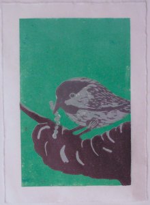
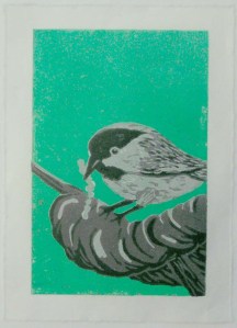
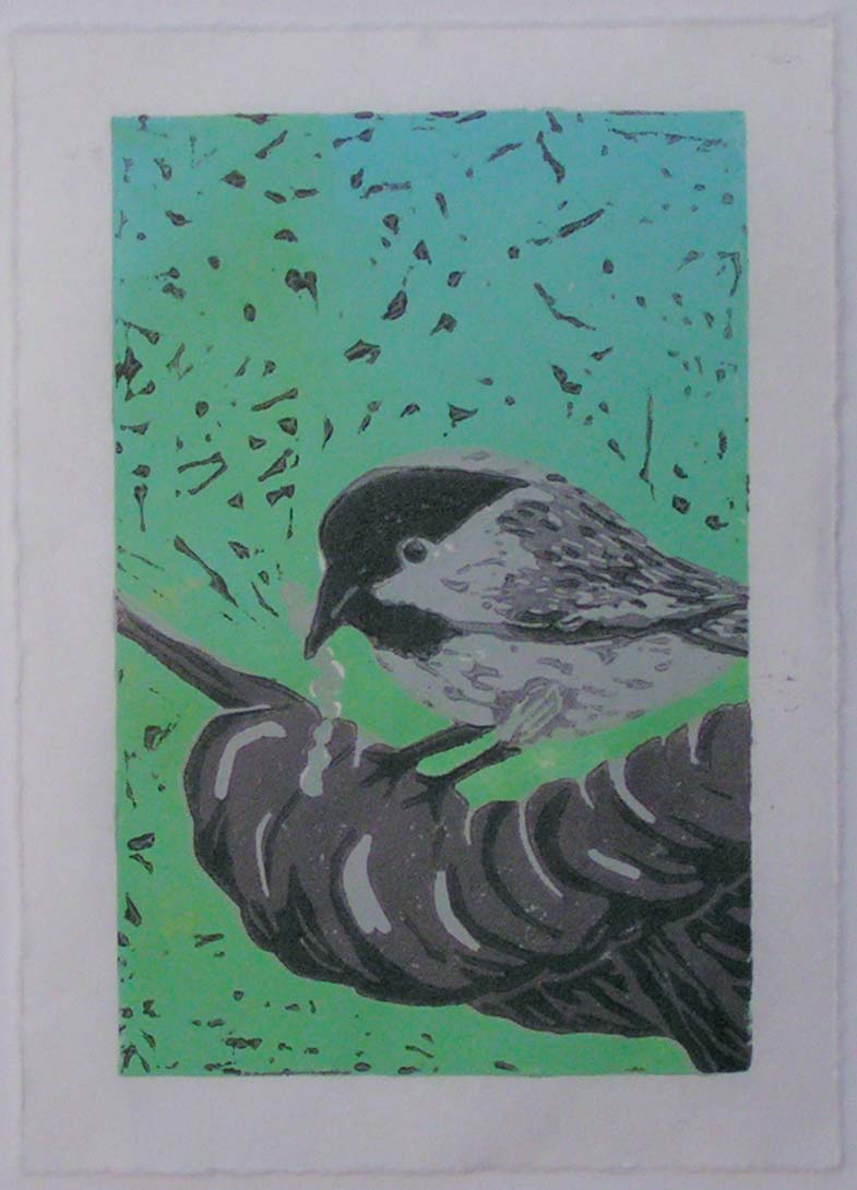
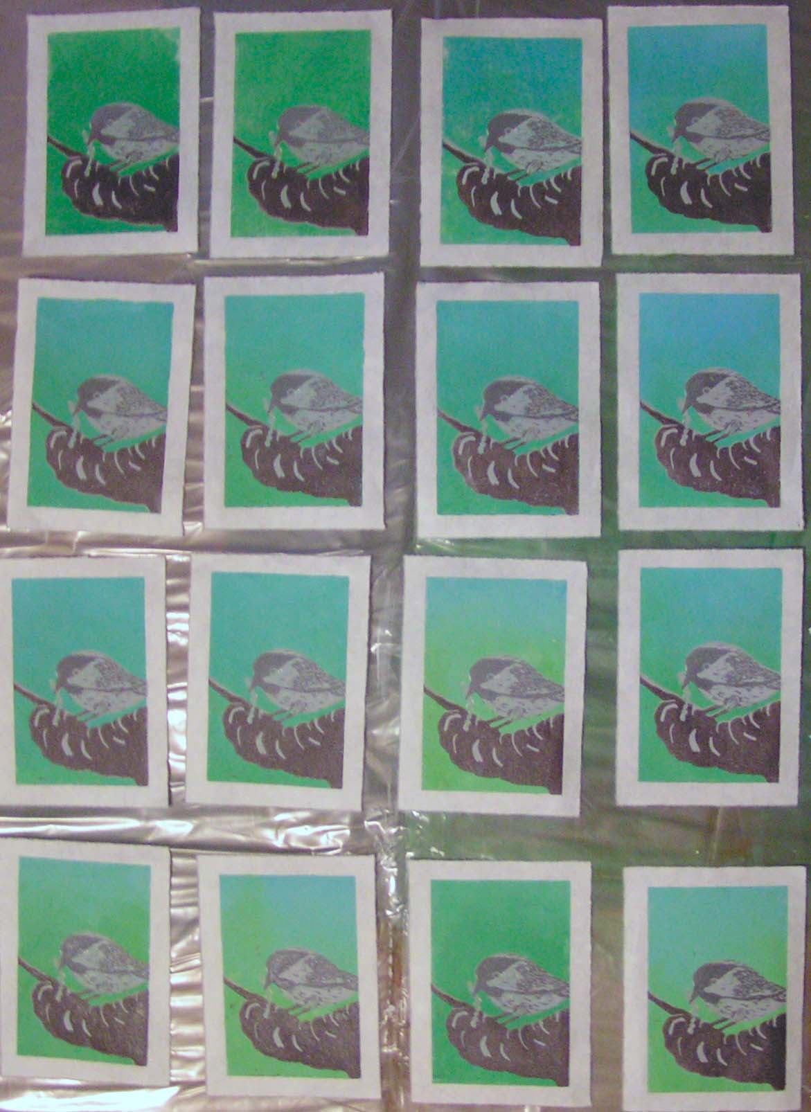
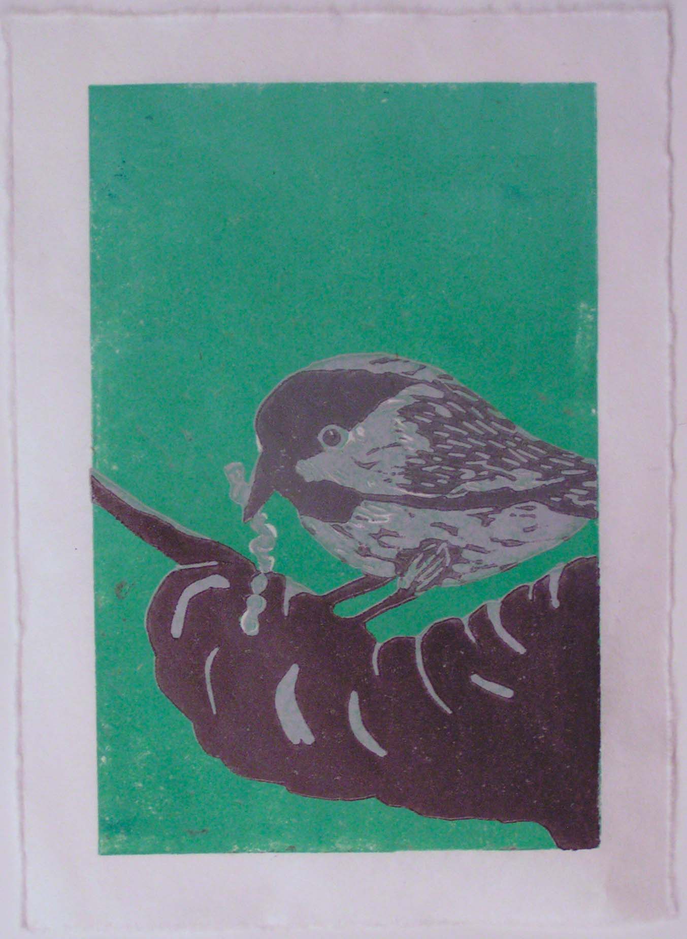
The little bird is finished! It is quite a process doing the reduction linocut method but the results are definitely worth the effort. None of my prints are perfect, I seem to be a bit messy with this printing process. And my registrations aren’t perfect but I learned a lot and will do better next time.

Here’s the progression of the print minus the first print where I printed green/blue and had little specks of white left. I had wanted the background to be a bit more of a mixture of colors but found that hard to do with the brayer.

I tried a couple of prints with allowing the black to get on to the carved out space around the bird. I don’t mind this look but wish it had looked more branch like instead of so spotty. Plus the edges around the bird and branch look a little artificial since there is no spottiness there. The colors in all these photos is not the best due to low light conditions for photos.

I’m happy with the result since I had never tried this before. It takes a bit of practice and work to get your system set up. I will try some registration pins the next time I do a linocut so I can work out that process a little better. I might work into a few of these prints to give the background a little more life. I have to wait until the ink dries to see what will work best for that.

Better Than Expected

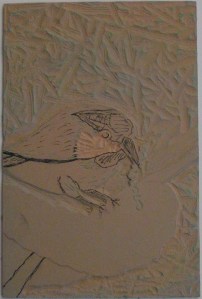
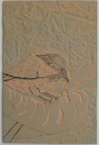
After spending hours on this reduction linocut process, I was getting a bit discouraged because I didn’t feel the prints were going to turn out. But I pressed (ha ha) on and carved out the areas in the block today that were to stay light gray. My original plan was to print dark gray and then brown, but I decided I could do that fairly easily in one pass instead of two. There will be less detail on the branch but the important part is the bird and I want to complete this project soon.

I carved out all the parts that were to stay light gray. I left some feathery bits on the bird’s body to give him more texture. His upper body is darker gray than the bottom so I left more printable linoleum there.

And I printed all 16 of my prints. Quite a few of these, the registration is off but they still look pretty good. So much better than I expected.

Here’s one where you can even see the white bits fairly well. Now all I have left to print is the black layer. So I am letting these dry and I’ll carve out everything on the lino block except the black on the bird and some shadows on the branch. I am really looking forward to seeing the end result now as my little bird definitely looks like a bird now.

Thanks for stopping by and have a great weekend!