I am continuing to work on my homework for Level 3 Art and Design. Today I worked on another collage from painted pages that I made while in class. These are the low value saturated colors. I showed you the collage with the low value chromatic grays before.
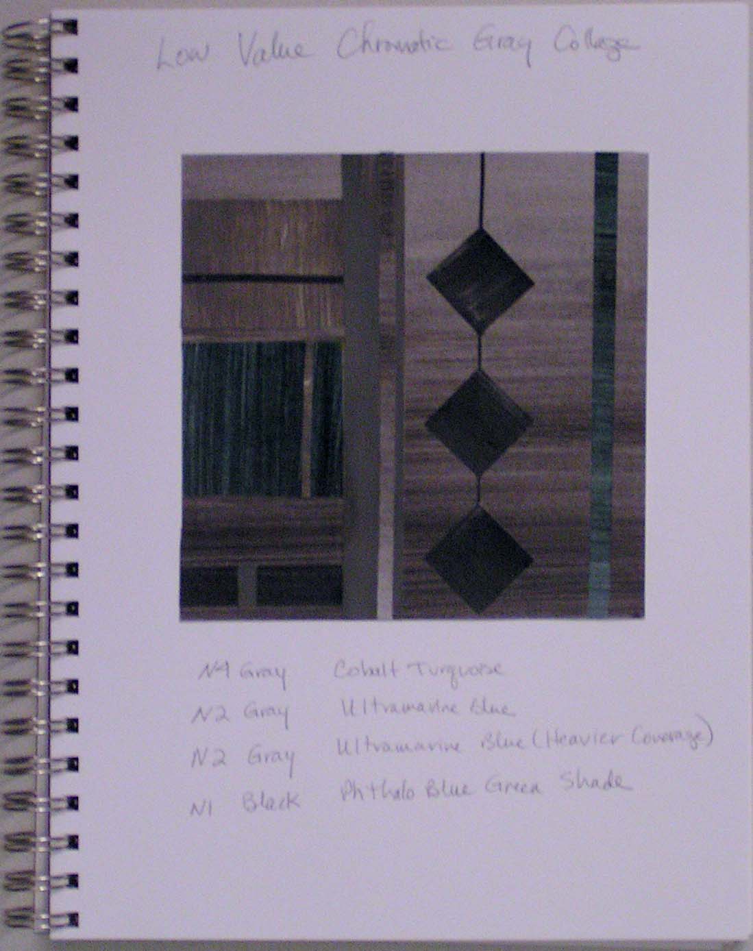
Here it is in my notebook. The colors that I used were Cobalt Turquoise, Ultramarine Blue and Phthalo Blue Green Shade combined with grays of the same value.

And here is the collage I made today with the pure colors. We are only supposed to use lines, squares and rectangles in these collages and the colors are limited. It is hard to make them look interesting. Next I have to do a collage with the saturated colors and the chromatic grays in one piece, both in the high value and the low value. That will at least give me more to work with in regards to different colors.
Have a good weekend! If you’re in the area, stop by at Whitefish Mountain Resort on Saturday afternoon for the SNOW Bus Brewfest, lots of fun, brews and all for a good cause. See you there!

I like these colors and values. And I think you did a good job of making the picture interesting with lines and shapes.
Thanks Marilyn!
Love the colours and the way you’ve used them.
Thanks Lyn!
I love it! 🙂 I’ve been painting with those colours, or more accurately those blues and yellow, but getting similar greens from overlaps.
Thanks Zed, nice to add in the yellow 🙂 It shows green here but it is more blue green, turquoise in real life.
It’s strange how different colours look in photos!
Blue is always good. 😉
Could you paint your colours on tracing paper so that you get different colours where they overlap? Then you could put some of the strips horizontally so you get a tartan effect. Or is that cheating?!
That’s cheating for this exercise but we are studying plaid this time too. So I was thinking tissue papers for the same type of idea but tracing paper or velum would work too. Thanks for the idea!