I have been gradually adding more to my sketchbook pages. Some of them I worked into with more paint, ink pens and colored pencils and others I added more paper elements.


The photo on the left shows the original stamped version. Then, on the right I added some dark elements with white highlights and some red highlights.
")

Again, the photo on the left was the original after stamping. Here it is after I added Inktense pencils, sprayed with water and then added darker elements with ink markers. Not sure if this one is finished yet. I thought it might benefit from a bit of black pen.
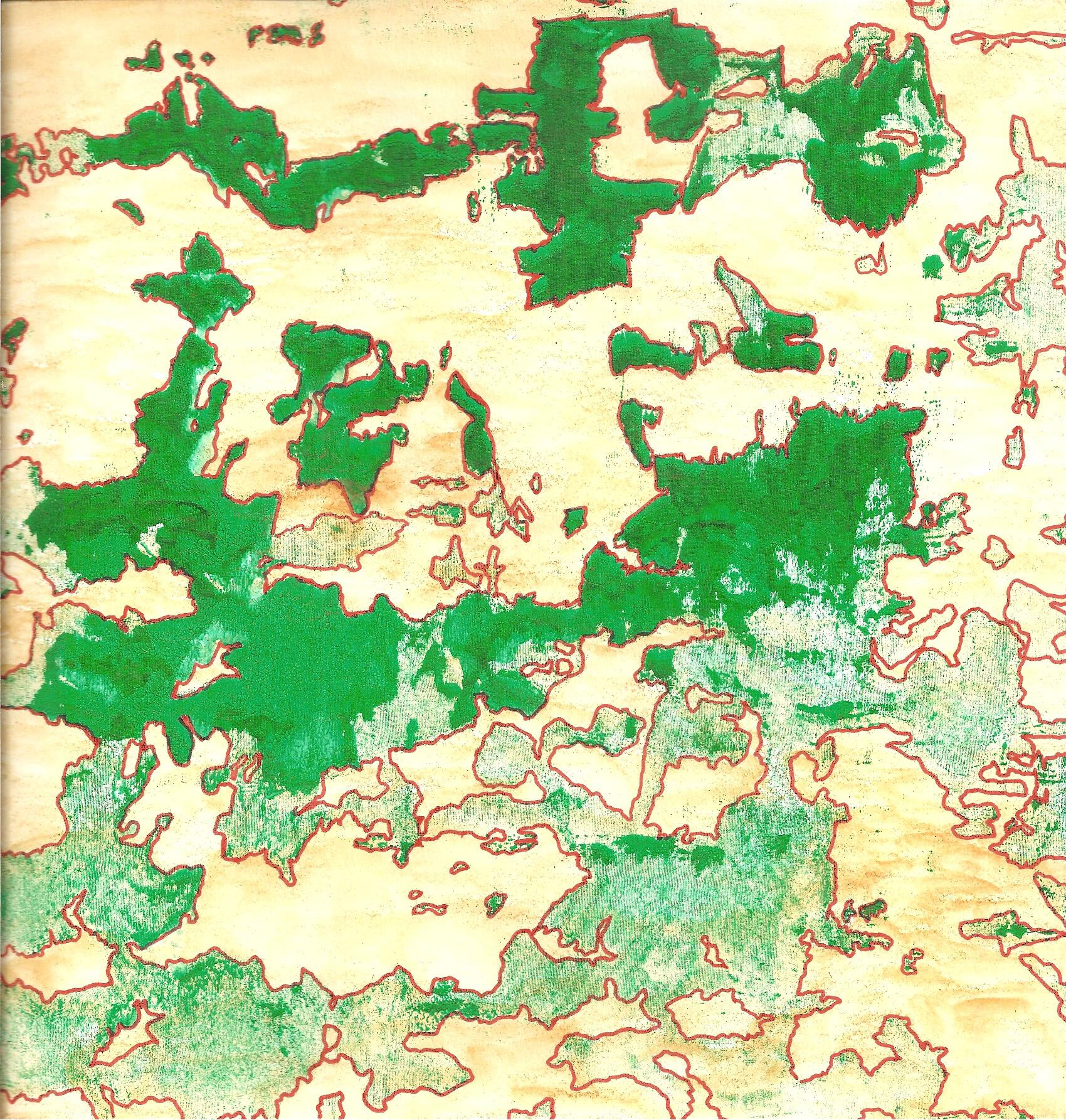
I’m not sure if I showed this one before. The green is screen printed with inks. I colored in the background and outlined with orange marker. The scanner has trouble picking up the subtleties of the screen printing process.
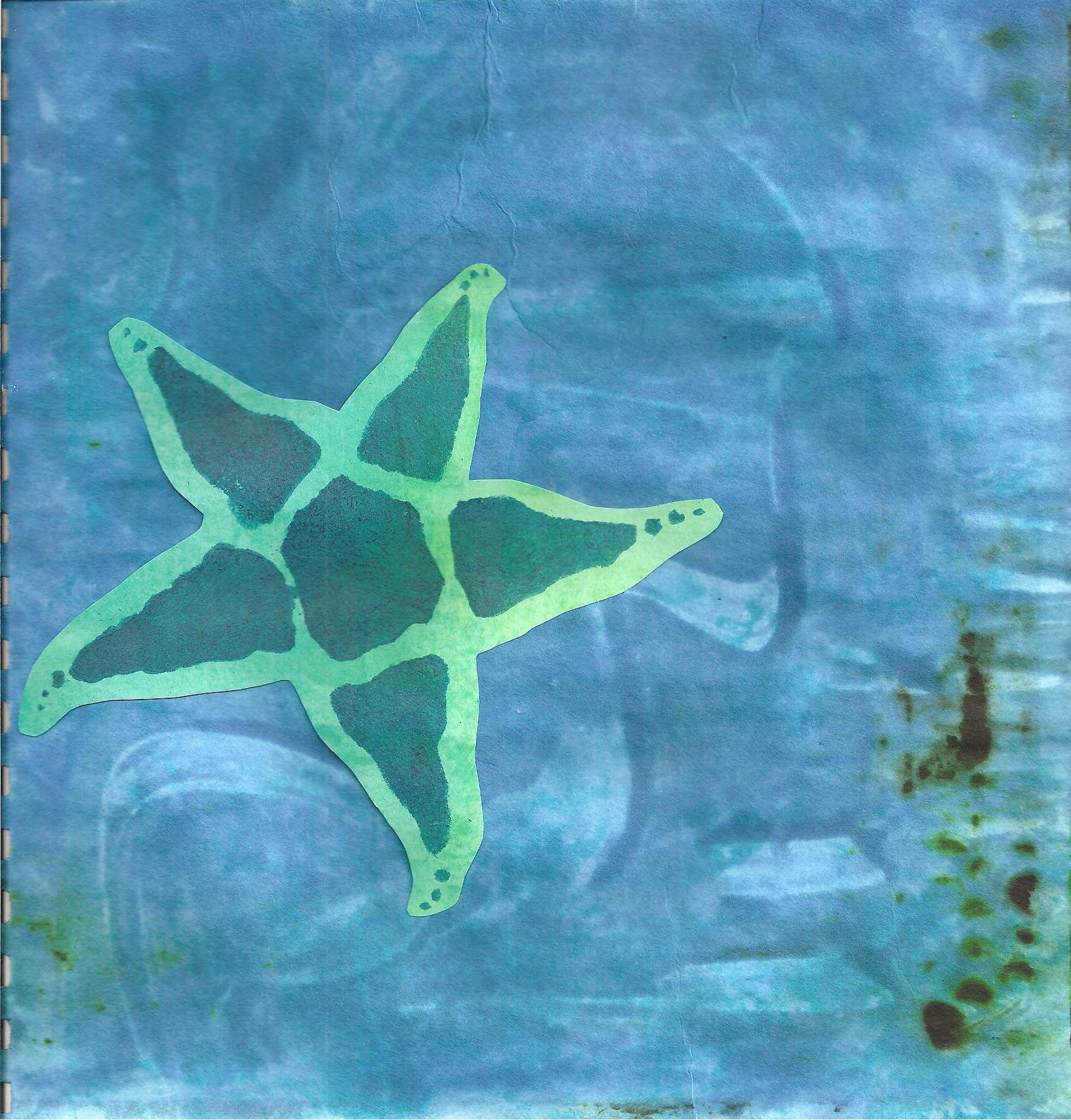
This is a star that I had stenciled on to another color of paper. I cut it out and glued it in place. I’m sure I could do more with this but I kind of like the simplicity.

This last one is circles printed on to the paper with thickened dye and then rinsed out. The darker ones on top were cut from another page that didn’t get rinsed. This might benefit from some orange highlights.
I hope you have a great weekend and thanks for stopping by!

Ruth, I’m amazed you can work on so many projects at once. It looks as if you’re making good progress on each one. I agree the red one could use a little black. They are all interesting, but I particularly like what you’re doing with the first blue one. I free the last blue could use a little Orange or perhaps gold. Have fun!
Perhaps that just means I jump around from project to project too much 🙂 No, I just squeeze a few minutes in at a time on the sketchbook stuff so it just keeps adding up as you go. Thanks!
Good for you. That takes a lot of discipline!
They look great, Ruth 🙂
We’re lucky that we have the technology to save images of our originals and any stages, and keep adding details, aren’t we?
Thanks Zed – It is wonderful to be able to record each piece so easily. And I like being able to see the stages because half the time I forget what it looked like before I made changes.
On first seeing the red and yellow page I thought it felt complete but the more I look at it the more I want to add some doodles too. I’m a bit concerned that black would be overpowering though, I would be tempted to try a dark brown…
The blue circles are gorgeous, very calming to look at and have a wonderful sense of depth to them. I could get lost in it for hours. It’s like looking at bubbles in deep water. I can see them making a lovely print for a greetings card.
Thanks Teri – I haven’t done anything with the red/yellow page yet. I like your suggestion of dark brown, thanks!
I love the blue circles too and you’re right, it is very calming.