Finished UFO

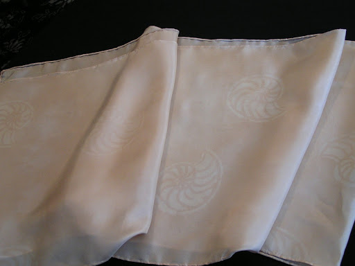
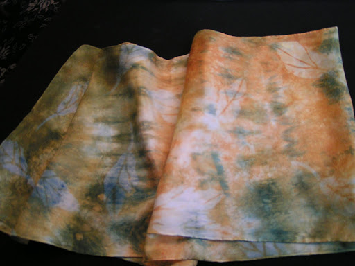
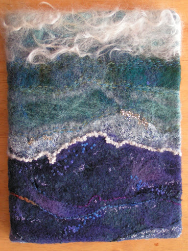
 I have had this water/sea themed piece around for over a year and it might be two. I finally got around to making it into a notebook cover. This was spurred on because I’m going to try and get some of my work on consignment in a shop in Missoula. I needed a sample notebook cover so here it is. This is the front.

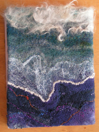
 And here’s the back. I just bought a school type notebook from Wally World. It can be easily replaced.

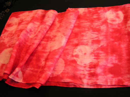
 Here’s the inside. I decided for a pop of complementary color. Plus the orange fabric had purple in it and the lining is purple.

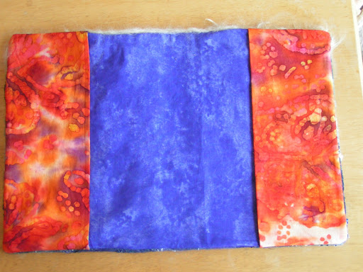
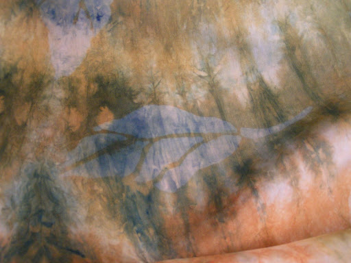
Here’s the inside of the cover without the book in place. That’s the only time you can see the purple which this photo made a bit more blue than it is in real life. I am also working on finishing up more barrettes, scarves and perhaps a felted vase. If I do get accepted, I’ll have to be very busy when I get back from my class and get pieces done to sell.

Discharging Scarves

 I am working on the next layer of complexity on my recently dyed scarves. This one was the walnut ink one so I used Jacquard Discharge paste through my ammonites stencil. It worked great.

 I took Jane Dunnewold’s advice in her most recent book and ironed the discharge paste when wet. The instructions say to let it dry. But it worked fine and took less time that way. These look like watermarks. This scarf is currently getting the flour paste treatment. Since I got quite a few questions on that technique, I am working on a tutorial on how for that. Hope to have it completed soon.

 This one I discharge some circles through a cardboard stencil that was part of some packaging.

 Here’s a close up. The red only discharges part way especially if it is really dark red.

 This one I used three different leaf stencils to discharge. Again, they look like watermarks and are pretty subtle. But that was just the effect I wanted.

Here is a close up of one of the leaves. These will be getting more layers and I have a bunch more scarves to discharge. More later!

Future Silk Screens

 I worked this week on finishing up my fossil sketches.

 This one will be for a background type of silk screen for an all over pattern effect.

 These two were a bit tedious to draw and get all the black filled in but I think they will make good silk screens.

 I then scanned the sketches into the computer as black and white photos. Then I put them into PSE (Photoshop Elements) and cleaned them up a bit. Do you think my fossil fish looks mean?

 This one I reversed the colors in Photoshop. You an do this by opening your photo, clicking on filter, then adjustments and then click invert. Worked like a charm! Any stray bits of black I painted over with the paintbrush tool using white.

 I couldn’t decide if I liked the positive or negative so I think I will make a screen both ways.

 Here’s the all over fossil pattern. I cleaned up stray bits of black with the paintbrush again on this one.

Here’s my trilobite. I really like how this turned out. I can’t wait to make the silk screens and try them out on my scarves. I ordered some PhotoEZ sheets but I won’t get time to finish these until I get back from my hand embroidery class. Our next meeting with my local surface design group we are going to make silk screens and try out a Yudu machine. I’m getting prepared for that get together. I have to print these on to transparencies and then I’ll be all set. Hope you have a good weekend and thanks for stopping by!

Mama Grizzly for Gayle

 This is the beginnings of the page I made for Gayle. Her theme is All Creatures Great and Small. I wanted to do an animal that is native to Montana so I chose the grizzly bear. I had a photo from a calendar that I used as inspiration. I thought just the face coming out of the page would give a bigger impact and give a sense of the size of grizzlies. I painted this with a combination of walnut ink and Jacquard paint.

 Then I thread sketched the bear. I used about ten different shades of brown for this. Even with two stitch and tear sheets behind the page, it still distorted quite a bit. But except for a few wrinkles here and there, I got it flattened back out again. The shape of the page makes her look a little like a cone head, don’t you think?

 Here’s a close up of the eye. I left the white part of the eye unstitched so that caused a bit of distortion.

 Here’s another close up.

And here’s the back. I hope you like it, Gayle. This is the last page I have to do for this swap. Next, after I get my last two pages, I’ll be putting the book together.

Another Watercolor and Rice Paper Collage

 Here’s another rice paper collage with watercolor similar to last Friday’s post. But this time I pasted down the rice paper first with no paint underneath. I then just added watercolor on top with my Neocolor II crayons and then added water. I really love the textures that develop with the base of rice paper. This one is much more subtle as I used less rice paper. This is based on a photo I took, can’t remember when I took it but it was probably at Glacier National Park. Another one of my favorite surfaces – bark (again, I know!).

Here’s a close up. I could keep adding more to this painting as there are so many little details when you look closely at bark. But I decided I like it the way it is so I stopped. I love the organic lines and the diagonals of the various bark pieces on the tree. I am doing a series of these surfaces in paint first as inspirations for embroideries after my hand embroidery class. What are your inspirations? Do leave a comment and let me know.