Design Focus Friday – Form

Three dimensional shape and space is the basis of architecture and most designed objects. There are added design considerations in that the object will be experienced from more than one side. In sculpture the space defined by the shape of the sculpture may be an important aspect of the total design. Other designed objects such as furniture, tools, and appliances must be conceived in relation to function and, often, the contours of the human body that will use the object. In needle felting this pin cushion, I used the familiar shape of a pumpkin but needed to make sure that it would sit flat on the table and was stable enough not to tip over every time I pull a pin out or stick one in.

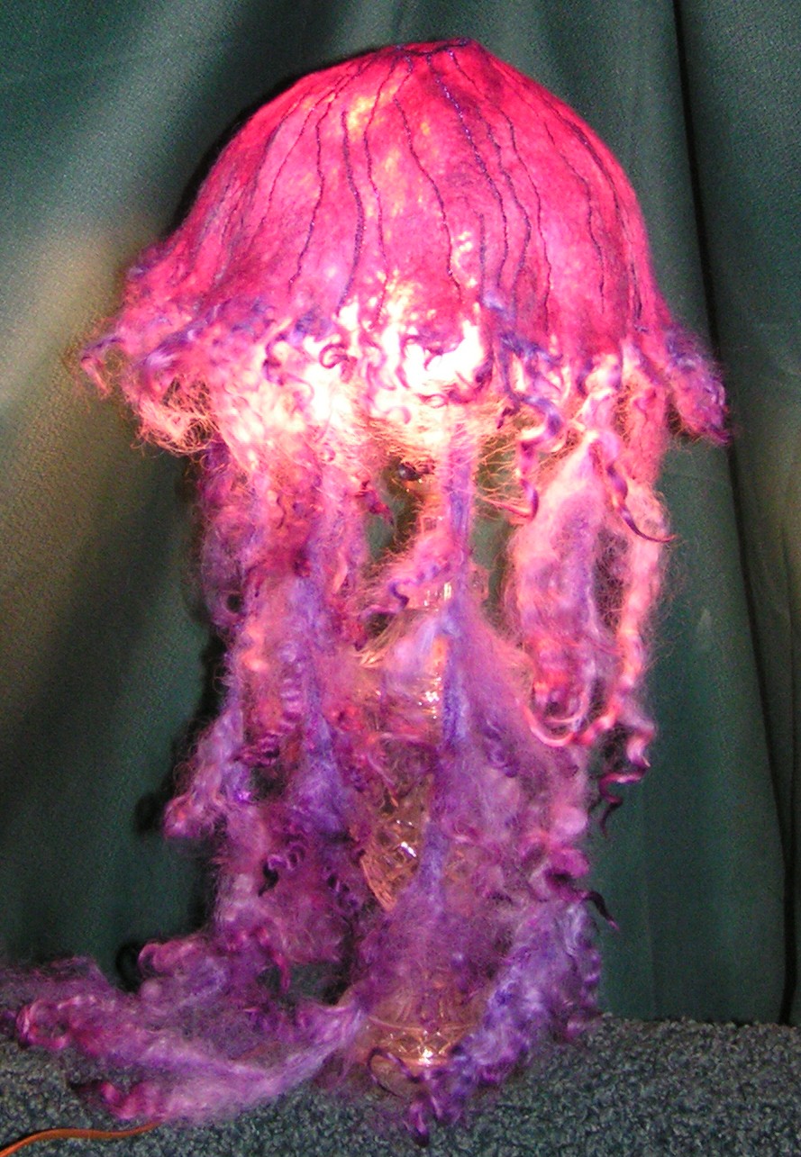
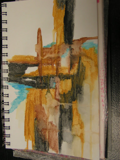
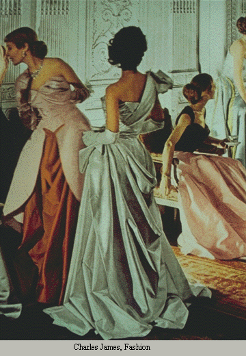
Fashion designers face special problems of engineering and spatial thinking, in that the problem is to translate a two dimensional material (cloth) into a three dimensional form (body-shaped garment), a unique and complex problem in topographical engineering. This is one of the things I want to explore in form, making a seamless felted jacket. Hopefully, I will get this started this month since we are talking about form.

Form or space in a two-dimensional drawing or painting refers to the arrangement of objects on the picture plane.  The picture plane is the surface of your drawing paper or canvas.  You can have a picture plane that is a crowded space with lots of objects or an empty space with very few objects in the picture plane.  A two-dimensional piece of art has heights and width but no depth.  The illusion of depth can be achieved by using perspective.  This is the technique used to have your picture look like it is moving to the distance like a landscape or cityscape. 
Types of Perspective


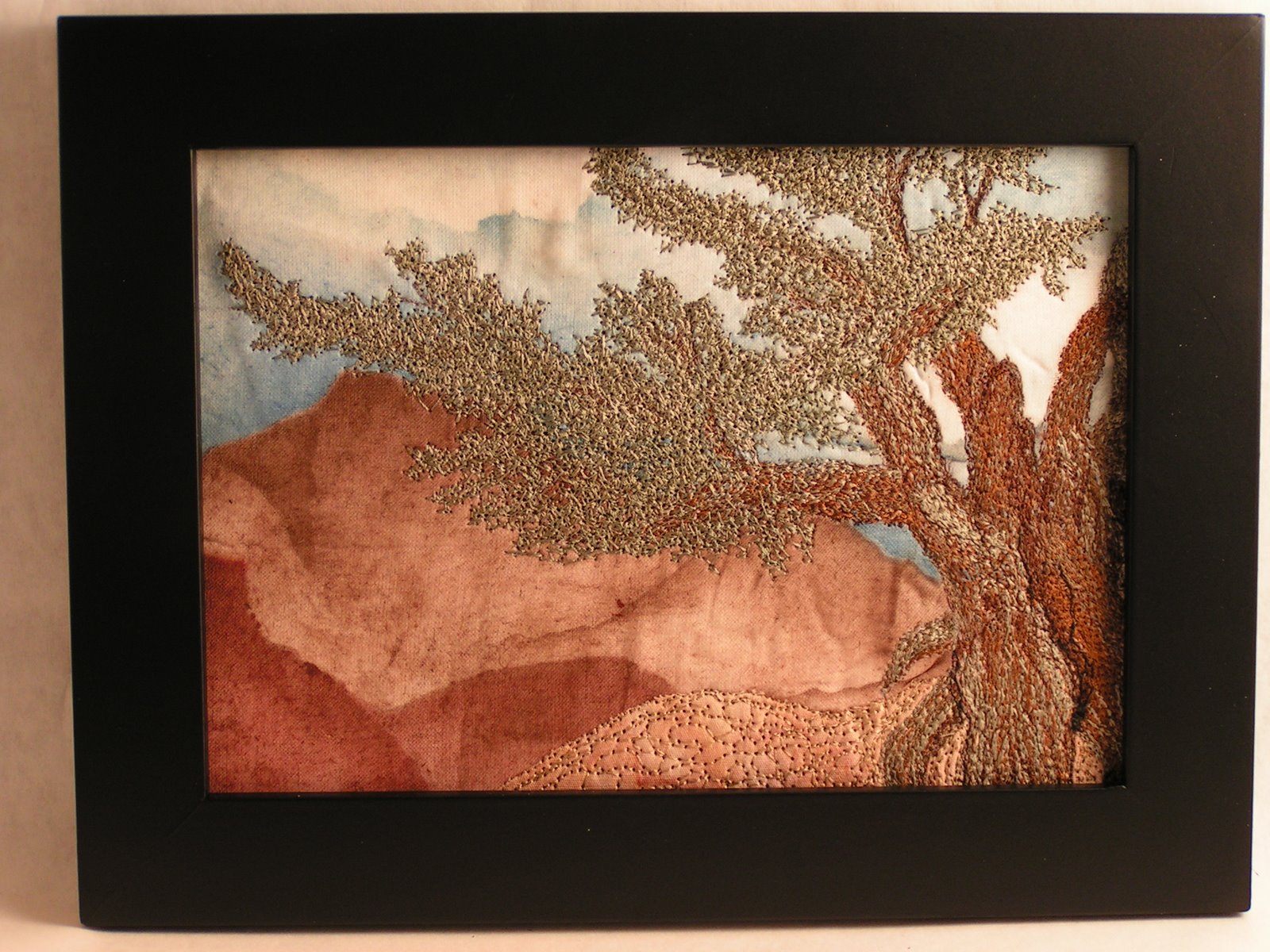
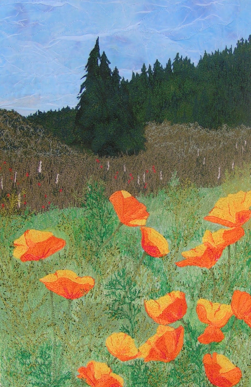
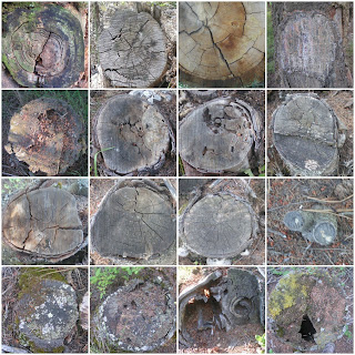
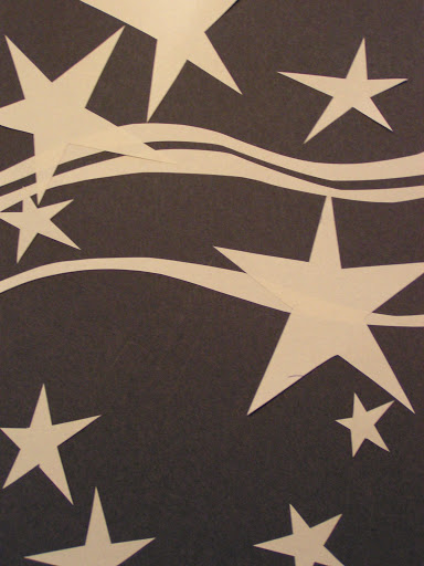
• Nonlinear Perspective is the method of showing depth that incorporates the following techniques. This is the type of perspective I usually use. I couldn’t find any photos using linear perspective.


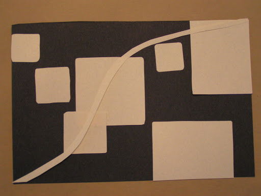
o Position-Placing an object higher on the page makes it appear farther back then objects placed lower on the page.


o Overlapping-When an object overlaps another object it appears closer to the viewer, and the object behind the object appears farther away.


o Size Variation-Smaller objects look farther away in the distance. Larger objects look closer.


o Color-Bright colors look like they are closer to you and neutral colors look like they are farther away. 


 • Linear Perspective is the method of using lines to show the illusion of depth in a picture. The following are types of linear perspective.


o One-point perspective-When lines created by the sides of tables or building look like that are pointing to the distance and they all meet at one point on the horizon this is one-point perspective. To see an example stand in the middle of the hallway and look at the horizontal lines in the brick or the corner where the ceiling meets the wall. See how they move to one point on the horizon.


o Two-point perspective-Here the lines look like they are meeting at two points on the horizon line.

Categories of Space/Form


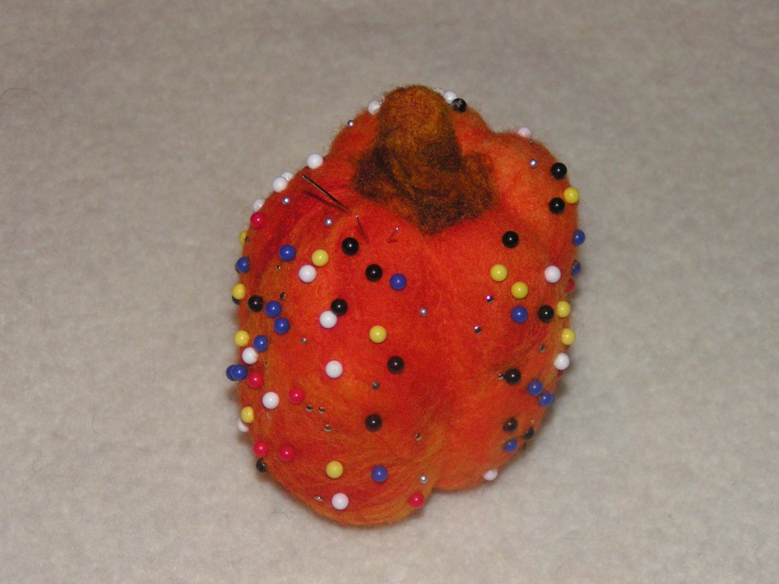
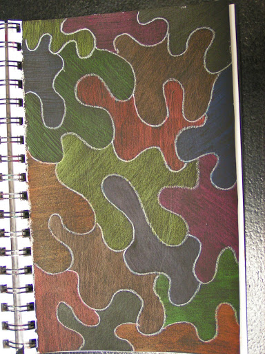
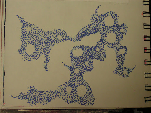
• Positive space-Like in a positive shape, it is the actual sculpture or building.


• Negative space-Also like negative shape, it is the space around the sculpture or building.


• Picture Plane is the flat surface of your drawing paper or canvas.


• Composition is the organization and placement of the elements on your picture plane.


• Focal Point is the object or area you want the viewer to look at first.


Questions to get you started:

• How can you make your 2 dimensional designs look more 3D? What are the effects of shading and shadowing on an object or shape?

• How can you use value changes to imply form?

• What steps do you need to take to make a 3D object using fabric/fiber? What can you use to make your form sturdy enough to support itself? What will your pattern look like?

• What would the effects be if you chose to do the opposite of nonlinear perspective guidelines above? Would your piece be more realistic or less?

So have fun with form! Let me know if you are using any of these concepts in your work. I’d love to see what you are doing.

Design Focus Friday – The Last Shape

 Actually, I’m sure this isn’t the last shape you’ll see on Design Focus Friday but it is the last time we’re going to focus on shape. I’ve been playing with my new art supplies from Santa and thinking about shape. These are just doodled shapes that I colored in with Inktense pencils. I started this page with a coat of black gesso. I can’t decide if I should now add water to the ink or leave it as is. What do you think?

 Then I was thinking about how to draw a shape without using line. So I used dots. I was concentrating on the shape the blue dots were making but now all I can see are the white negative shapes.

 This page started out about line but then when I added the color, it turned into shapes.

This is the start of a page where I am following ideas from the book Watercolor and Collage Workshop by Gerald Brommer. This is the first step of adding watercolor (I used my new water soluble crayons). Next I am supposed to collage different kinds of rice paper over the watercolor and then add more watercolor and line as needed. I liked the shapes that I got with this method.

Next up is form, we’ll be exploring three dimensional objects as well as how to give two dimensional work the illusion of depth. Hope to hear from you soon about how you’ve been using the different design elements in your work.

Design Focus Friday – Shape – The Circle


Shapes are all around you and you can find thousands of ideas from almost anything. The circle is a simple shape found in nature. These are some of my favorite tree stump photos that I’ve taken over the last several years. I love the shape but also the line that draws your eye inside the shape.
And then there are circles everywhere you look. So get out your camera and pick a shape. What will you look for today? Circles? Squares? Triangles? Or maybe something a little tougher like a star.
Once you’ve found some photos for inspiration, what next? Perhaps you want to do a little research on the symbolic meaning of the shape you picked. The circle is an ancient symbol used throughout humanity. Because the circle is seen in the sun, the moon and even the earth, the circle represents wholeness, unity and infinity. It has represented a spiritualized Mother Earth and feminine power. Perhaps you can now take some of these ideas and begin thinking of ways to add circles to your work (or whatever shape you picked). Or perhaps you’ll want to research a few symbols first that relate to a topic that draws you. Then you can use that shape of the symbol and look for that shape in your world.
Let me know some of the shapes that you are drawn to. What inspires you about certain shapes? Do they show up in your work often? Can you find different shapes that inspire you now that you are looking for them?

Design Focus Friday – Shape Continued

 One way you can use shape is making stamps. You can combine small shapes together as I did with the stamp on the left or a bigger shape. You could use geometric or organic shapes. Guess which ones I usually do?

 You can also use shapes to make stencils. The most important thing to remember with stencils is to make sure you have bridges so your center part of your stencil won’t fall apart once you’ve cut it out. This one hasn’t been cut out yet. I am planning on trying to use a heat tool to cut it out.

 Here’s the sketch where I figured out how the stencil would work. I drew the big shape of the pine cone first and then drew the smaller pine cone bits (what are those called?). My friend thought it was a pineapple.

 Here are the stamps in my studio journal. I seem to have lost my ginkgo leaf stamp somewhere in my studio. I’m sure it’s there somewhere…

The fun thing with the foam stamps is you can add details within your large shape. Have you been thinking about shape and how you use it in your work? Let me know!

Design Focus Friday – Shape

 When our local group got together last week.  We played around with shapes. Each of us cut out various shapes and then considering positive and negative shapes, we made a design. We all chose to use black as the background but could have done either. This is one of the designs I was playing around with. I feel it needs some line, what do you think?

 Here is another one that I did. I added some line to this one. I really like this better in the vertical orientation with the small squares at the bottom.

 Here is Louise’s design. I liked her wonky stars – she said that she got the ideas of the lines from my design. They certainly added a good focal point to her design as it was lacking a focus with just the stars.

 This one is Bunny’s. We decided it looked too much like a snowman on skis.

This is also Bunny’s. And we also liked this one in a vertical orientation.

This is a simple exercise to try out. We used only black and white paper so that color didn’t get in the way of designing with shape. You could also try this with fabric. What have you been doing with shape this week? Leave a comment and let me know.