Wooly Goodness

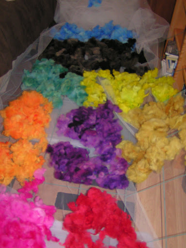
 Finally, something that I’ve been working on that I can show you. I dyed wool all day Thursday. This is from a merino fleece that I got locally. I washed it last weekend.

 Then today, I spent all day carding. I have borrowed a drum carder from my friend Bunny and boy is it fun. It makes beautiful batts and you can mix all kinds of fiber together. I want one of my own now.

This is the same batts without the gray and black ones. It just looks so colorful. Hope you all are having a great day and have a wonderful weekend.

Design Focus Friday – Balance

Balance is the visual distribution of weight in your composition. A sense of balance is innate in humans; lack of balance disturbs us and we feel more comfortable with a balanced pattern.

Pictorial balance usually refers to horizontal balance, the right and left sides of the image. Vertical balance is also a consideration with a horizontal mid line dividing top and bottom. Due to our sense of gravity, we are accustomed to seeing more weight toward the bottom, giving us a sense of stability and calm. The farther up in the format the weight is distributed, the more unstable and dynamic it seems.

Types of balance:

• Symmetrical – shapes are repeated in the same positions on either side of a vertical axis; this type of balance seems more formal.

• Asymmetrical – achieved with dissimilar objects that have equal visual weight or equal eye attraction; this is informal balance and appears casual and less planned.

• Radial – all elements radiate or circle out from a common central point; this type of balance is common in the natural world.

• Crystallographic – an equal emphasis over the whole format with an all over pattern; the constant repetition of the same quality everywhere on the surface.


 Ways to achieve asymmetrical balance:

• Value difference – black against white gives a stronger contrast than gray against white, therefore a smaller amount of black is needed to visually balance a larger amount of gray. Balance by value or color is a great tool, allowing a great difference of shapes on either side of the center axis and still achieving equal eye attraction.

• Shape and Texture – Differences in shape when value and color are the same, can achieve balance. A small irregular shape can balance a large even shape. Texture can achieve the same effect. A small textured shape can balance a larger plain shape.

• Position and Eye Direction – a large item placed closer to the center can be balanced by a smaller item placed out toward the edge. This effect appears casual and unplanned. Eye direction can assist in balancing a composition and should be carefully planned.

• These techniques are rarely used in isolation and many times all are used in a composition to achieve balance.

Questions to get you started:
What type of balance do you usually use in your compositions? Try one of the other types of balance and see how that affects your design style. Can you use all types of balance listed above and work in a theme? How does the type of balance used affect what you are trying to say in your theme?

Using your geometrical shapes, can you make a piece balanced by just using value differences alone? Shape and texture? Position and eye direction?

Sorry I missed posting last week. Things just seemed to get away from me. Been busy, busy, busy with my project. Hopefully, I’ll be able to announce soon what I’ve been doing! Thanks for stopping by.
Design Focus Friday – Harmony and Unity

Using continuation of an element to create harmony and unity in a piece many times uses line as that element. Drawing a line through various elements on a page as shown here in cut paper helps to unify the elements and draw the eye from place to place in the design.

 Some styles tend to use continuity as part of the style itself. Art Nouveau and Celtic designs have flowing, curving lines that tend to curve back on themselves. This gives a sense of harmony in the overall design.

One way to use line in a piece to create harmony and unity is through quilting or free machine stitching over the entire piece. Many times, this draws diverse elements together and puts the finishing touch to unify the piece.

Hand Stitch Course

 Finally, a post that isn’t about design! I got my notebook back from Gail Harker after it was graded for the Level One Hand Stitch course. She made some very nice comments and seemed pleased with my work. I know there were several pieces that I didn’t show you because I forgot to take photos before I sent the notebook off. The piece above is my fly stitch sample. Not my usual color selection but I like how it turned out.

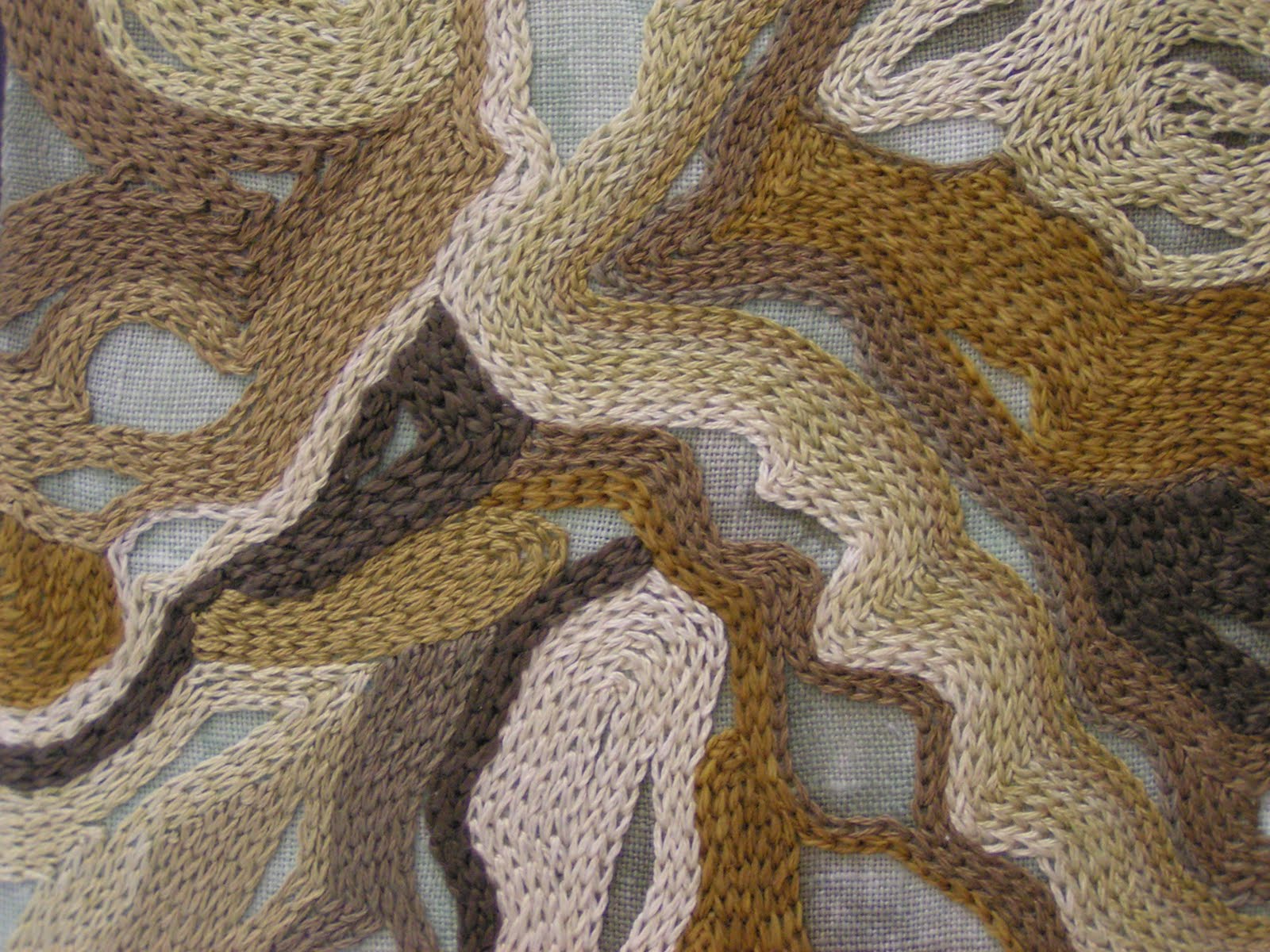
 This is chain stitch used as a filler. This one took a while. I followed the lines of the dyed material to achieve an organic design.

Here’s a little closer view. I used mostly hand dyed threads but some were ones I purchased. It is hard to find a good gradation of colors in this subdued color palette. I enjoyed this class and I hope that I can take level 2 hand and machine embroidery the next time it’s available.

Design Focus Friday – Harmony and Unity

 Using repetition to create harmony and unity is often seen in traditional quilt patterns. Shapes are repeated and colors are repeated to give a pleasing unity to the quilt. I don’t make many quilts and the piece above is made from selvages that are repeated. Often the quilting is repeated over the quilt’s surface and that may create a unifying factor.

 Any of the design elements that I have discussed before can be repeated. This is a simple pattern of repeating lines based on frost. Think about how to use the different elements in your composition and how you can repeat them to create harmony. Should you use repetition of line, shape, color?

And the shapes or lines that are repeated do not have to be the same. Similar shapes and lines that are related still give repetition and a feeling of unity without being too boring. Do you use repetition in your work? Let me know and leave a comment.