Design Focus Friday – Rhythm

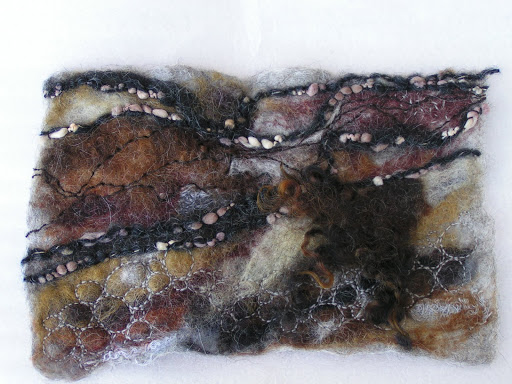
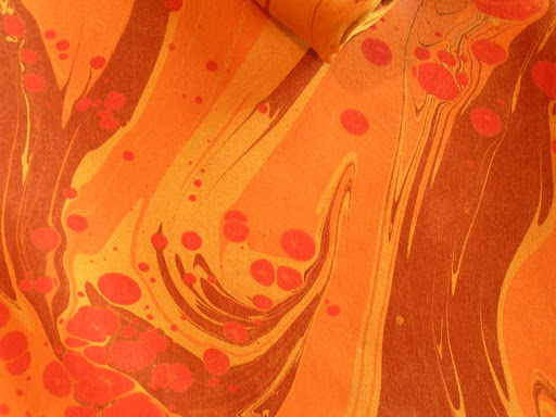
 Do you listen to music while you create? Does that change the rhythm in your work. The marbling above has a nice flowing rhythm with a little excitement added in with the red dots.
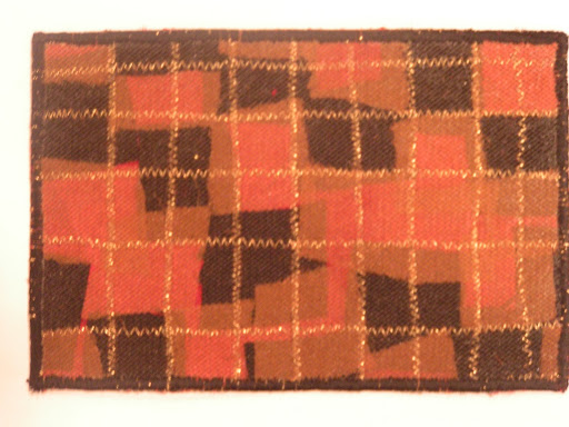
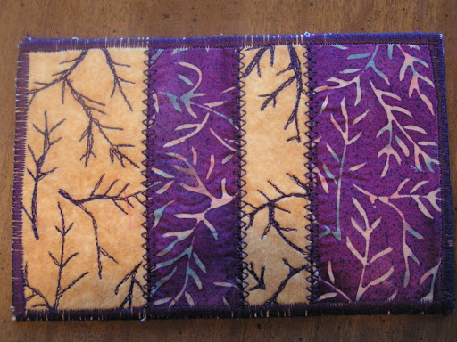
 This postcard is repetitious and has more of a staccato type of rhythm as the eye jumps around more.

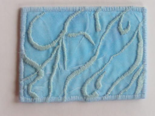
And this is also very repetitive but flows better as your eye has a tendency to move up or downward.
This is probably the last of the Design Focus Friday posts. It has been a year since I started this journey and I feel it has really helped me with thinking about design a bit before jumping right into a piece. I hope you have enjoyed the series of posts and thanks for stopping by.
In another note, my big project is almost complete. I just have a bit of mopping up to do and then it will be off to the publisher. Yes – I wrote a book about felting. I will soon have a bit more information for you. I’m very excited that it is finished and there will be more details to follow. So I will be around the blogs more, leaving comments and showing you some actual new work in the near future. WooHoo!
Design Focus Friday – Rhythm

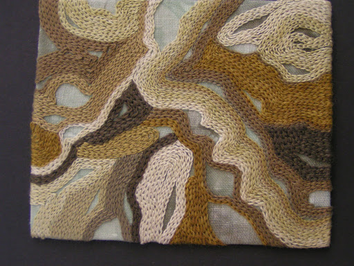
 The use of chain stitch as a filler in this piece gives a very flowing rhythm to the end result.

 The use of dots could seem more disjointed in rhythm but because they are spaced close together, the eye sees the entire shape instead of just the dots. So it ends up being more sinuous than spotty.

The rhythmic repetition of squares by themselves creates a choppier rhythm than the two pieces above.

How do you use elements in your work to create rhythm? Leave a comment and a link so we can all take a look! Thanks for stopping by and I will soon be back to normal operations as my big project is almost complete. WooHoo!!

Design Focus Friday – Rhythm


Rhythm in art refers to the movement of the viewer’s eye, a movement across recurrent motifs providing the repetition inherent in the idea of rhythm. It is based on repetition and involves a clear repetition of elements that are the same or slightly modified. Most often we think of rhythm in the context of shapes and their arrangement.


Flowing horizontal curves give a feeling of relaxation and calm or connecting and slowing. The rhythmic pattern chosen will quickly establish an emotional response to a piece. If the shapes are rigidly defined with sudden and startling value changes, you will achieve a feeling of abruptness and dynamic contrast. If the rhythm is consistent or regular throughout the composition, the mood will also be consistent. However, if the rhythm is in an irregular pattern, it may be unsettling to the eye.
Alternating rhythm consists of successive patterns in which the same elements reappear in a regular order. This is seen many times in the natural world. Alternating rhythms and rhythmic variety can relieve predictability in a design.


Progressive rhythm gives a feeling of a sequential pattern and is achieved with a progressive variation of the size of a shape. This is seen in perspective changes when we look at buildings from an angle. The perspective changes the horizontals and verticals in to a converging pattern that creates a regular sequence of shapes gradually diminishing in size.

Questions to get you started:

Rhythm is usually associated with music. Can you make a composition that is based on your favorite piece of music? How does the repetition of the shapes you are using remind you of the music? How can you use the various elements i.e. line, shape, color, value, texture to form the rhythm and feeling of the music?

Can you use rhythmic repetitions in your work to show movement? How can you depict sequential patterns? Or alternating rhythms?

Design Focus Friday – Proportion and Scale

 As I was thinking about proportion and scale, I started thinking about three dimensional work and the importance of getting the scale correct in a sculptural piece. One of the hardest things when I first started needle felting was getting the scale correct in a figure.

 This is from the class that I took over a year ago and you can see that the proportions of a figure make a difference on the outcome. What size is the head as compared to the body? Are both arms or legs the same size. It is fairly easy for us to see if something is out of proportion because we compare it in our minds to the human figure.

Even if you don’t do three dimensional work, you can still compare what you are representing in your work to the human scale. If there is a very large person in the foreground and the landscape in the distance is small, then the scale of the human figure will indicate how far distant the landscape is in comparison.

Thanks for stopping by. Come back in September when I start discussing Rhythm. September will be the last month in the Design Focus Friday series. I can’t believe it’s been a year since I started Design Focus Fridays.  I hope you’ve enjoyed the discussions and learned a bit about design.

Design Focus Friday – Scale and Proportion

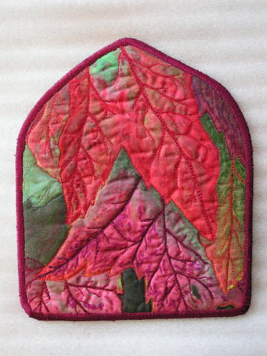
Whoops! It isn’t Friday, I seem to have missed that but here’s a short post about scale and proportion. Both of the pieces that I show here are based on leaves. The one above has a different scale than the one below. What do you think the difference in scale in the two pieces makes?

Both pieces have multiple leaves, but the top piece is completely covered with “large” leaves in comparison to the size of the work. This second piece to me is more about the placement of the leaves and is entitled “Balance”. Do you use different proportions in your work? I’d love to hear about it.