I saw this on another blog and just couldn’t resist. Sounds just like me!
I saw this on another blog and just couldn’t resist. Sounds just like me!
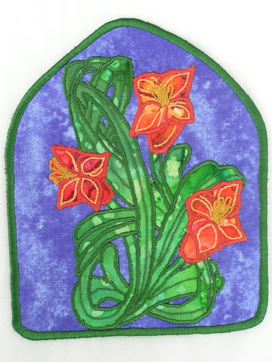
Here’s the page I made for Cobi for September. Her theme is Art Nouveau. I probably wouldn’t have chosen this theme so it was fun trying something different. This is done with commercial batiks, machine applique and hand stitching.
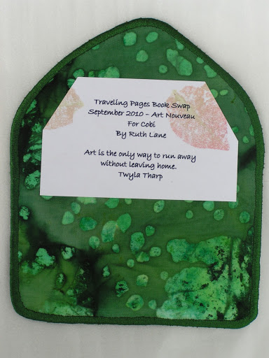
Here’s the back.
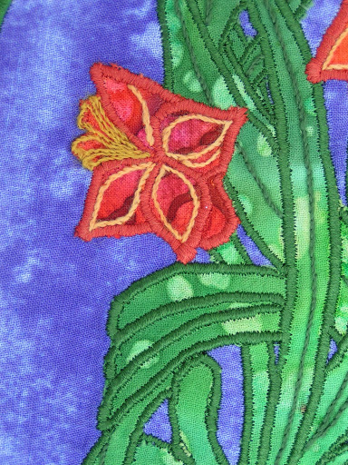
And here’s a close up. I’ve got my design worked out for my next page. It is for Elizabeth and her theme is windows. I’m not sure if I have the fabrics I want so I may have to go out and buy some fabric. I have to go search through my scraps first though. Hopefully, I’ll find something I can use.
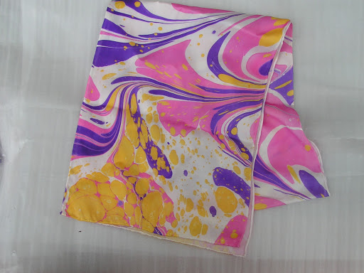
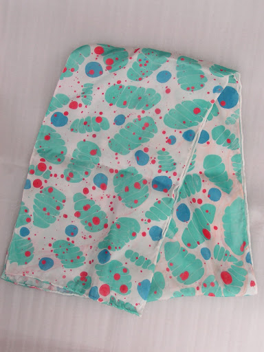
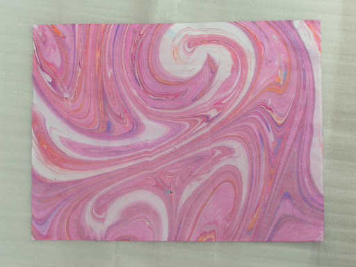
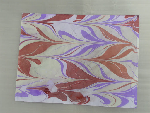
Here is the last one that I did. I didn’t marble this one at all.
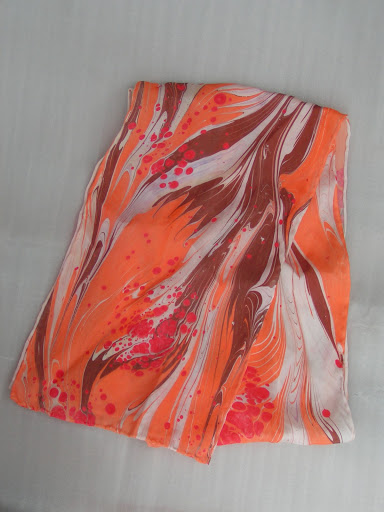
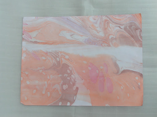
I like how this one turned out but I don’t really like the white in the pattern and the backs are white since it is paint and not dye. So I will probably over dye all of these. I will show you the results of over dying whenever I manage to get that done. I do need to dye soon because I have some wool that needs dyeing.
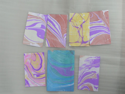
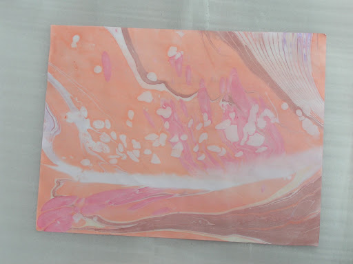
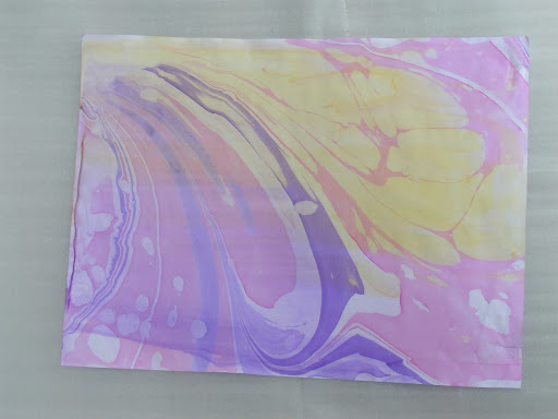
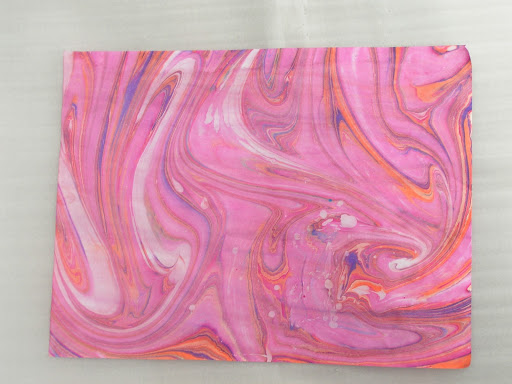
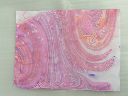
And larger papers which I am going to cut up and use for greeting cards.
We had a blast. We did discuss our Design Focus Friday and so this month I am going to try and find a couple of pieces of art and “critique” them to see if I can determine how the artist used the design elements and principles in their work. More on that later. Next month, the group will be coming to my house and we will be doing nuno felting. Perhaps I will remember to take some photos. I completely forgot to take any of us marbling as I became so engrossed in the process.


Elements of Design
1. Line – A mark on the surface that can be thick or thin, smooth or jagged. There are many types of line such as vertical, horizontal, diagonal, actual or implied, contour etc.
2. Shape –A line that comes together to form a 2 dimensional object which can be geometric or organic.
3. Form – A 3 dimensional object such as sculpture with real volume or thickness. It can be implied 3 dimensional shape using shading, lighting or other techniques in a 2 dimensional work.
4. Texture – The surface quality of the object whether it is rough or smooth. This can be actual texture or it can be implied by various techniques.
5. Color – This refers to the hue used from the spectrum of colors. A basic color wheel can be used to determine a variety of color schemes in including monochromatic, complementary, analogous or triadic.
6. Value – A property of color, value refers to the lightness or darkness in a composition. Contrast can be depicted by changes in the values you use.

Principles of Design
1. Center of Interest – Also called the focal point or emphasis, it is the way to catch the viewer’s attention. The center of interest is more important in the composition compared to the surrounding areas.
2. Harmony/Unity – The presentation of an image that is integrated and pleasing to the eye. Agreement exists between the parts and provides visual connection.
3. Balance – The distribution of the visual weight in a composition provides equilibrium to the piece. This can be symmetrical, asymmetrical, crystallographic or radial. All of the elements of design can be used to create balance.
4. Scale/Proportion – This refers to the comparative sizes of the components of the composition. It is relative, size measured against other objects or against a “normal”.
5. Rhythm – Refers to the movement of the viewer’s eye over repetitive patterns in the composition. It involves a clear repetition of an element in the piece.

http://desktoppub.about.com/cs/graphicdesign/a/designbasics.htm
http://daphne.palomar.edu/design
http://www.artgraphica.net/free-art-lessons/watercolor/watercolor-values.html
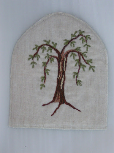
Here’s the page that Juliette sent me – isn’t it lovely? Her stitching is exquisite and I love the simplicity of it.
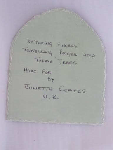
Here’s the back. Thanks so much Juliette! It will make a wonderful addition to my book.
