In my recent Art & Design class, we started creating a sample library. We used lots of different acrylic mediums on a variety of papers with different application techniques. The documentation is the hardest part because you need to remember what you did so it could be replicated if you wanted.

I’m doing more samples since I got home and adding more layers to some of the original samples done in class. The samples are all about 5″ x 7″.
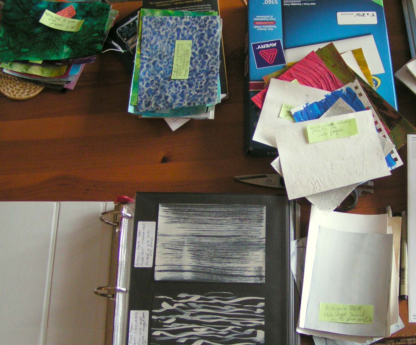
I have started putting my “library” together into a 2″ ring binder. I’m not sure I am going to have enough room. All the little green sticky notes have my notes about what the sample is, what medium and paper was used and how it was applied. Hopefully, none of these will disappear between now and when I get these into the book.

Here’s one of the original samples that I did in class. I have picked up a leaf on my way to the store and when I brought it home, it really matched this sample. We are supposed to add more color with colored pencils and other media to some of our samples. So I thought maybe the leaf would give me some inspiration.
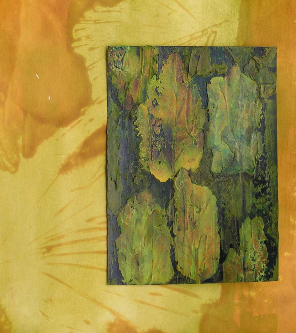
Here is the piece after I added more color and details. I’m trying it out on different backgrounds to see which I might like.

I love this red background but I think it is a bit too much for the sample piece. What do you think? Click on any photo to enlarge.

I don’t think the red background is too strong at all. It echoes and amplifies a red tone in the leaves and it celebrates that subtle blue grey. Very satisfying.
Thanks Pam, glad you like the red background. Even if I don’t use it with this one, I will definitely use it somewhere.
Wow! You’d think that the leaf was the inspiration for the green paper – what a find!
When your ring binder is complete it will be a wonderful reference.
I love the red background but I think it’s a little strong and it takes centre stage – the green piece shows better on the yellow.
Thanks Lyn, yeah, I know that was weird when I brought the leaf home and it matched perfectly. I agree about the red background. It will get used though for sure.
Remembering what I’ve done to replicate it is one of my big problems! Your ‘sample’ which matches the leaf is a lot like some of my abstract paintings, in fact any of your ‘amples’ could be actual paintings!
Thanks Zed, yes, replication is not my strong suit either. Not sure how many of the samples are strong enough to be actual paintings but it does give you ideas for what I could create in a larger format.
I definitely like the grenn against the yellow. It ties it all together. Great find with the leaf. You must have had your eyes attuned to that sample and the leaf stood out.
Thanks Marilyn, I do look for good colors in leaves.