I wrote a post about my first felt scrap landscape over on The Felting and Fiber Studio blog. I still had lots of scraps left over and some were pretty bright orange and pink. We visited Hawaii last week and those colors reminded me of sunsets.

Here’s the layout I started with for the sunset background. It’s a combination of screen printed, felted and dyed commercial felt.
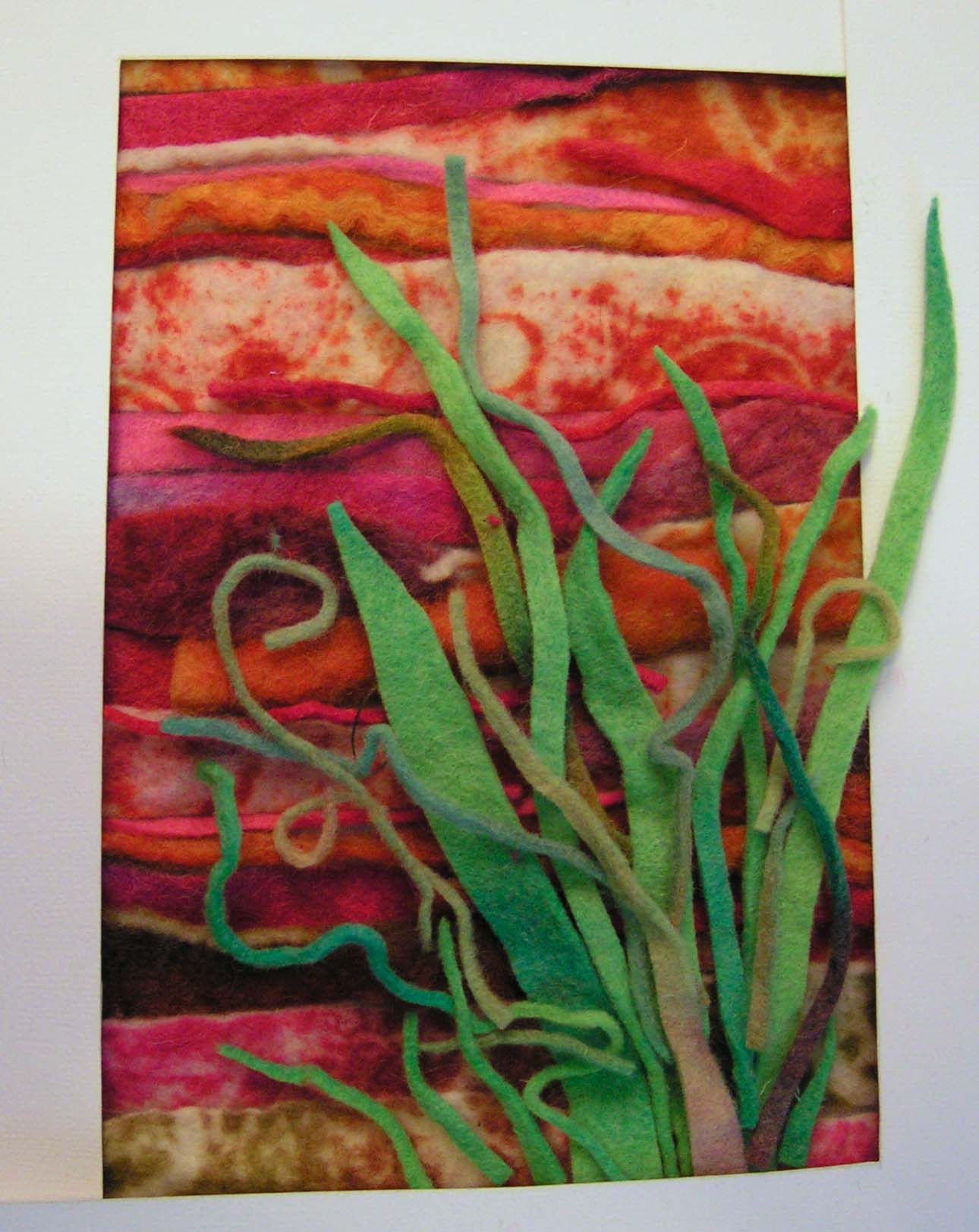
Then to add some lush greenery. I also wanted to include some fiddle head ferns still all curled up. I started with a light taupe green for these but midway through stitching I changed my mind. I felt the piece needed some darker values. You will see the change from this photo to the end but this was just a basic idea of how it would end up.

This time I decided that instead of using a white background of light weight interfacing that I would paint the interfacing. This is a terrible photo but you get the idea. Then there wouldn’t be any white spots showing through between the scraps.
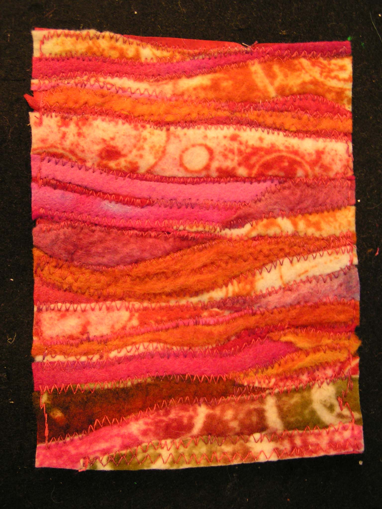
I used a zigzag free motion stitch on the machine to hold all the background scraps down. I used a variegated pink, red and orange thread.

You can see a little of the texture in this photo. The orange bits in the middle were not very well felted but the stitching holds it all together.

I then started to hand applique the leaves in place. At first I was planning on stitching them all flat to the background but decided I liked the way it looked with parts of the felt loose or just stitched on one edge.

And here it is with the matt around it. I definitely will not use the inside blue matt with this but that’s all I had at the moment. You can see the fiddle head ferns got darker in the end. I just cut some thin pieces from some darker felt scraps and then curled the end into a spiral. It was all a bit fiddly with the stitching but didn’t take all that long.

And here it is framed. Again, not the best photo but you get the idea. It definitely reminds me of Hawaii. Great tropical colors which I don’t use a lot but obviously if I had scraps, then I had used these colors before. Perhaps I just don’t usually use them together? These scrap landscapes are a lot of fun. I still have plenty of more scraps so I think I’ll just keep going. Have a great weekend.

Very nice and very Hawaii!
Another lovely scape Ruth – and such a good idea to paint the interfacing!
Thanks Lyn, I actually thought of painting the interfacing for the first one but was too lazy to get the paints out 🙂
Its great. I like how 3d it is with everything popping out.
Thanks Ann, I like that too.
Nani! Great idea to leave some of the felt loose peeking over the edge of the frame – it really adds to the sense of depth and movement.
Thanks Kim. I just couldn’t contain all that lush greenery in a small 5 x 7 frame 😉
Lovely work Ruth, you were absolutely right to add the darker shades of green, they give the whole piece so much more depth
Thanks Teri!