I always take my sketchbook with me when I travel and I recently took a trip to the east coast. These are a few of the pages that I worked on during my travels.
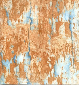
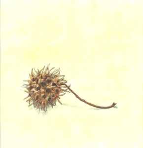
The top two were rusted already and I added the blue. The other two colorful ones had a layer of paint and soy wax and I added a bit more color to them, filling in the areas that were white from the soy wax. And the last one is a sketch I did at my sister’s house. This is a seed pod from a Sweetgum tree. We don’t have them in Montana so I picked up one on my walk and sketched it.
These two I did at home. I like the one on the right but I’m not so sure about the one with leaves. And thanks Teri for your suggestion of adding some black pen. Hope you all have a good weekend.


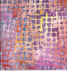
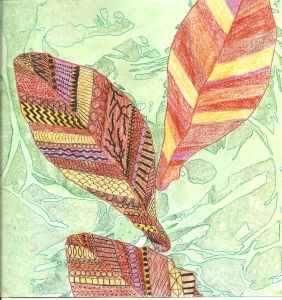

Wow, I so love looking at the pages from your sketchbook, it’s so much prettier and full of juicy colours than mine. I adore the purple, yellow and red soy wax print, that would look fab on fabric…. I like the added contrast in the ring sketch, your thoughtful (restrained) use of the black gives it a sense of movement. I think the leaves just need some deeper shades in the green background, the contrast between the background and foreground is too severe, giving the appearance that they are unrelated.
Thanks Teri! I just keep adding color until it gets juicy 🙂 I like the purple, yellow and red one too. I might have to look into some of those sites where you can put your own designs on fabric.
I am in the process of adding darker values of green to the background and it’s helping. So good eye! That was a great suggestion. I’ll show you the results soon.
Teri has hit the nail on the head. I was trying to think why the leaves were ‘missing something’ but I couldn’t think what until I read her comment.
I really like the circles – perfect!
Thanks Lyn – I agree Teri did figure it out. I will show you the outcome soon.
It’s funny I can spend weeks looking at my own work, knowing that it just is right but completely at a loss to figure out what is wrong or how to fix it, give me someone else’s work and it’s almost always obvious what to do! I guess it is all about perspective, we all get a bit too close to whatever we are currently working on so can’t see the Wood for the trees. Glad to hear the darker greens are working 🙂
They all look so nice 🙂 I honestly didn’t think anything about the background of the leaf one, but I love those leaves.
Thanks Zed. I am trying Teri’s suggestion and I will show it to everyone so they can see if they like before or after better 🙂
They all look good. I think it’s interesting that the leaves are colored and the background is green. Kind of a reverse scene. Cool!
Thanks Marilyn!