I worked most of the day competing my homework for Level 1 Color Studies. And it is finally finished.
 All of the pages just barely fit back together. The first comment from Dennis was “This book is heavy.”
 I was going to use this as the cover but decided to use the original one instead. I put this one in front of the section on color wheels.
 This is the page on painting neutrals to match a photo. This was really difficult to do and get colors that are similar.
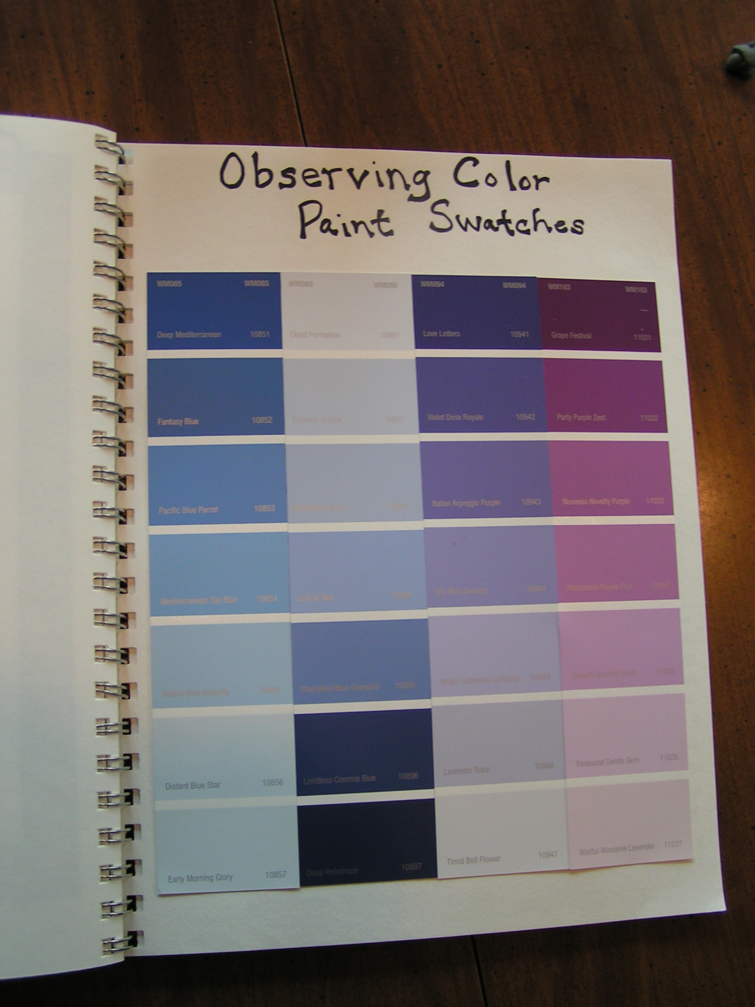 This section is about finding paint chips to match an object. I had a hard time with this exercise as well because nothing really seemed to match.
 The other problem with this exercise is that when I printed the photo of the object, the color wasn’t even close. I fiddled with the first photo to get it to match the real color. I left the purple vase photo as it printed out so it looks nothing like the paint chips.
 I enjoyed this exercise. I mixed and painted a variety of colors that I thought worked. Then I put them into a color scheme. I also found some fabric and threads that worked.
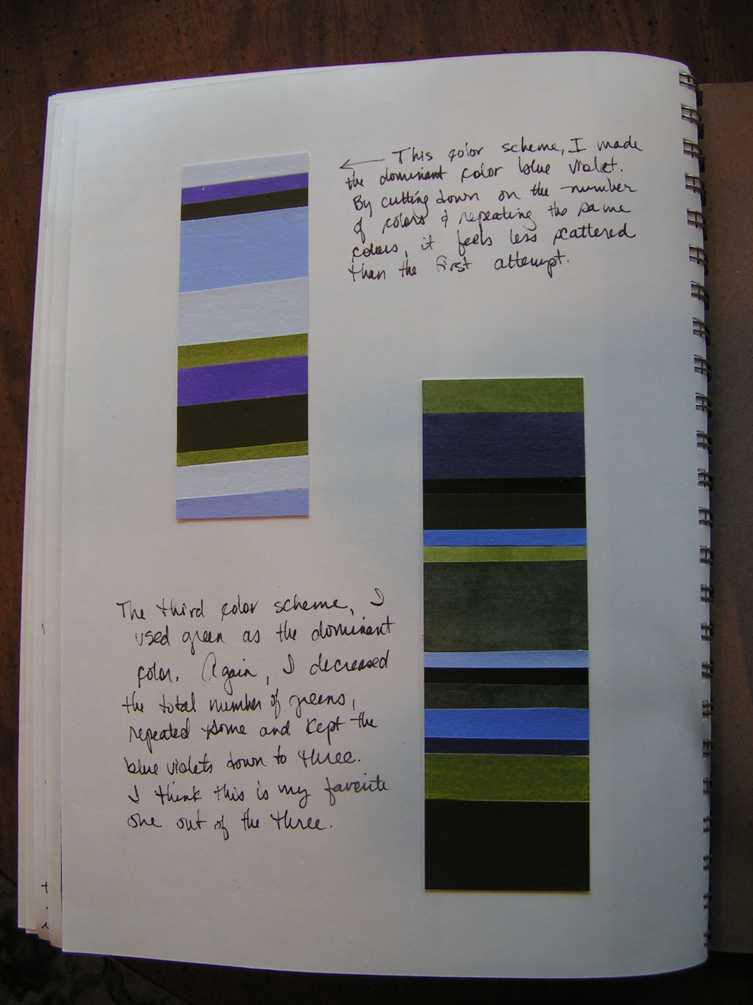 Then I made two more color schemes. One with more blue violet and one with more green. I like the one on the right best.
 After I finished the color notebook, I cut up a large Kantha piece into three squares. I am going to lace these and then they will be in an auction to raise money for a new exhibit space at the Gail Harker Center for Creative Arts.

That’s a lot of work Ruth, but I’ll bet you enjoyed it. Lovely colour book. 🙂
Thanks, I did enjoy it and I learned a lot.
This was a really profitable time for you. I can see how useful this will be in the future. Better than a college art class.
I have never taken any art classes in college but her courses are great. I am sure I will refer back often to my color books.
Your colour study work is gorgeous, Ruth. I’ve found that there isn’t much continuity from a real object, the photo as it appears on screen and the print out. We need a real life eye-dropper to match things up 🙂
I’m looking forward to seeing your finished Kantha piece.
Thanks Zed – hmmmmm…… maybe you could invent that! I will hopefully have three Kantha pieces done soon.
Colours are slippery……I have a theory that they change slightly when you look away.
Lots of hard work but worth it! I enjoyed reading the pages of your notebook (wish my handwriting was as legible as yours).
Thanks Lyn – those colors do seem to change. I wrote fairly slowly so that it could be read. Lots of times my handwriting is much sloppier.