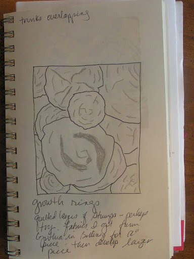
Here’s one of my ideas for a future piece with tree stumps.
I worked a few samples to see how I would like to do this piece. I don’t care for this one much.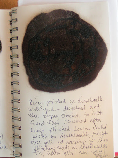
This idea worked better for me – as usual I go back to felt and I always seem to like that better.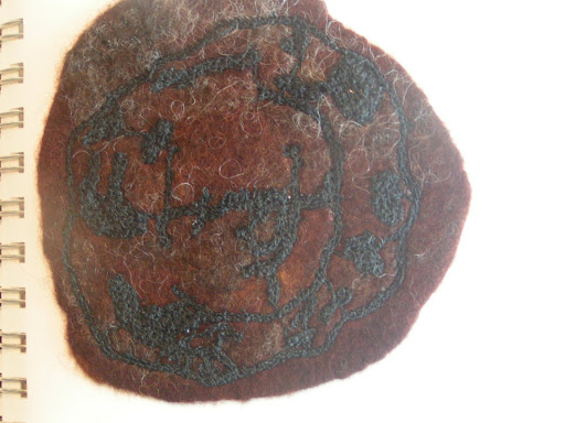
Here’s a close up. I think I’ll try some with lighter felt background as there isn’t enough contrast in this one. Plus all the stumps I’ve taken photos of are much more of a tan than a dark brown.
I did a backing for my July TIF “Halfway?”. I think it looks better – now I just need to get a frame for it. Have a great weekend! I was so happy today to be able to get back into my work room as our company is gone and my niece is no longer inhabiting the room. Such a wonderful day to be able to do whatever I wanted without worrying about company. Short reprieve though, we’ve got more company next week.
Category Archives: Uncategorized
Tree Stump Mosaic
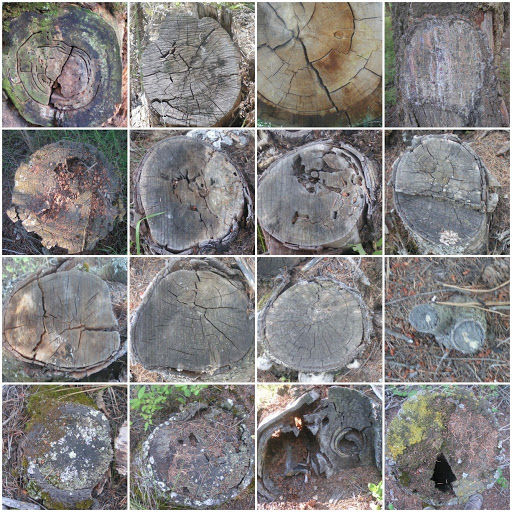
I’m working out a new project in my studio journal. These are some photos I took this evening in preparation. More later.
Mosaic of Photo Circles

Here’s a set of photos that I took for the studio journal course – we were supposed to take a set of photos of all one shape. I used this link for making the photo mosaic. I just noticed that I used one photo twice – that means I missed one – oops!
Studio Journal Course Continued

I have been really busy again this week and all I’ve been working on in the studio journal course I’ve been taking online at Joggles by Sharon B. Here I’ve taken a photo of a stump end, sketched it and then cut it up to form another design.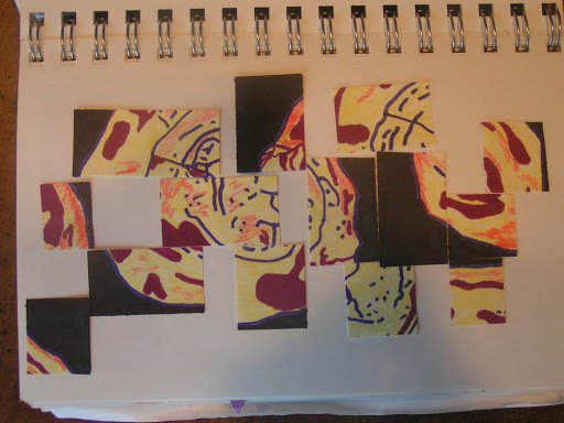
Here it is in color – but I didn’t really end up liking this one.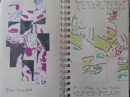
So I turned over the pieces from the photo above to get the design on the left. The one on the right is a different color scheme. I am definitely going to try one of these in fiber once all my company goes home and the summer time rush calms down.
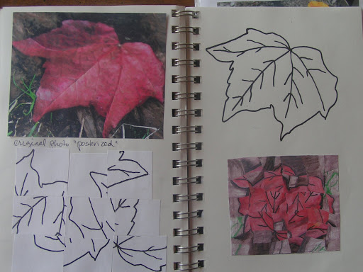
Here’s another one done from a photo of a leaf. I “posterized” it on the computer before printing it out. Then I sketched an outline which I copied and cut up. The bottom right design is done with a water colored version of the outline which I copied and then wove together with one of the photos upside down. It looks very floral to me as I’m looking at it now. It looks different if you enlarge the photo.
This week we are working with fonts and wingdings. So I printed some off and then put them on the copier and moved them around in different patterns.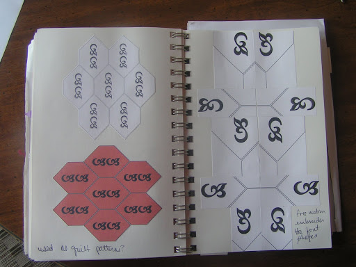
The I tried to work with them on the computer. I don’t have any fancy programs so I used MSWord. I used Autoshapes but still had problems getting what I wanted. So I finally printed some out, copied and cut them out and rearranged. I have to work on my computer skills I guess.
Here’s the last set. I hope everyone is having a good summer and I appreciate all the recent comments.
July TIF & Studio Journal Course Work

Here is my studio journal with part of my thoughts leading up to my July TIF challenge piece. We were working on frottage in the studio journal course and I was trying to decide how to use frottage for a complete design. I thought about doing a monochromatic, minimalistic landscape. Then I was thinking about TIF “Half Way Mark” and the two clicked. What if I made a landscape with a path that went “half way”. And since the distances in a landscape look different in the distance, how do you tell when you are really half way? Is your goal the horizon and if so, doesn’t the horizon keep moving away from you as you go forward? Therefore, the goal is illusion and so is the half way mark. To me, that means that it is the journey that is important and to keep yourself open to the opportunities that your journey affords you.
Here is the finished piece. This isn’t a very good photo though. It’s a felted landscape and I hand stitched the path to the “half way mark”. I’ve titled it “Half Way?”
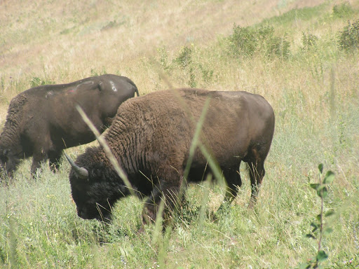
We went to the National Bison Range today. It’s about two hours from our house. We saw bison, antelope and lots of different birds. I took lots of photos as we are supposed to be finding design ideas in the world around us for this weeks studio journal exercises. More on that later.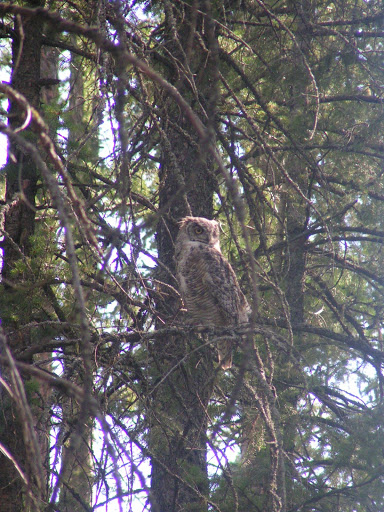
Here’s an owl I saw up behind our house yesterday while taking more photos.
Here are some expanded squares that I did as part of the studio journals course. I used a bird that I had used in my MIL’s book. I liked these so I made a stamp from the heads one. See below.
Here are some more expanded squares. I thought these were fun once I got the hang of how to do them. My niece and my sister also did a few.
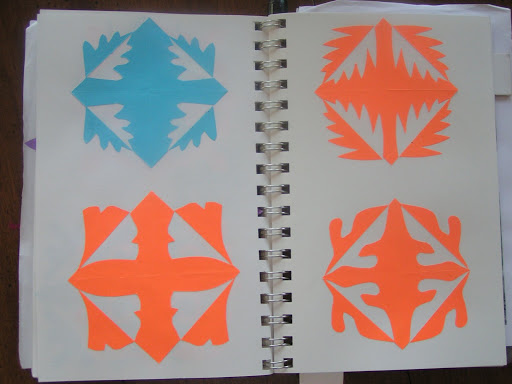
Another set.

Here’s the stamp I made from foam. I will most likely make more of these to use in future fiber projects.

Here I used my stamp on the right page with two different colors and overlapping. The right hand side is a commercial floral stamp that I was playing around with.
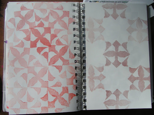
More patterning with the bird head stamp. I had a little problem with this as the pages in my journal are really quite small to put many of the stamps together.

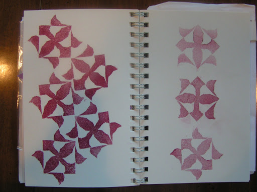
Last page of stamps.

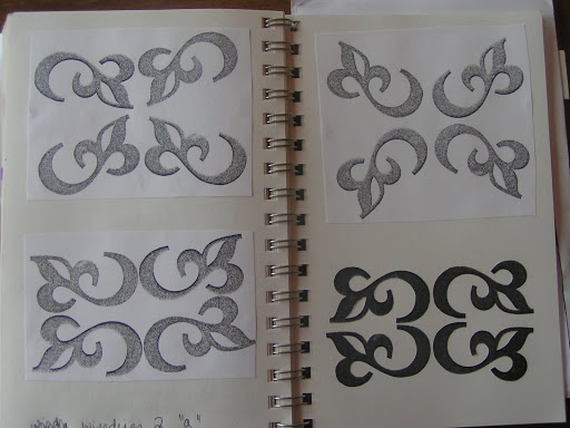
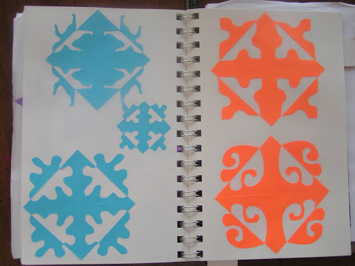
Here is more work from the kaleidoscopes. I traced parts or drew different pieces that could be used in design.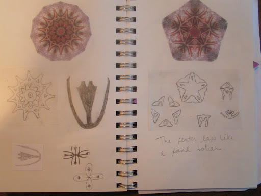
Another page of kaleidoscope parts. I am really finding this studio journal course useful and I am certainly getting into the habit of using my journal and exploring ideas more thoroughly. I have used more pages in my journal in the last three weeks than I have since January. I think this will really help in my designing process and I would highly recommend this course to anyone who wants to use a studio journal.
