Design Focus Friday

I checked out another book from the library about design. I’ve only read half way through part 1, but it is quite interesting. It’s a book about painting but she used a very mixed media approach so it translates well to fabric or fiber.

Here’s one section I thought would help anyone. I’ve shortened and summarized a bit.

Thirteen Tips to Become a Better Artist

  1. Look at good art.
  2. Read other art books (library, bookstores that sell out of print books)
  3. Study and take classes in other art fields.
  4. Find a place to create where you won’t be worried about the furniture or the floor getting stained.
  5. Create! There is no substitute for actually doing the work and making something (many somethings).
  6. Make small studies. Working on many small samples at once can help if you get stuck on one piece. Just go on to the next one. These small pieces will teach you so much that can be applied to larger works.
  7. View your in-progress work in an upright position, from a distance and from every orientation.
  8. Take good photos for reference. In order to create abstraction from reality, you must know that reality. Also take good photos of your work, you never know when you’ll need them.
  9. Work in more than one genre as one enhances another.
  10. Enter shows. Start by entering local shows, you must view yourself as a professional if you want to be treated as one. It is good to see how your work holds up against others work. If you start to win prizes at every local show you enter, it is time to enter national shows.
  11. Sell your work. It’s wonderful when someone wants to own something you’ve created.
  12. Make the time. If you really want to create, do it now. Tomorrow may never come. If you want to create, you have to make it happen.
  13. Reward yourself. (she says to treat yourself to food – this is a bad idea for any of us trying to maintain our weight.) Pat yourself on the back, go out on a fun outing, go to a movie etc.

There are also some very interesting exercises in this book and I’ll get to those later in the Design Focus Friday series. Next Friday I’ll start a new subject – line. I will also be hosting my local fiber group at my house and we’ll be working on nuno felting. I can’t wait!

Design Focus Friday

Just a short post about critique today. I haven’t been very comfortable with the critique process so I have been looking for pointers. Here’s what I found:

Jane Dunnewold of Art Cloth Studios has a wonderful tutorial about critique and a critique check list.

Quilt Critique is a website where you can get a free evaluation of your quilt. So if you’re looking for some feedback, check it out.

Here’s an interesting article of a critique of work by Nancy Crow.

Do you usually critique your own work or are you so happy when it’s finished, that you just go on to the next project? Could you learn something about your work and ways to improve it if you took a few minutes to critique your pieces? Let me know what you think about critique.

Design Focus Friday – Exercise 1

I have been putting this off all week. I have tried before to evaluate art using the elements and principles of design. But I never really do it. Why is that? Is it because I don’t feel confident? Who do I think am I evaluating another artist’s work? Do you feel that way too?
But that is why I’m putting the Design Focus Friday idea out there. To force myself to follow through even when the little voice in the back of my head is shrieking at me to quit. Is there another way to think about this that makes it slightly easier than the word “critique”? I decided I would think about it as trying to understand what the artist was thinking about when they created their work. How did the artist use line, shape or color to get his/her point across? Did the artist use symmetrical or asymmetrical balance? Why? With questions like that, I am focusing on what I can learn from that artist.
 So I am going to take a look at a painting by Vincent Van Gogh. I have always liked his work but wasn’t really sure why I liked it. I’m going to think about it as Van Gogh teaching me about how he paints not as if I am trying to evaluate or critique Van Gogh’s work. I also wanted to point out that Van Gogh produced around 900 paintings and 1100 drawings during a period of ten years but only sold one painting during his lifetime. Isn’t that amazing? It’s so important to keep producing work; the more you create, the better it will become.
So here it is.

This is called Green Ears of Wheat. How did he use line? The most evident lines to me are the stalks of wheat although there is also the implied line of the grasses, trees and horizon. Because there isn’t that much line, mainly dabs of color, these stalks are emphasized.

What about shape? Due to the subject, they are very organic. But the shapes aren’t really drawn with hard edges. The shapes are determined by the changes in color. I love the larger poppies in the foreground, don’t you?
Form? To me, Van Gogh achieves this by proportion and size as well as with color. The stalks in the foreground are bigger and overlap the smaller shapes in the background. His colors are brighter in the foreground and it looks hazy in the background due to his use of blues and grays.

One of the things I’ve always loved about Van Gogh’s work is the texture. By using daubs of color on the canvas, he gets such wonderful textures that could be felt. But he also has implied textures in the background with his use of color and value changes.

So for me, it all comes back to color. The colors are vibrant, the values change from the dark ground, to the leaves and ears and then those bright pops of red of the poppies against the greens provide emphasis. He uses value changes to differentiate the foreground from the background and the sky is a wonderful mixture of colors.

The ears of wheat are definitely the first thing that draws my eye and then down to the larger poppies. What draws your eye? I find it interesting that the central stalks are almost in the center of the painting. How does he make that work? The greatest contrast in values is the light green against the dark foreground with the two larger poppies on the right hand side. Perhaps that is the focal point? What do you think?

Harmony and unity look to me like they are achieved again by the use of color. The colors of the wheat, fields and poppies also show up in the sky with lighter values. The heavier weight of the foreground is balanced by a bigger overall background.

How is balance achieved? It’s asymmetrical, isn’t it? There is more weight to the right but that one stalk off to the left really draws the eye as well.
Proportion and size really give the painting depth. As I talked about in form, Van Gogh draws us into the painting with the large wheat stalks and then keeps us looking at details and wonderful colors throughout.
Last but not least is rhythm. The repetitiveness of the distant field’s vertical greens and even the continuous dots of red depict nature’s rhythms.
I’m not sure that everyone would agree with my assessment but each of us has our own view and opinion of artwork. This is the first time I’ve really sat down and looked closely and thought about what the artist was trying to portray through the use of design. I think what I like most about Van Gogh’s work is the use of color, value and the textures of the paint. Have you looked at your favorite artwork and seen how the artist applied the elements of design to develop the composition of the artwork? Take the time and don’t be intimidated. There is so much wonderful artwork out there that can teach you so much about design. Give it a try! And let me know if you put anything up on your blog so I can post a link.

Design Focus Friday – Episode 1

Doesn’t that sound like we’re going to be on reality TV? Did you hear Tim Gunn in the background with “Make it work, Designers!” I hope you’ll want to join in my journey into learning about Design Basics.

This is the first of many posts that I’m writing about design. All of this information I have gleaned from reading online, books and magazine articles about design. I will provide as many sources as I can and by no means is anyone to think I’m a design expert. I am just trying to learn more about design. To do this, I have formed a small group of local fiber artists which will be meeting once a month. As a group, we want to learn more about design principles and elements. So I volunteered to lead this part of the meeting. Since I have to teach someone else, I better learn about it first. This gives me incentive to really learn about design and challenges me to become more proficient in the use of these elements and principles in my work. Since I am already doing the work, I thought it would be fun to post the information here and anyone can follow along and join in the fun.
Each month, I will post the design topic, give an explanation and give resources for further information. I will then have a list of questions that you can begin asking about your work or your studio journal explorations to help focus in on that design topic. Anyone can join in and when you post your efforts on that design topic, please let me know and I’ll include a link to your post or photos so others can see what you’ve created. You can use the design topic to do work in a studio journal or create a piece of fiber art or whatever kind of art you make. I’d love to see your creations so don’t forget to leave a comment with your link so everyone can see. Please also spread the word to others if you get a chance.
Instead of focusing on “exercises”, I have decided to use open ended questions to start you thinking about the particular design concept for the month. I decided on this method after reading the website of Marvin Bartel. He is an art professor at Goshen College in Indiana. You should definitely check out his website as it has wonderful information about teaching creativity, learning to think artistically, and a list of creativity killers that I wish my teachers had read before they taught me.

This month, I’m doing an overview of design elements and principles. These are pretty standard and although there are some variations noted in different sources, I’ve tried to provide a comprehensive list. To develop a composition, you will be using design elements arranged with the principles of design in mind. There are no really hard and fast rules but the design principles can guide you to create a piece that draws the eye and keeps the attention of your viewers so that the message you are trying to express comes through in your art. Think of the elements as your building blocks and the principles as guidelines to follow in how to place your elements to achieve your best work.

Elements of Design

1. Line – A mark on the surface that can be thick or thin, smooth or jagged. There are many types of line such as vertical, horizontal, diagonal, actual or implied, contour etc.

2. Shape –A line that comes together to form a 2 dimensional object which can be geometric or organic.

3. Form – A 3 dimensional object such as sculpture with real volume or thickness. It can be implied 3 dimensional shape using shading, lighting or other techniques in a 2 dimensional work.

4. Texture – The surface quality of the object whether it is rough or smooth. This can be actual texture or it can be implied by various techniques.

5. Color – This refers to the hue used from the spectrum of colors. A basic color wheel can be used to determine a variety of color schemes in including monochromatic, complementary, analogous or triadic.

6. Value – A property of color, value refers to the lightness or darkness in a composition. Contrast can be depicted by changes in the values you use.

Principles of Design

1. Center of Interest – Also called the focal point or emphasis, it is the way to catch the viewer’s attention. The center of interest is more important in the composition compared to the surrounding areas.

2. Harmony/Unity – The presentation of an image that is integrated and pleasing to the eye. Agreement exists between the parts and provides visual connection.

3. Balance – The distribution of the visual weight in a composition provides equilibrium to the piece. This can be symmetrical, asymmetrical, crystallographic or radial. All of the elements of design can be used to create balance.

4. Scale/Proportion – This refers to the comparative sizes of the components of the composition. It is relative, size measured against other objects or against a “normal”.

5. Rhythm – Refers to the movement of the viewer’s eye over repetitive patterns in the composition. It involves a clear repetition of an element in the piece.

That’s the basics – it’s really not that complicated. I know that many people don’t feel confident in design because they haven’t been to art school. I haven’t either. But I think that together, we can work through these each month and it certainly won’t cost as much as art school!

So for the first month, do a little research. Look at the links I’ve provided below. If you have the time, the book Design Basics by David A. Lauer and Stephen Pentak is wonderful. I found a copy in my local library and it was the first design book that I’ve been able to read through without falling asleep. Do you have a sketchbook or studio journal? Do you use it much? Here’s an opportunity to start. Take a look at artwork that interests you either online, at a museum or from a book of your favorite artist’s work. How did that artist use the elements of design? Are the principles of design evident? Go through the list above and ask yourself how the artist used each of the elements and principles in the work. Why does a certain piece catch your eye and another doesn’t? Let me know how it goes and check back next month as we start with line.

http://desktoppub.about.com/cs/graphicdesign/a/designbasics.htm

http://daphne.palomar.edu/design

http://char.txa.cornell.edu/

http://www.artgraphica.net/free-art-lessons/watercolor/watercolor-values.html

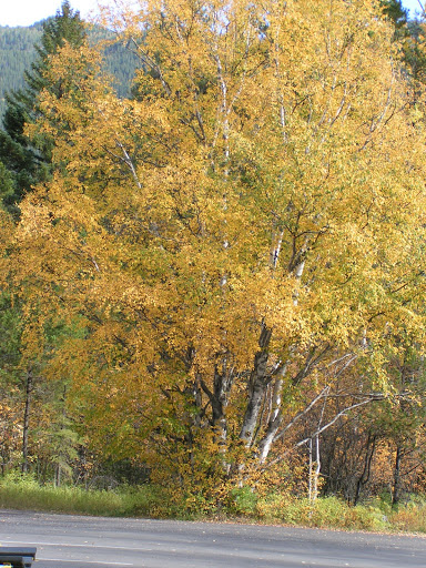
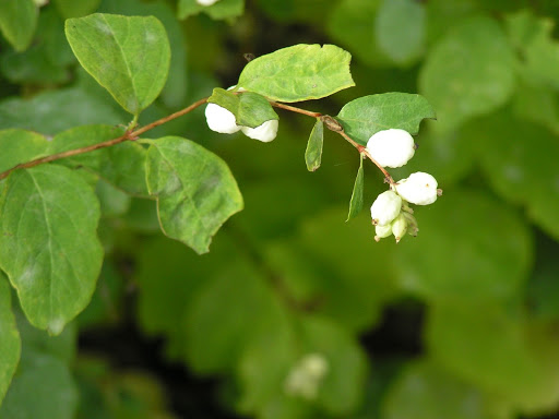
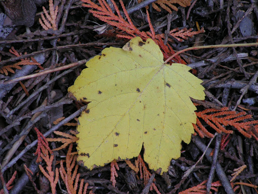
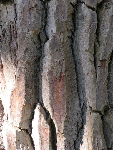
(All photos were taken last week at Glacier National Park.)