Life has been a bit crazy lately with company, travels and the usual stuff. But I have started on a new set of homework for Level 3 Art and Design. Most of what I’m working on is in some stage of being unfinished. But I did do a value study with some red and green squares that I had cut out some time ago.
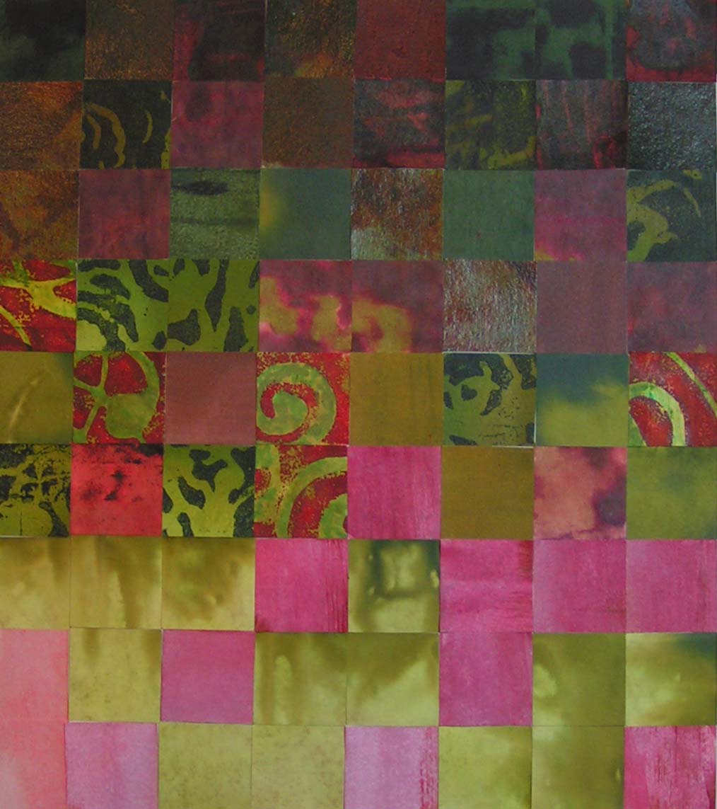
I had a lot more dark values than anything but I was able to find a few lighter reds that worked. Thanks for stopping by and have a great weekend!

Interesting study. I like the way it gets from dark to light very subtly.
Thanks Marilyn!
My mum always told me that “Red and green should never be seen” but I really like this combination. Happy Easter!
Thanks Kim, I really like the red and green color combination. Not sure why it shouldn’t be seen except it really reminds people of Christmas. Happy Easter to you as well!