I have created quite a few collages and extended prints. Now I need to put them into a notebook for presentation. I thought I had a 9″ x 9″ notebook that was new but I couldn’t find it anywhere. I searched and searched. I thought I might have lost my mind. But no, I put it with a pile of other notebooks but there are so many piles of stuff in my studio room that it took a while to remember which pile it was in. But thank goodness, I had one. Yay! So today I spent most of the day painting background pages. I had a bunch already painted but the holes are off and don’t fit into the same size notebook. That really irritates me but I don’t like the unevenness that it creates. So I figured out what colors I needed and then painted pages. Hopefully, the pages will work with the collages. It’s harder to paint the exact color that you need. It’s easier to choose from a selection of already painted papers.
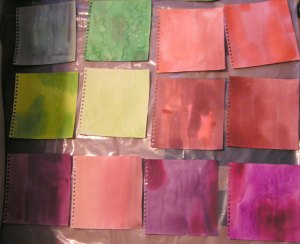
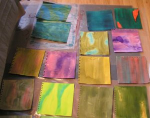
Here’s some of the ones that I painted today. There are a bunch more but the photo was blurry. I paint both sides of the paper so it takes a while for these to dry.


Here’s one of my collages. What do you think? Do you like the purple background or the yellow and orange background? I usually try out 3-4 different color backgrounds for each collage before I choose.

And last but not least, here is the Picasso head from last week. I decided to stick with monochromatic so did different values of blue. I’m sure that the orange or multi color would have been more exciting. I still might add some more color.
Thanks for stopping by and have a nice weekend.

The Picasso head works well in the blue Ruth – I’d leave it as it is! I like the yellow/orange background but it was a difficult decision as both backgrounds look good.
Thanks Lyn! The yellow and orange background really looks good in person. Even hubby agrees 😉
I like the yellow background, too. And I think sticking with the blue for Picasso was a good decision. Have fun putting your notebook together!
Thanks Marilyn! The notebook is together and I am mostly happy with it. Sometimes it is hard to put everything in order with so many different colors.
I am with hubby too, the yellow in the orange background really makes the figures in the collage pop. Nice work and I love the Picasso head, have you considered repeating him with different colours to see if changing the colour changes his expression / emotion?
Thanks Teri! I could try the Picasso peice again but I would have to remake the original freezer paper resists. Not sure how the stencils will work again either. They have a tendency to get wrinkled.
Can hardly wait to see your collages! Love your Picasso piece.
Thanks Tesi! I am looking forward to seeing everyone’s collages.
For once I’m with hubby – yellow background is good! 😉 And I think the monochromatic Picasso allows the design to show through without being distracted by colour. But would be interesting to see it with some orange too.
Thanks Kim! He was actually pretty good in choosing backgrounds for the various collages. I do agree that it would be interesting to do the same Picasso design with different colors.