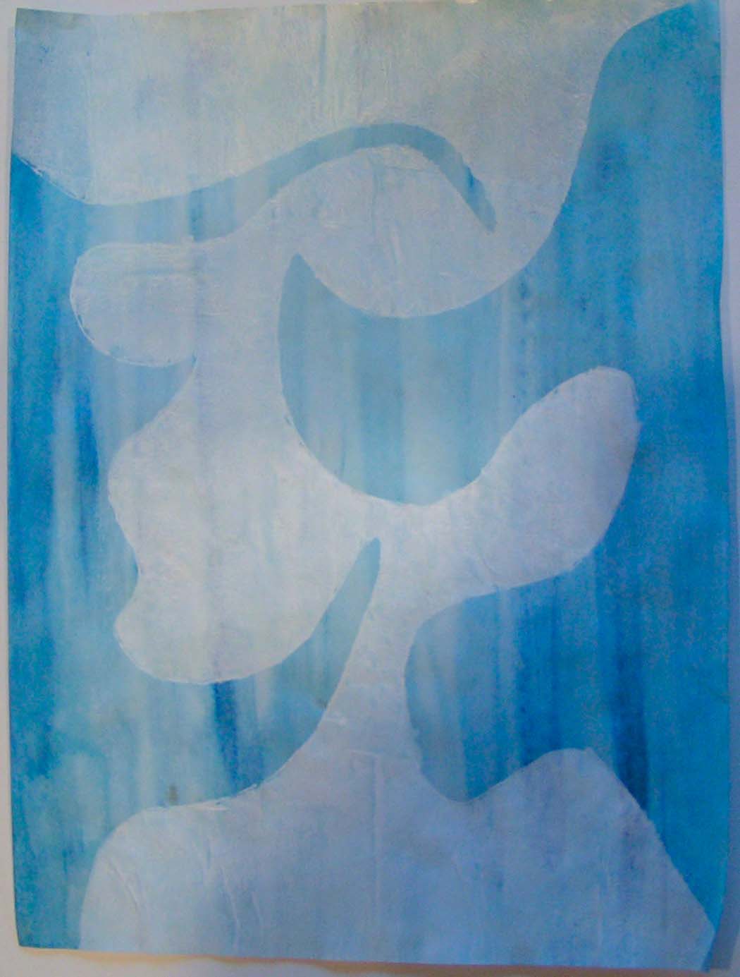
Part of my homework is to use freezer paper to make resists and stencils and then create a piece on paper with them. I have done several and this one I was thinking of waves when I cut out the design.
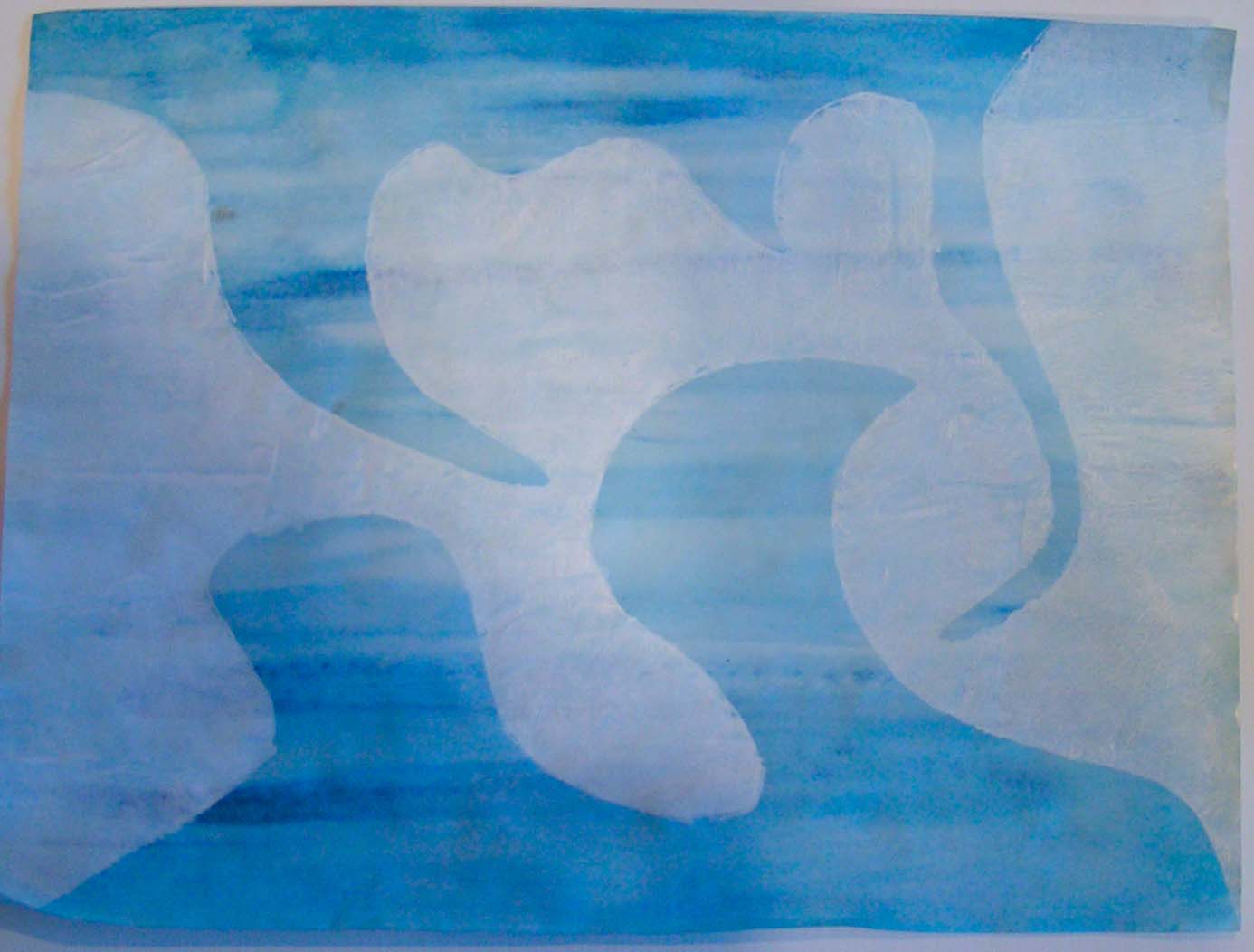
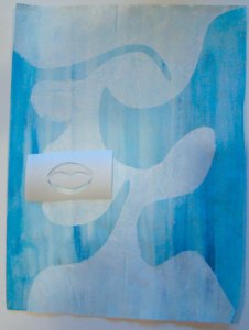
I applied the resist to blue paper and then painted white over the top. But then when it was dry, I could only see one thing in it and it wasn’t waves.
It was a “Picasso” head. Left side with a nose and the right side with a big open mouth. Hair on top, shoulders on the bottom. I think this might have been because I was doing some research on lino cut prints and I had looked at several by Picasso. So I decided to do a take on a Picasso lino cut. But I didn’t want to cut the stamp as I was only planning on using it once. So I decided I would make freezer paper stencils to achieve a similar effect.
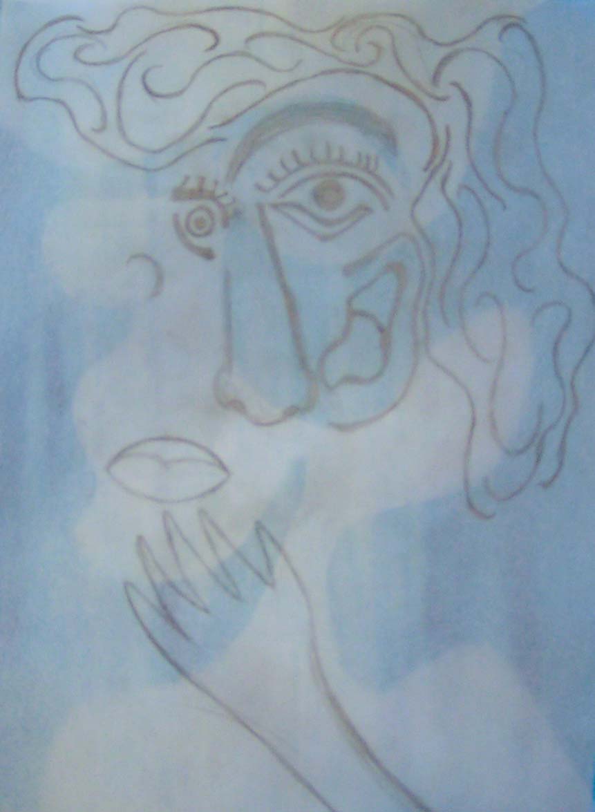
Here’s the design I came up with. You can see the head underneath the pencil drawing. Now to cut the stencil. Because I have had some issues with bigger freezer paper stencils either tearing or getting wrinkled up as I ironed them to the surface, I decided to make this in several stencils instead of just one.

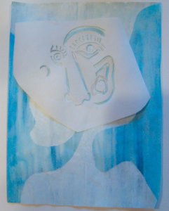

So I made four separate stencils which I could apply one at a time and hopefully it would create a cleaner print. Now I am deciding what paint colors to stencil. I had originally thought I would use dark blue for all the stencils. But then I thought maybe orange hair would be fun. But then I can’t decide if other parts should be different colors too. I think I need to go back and take a further look at the colors in Picasso’s lino cut prints. How many colors did he use? What color combinations? What would you suggest?

Brilliant save! Colour is always a tricky choice – maybe go for a Zed-type rainbow range of colours?
Thanks Lyn! It’s funny, I am leaning towards monochromatic and you’re suggesting rainbows. We’re at the opposite ends of the spectrum. 😄
I suppose it’s because I think of Picasso as outrageous and I always attach bright colours to over-the-top stuff.
Nice save Ruth! I think I’d start with the first dark blue one then relook at it. It may tell you what it needs next. But orange might be fun.
Thanks Marilyn, still thinking on it but I guess we’ll see how it turns out 🙂
Very Cool Ruth. I think I would go with several colours. Not necessarily Picasso colours , make it your won.
Thanks Ann, I definitely think it won’t really look like a Picasso, so no worries there. 🙂
As you’ve started with blue, you could use a mix of blues and greens, like his “Woman in a Green Hat” (though that was an oil painting rather than a lino print). https://www.albertina.at/en/exhibitions/monet-to-picasso/
Thanks Kim, good idea about adding in some green. I still haven’t decided yet what I’m going to do.
I’m liking the sound of orange on blue Ruth. As Marilyn said, once you get one colour down it might suggest to you what you should use next.
I went ahead and stayed with monochromatic. I will keep it that way for a while but I could always add more color if I wanted.
my vote is for orange too, I am a total sucker for complimentary colour combinations but that said, blue and white is lovely too – what emotion are you striving for (or what do you see in his face?), calm and peaceful (blues and greens) or zingy and energetic (blue/orange)?
Thanks Teri, right now he is being calm and peaceful. I might add more color but haven’t decided yet. I will show his picture soon.