After my print session, I now have tons of papers to use for collages and I’m trying to come up with different ways to use them. Putting all printed papers together presents somewhat of a challenge. Some of the collages I’m making are just made with printed papers and others include other papers from my stash. It’s a bit of a mess when I have it all spread out on the table making decision on what to use and what not to use. But it’s fun. My least favorite part of making a collage is gluing it down.

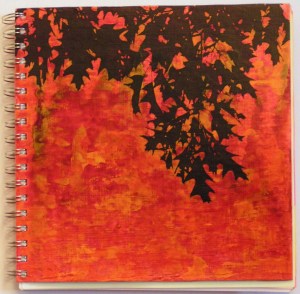
This one combines a variety of printed papers and other painting techniques. I think this looks better in person but the camera is having a hard time with the pinks and reds in this one. Plus the light is pretty dull at the moment.

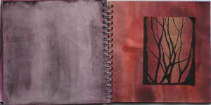
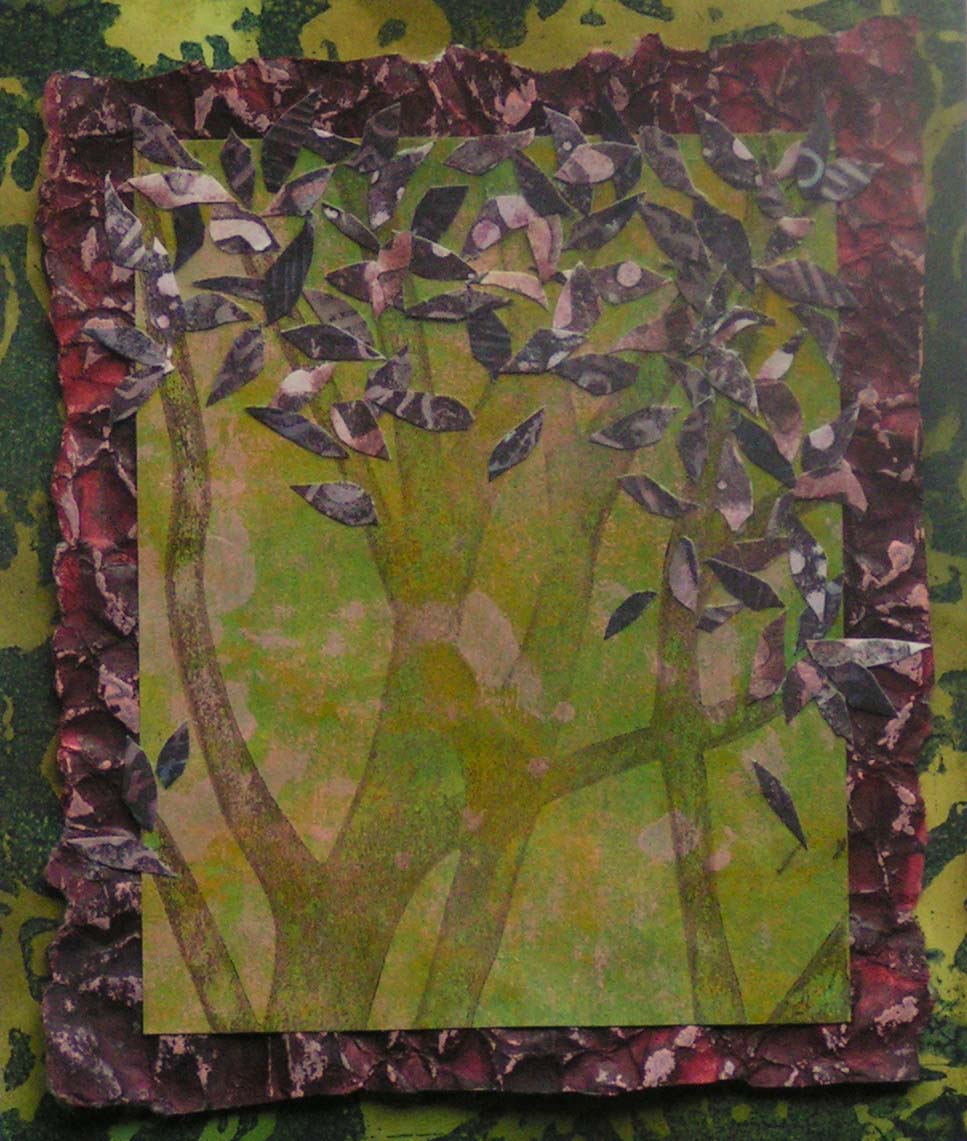
Here’s another leaf/tree theme. All of these papers were printed first and then combined.

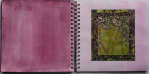
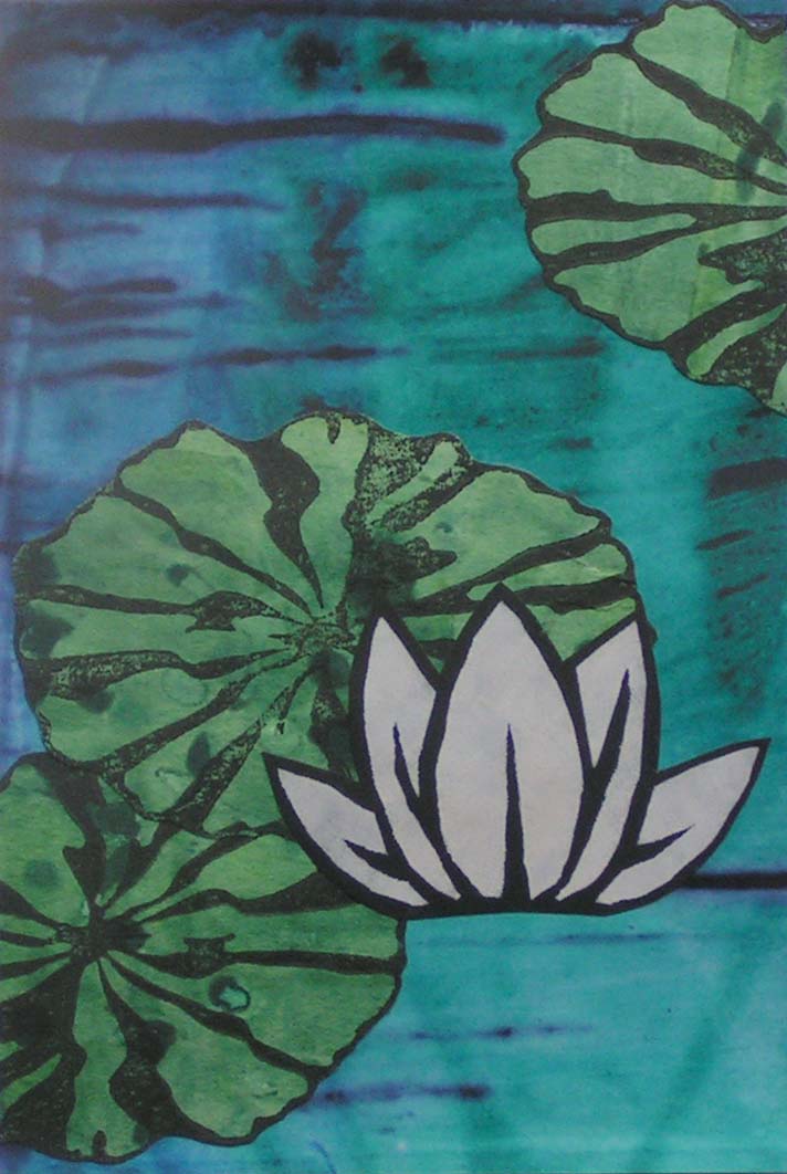
If you were getting tired of trees, here’s a very graphic one that is screen printed background, leaves are stamped and the water lily is a stencil. It turned out to be a very graphic style that isn’t my usual but I like the results.

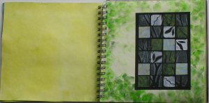
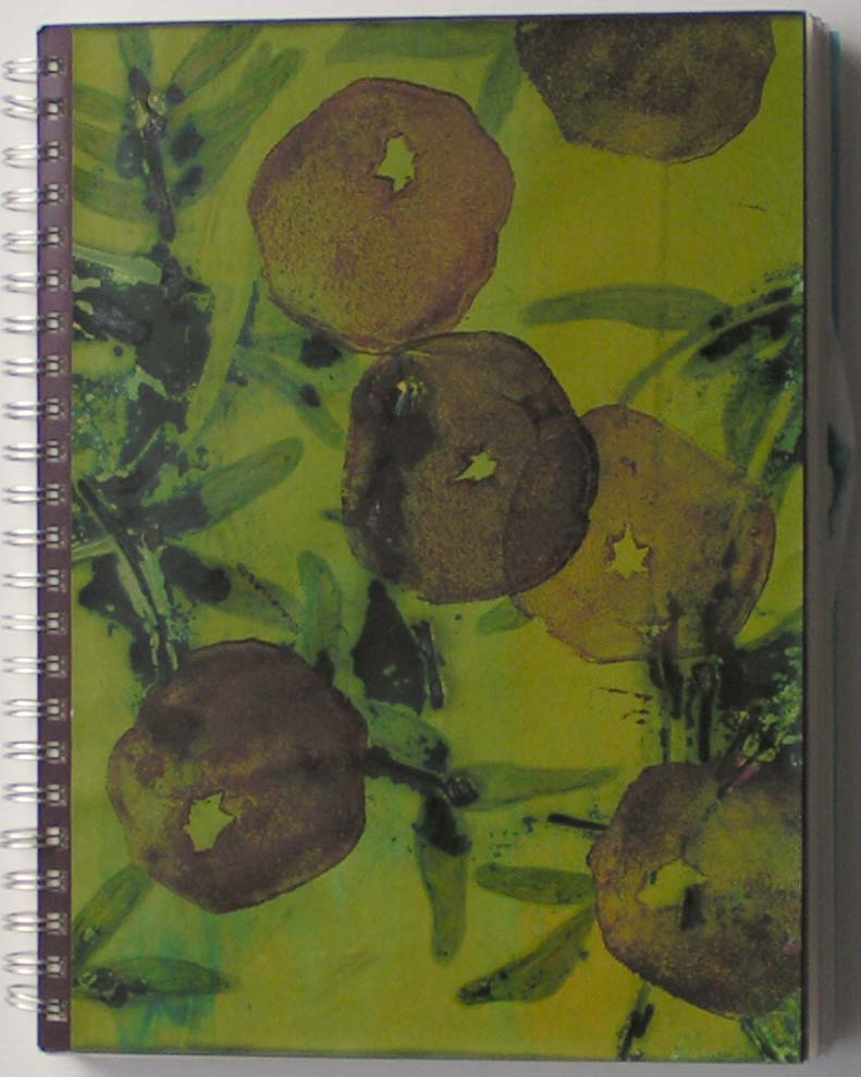
This one started out as total disaster. The center design was stamped on bright yellow paper and was quite ugly. The stamping wasn’t all that good and lots of yellow was showing through. The stamp was solid without any of the center cut outs. So I cut the entire design out of the yellow background leaving some of the yellow edges. Then I cut out the center designs and colored the edges where the yellow was showing through. I did try it out on a totally different background but then I found this one and it was perfect. The background has multiple layers of paint, glazes etc. and I think it started as a screen printed piece of paper. I really like the result of this and if I had tried to get this result, I’m sure I wouldn’t have gone about it this way. That is nice about those uglier prints, you don’t feel the pressure of preserving a “good” print so cutting it up and doing all different techniques to it is just an experiment as you have nothing to lose because it’s so ugly to start with. Not sure why I feel so insecure about those “precious” pieces that I really like. I’m always worried that I’ll ruin them. Do you feel that way too? Perhaps if I just decided they were all ugly to start with I would be more adventurous.