Design Focus Friday – Shape

We’re off to our next design element, shape. So what can shape do for you? Or perhaps the better question is what can working through these design elements do for you? Are you ever dissatisfied with how a piece turned out but aren’t sure why? Do you ever wish that you had planned ahead a little more instead of just throwing more embellishments at it? Learn more about design now because you’ll really be able to use what you learn every time that you make something new. Yes, it’s work but I’ve found that it’s fun once you get started!

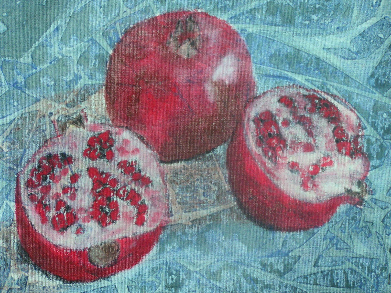
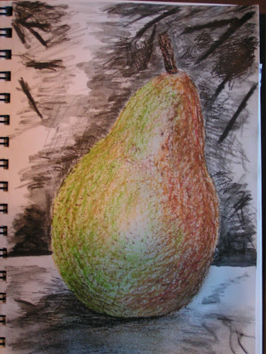
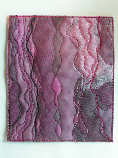
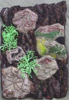
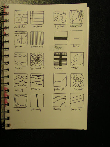
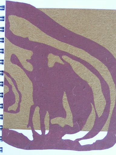
A shape is an area that is separate from other areas and/or its background. The separation can be by a boundary line or a change in value/color, texture or any other difference that lets you see that the shape is different. The boundary can be an outline or a distinct edge like cut paper, a rough edge like torn paper or a soft edge like a smear of charcoal.

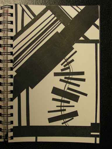
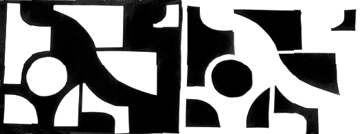
Mechanical shapes are those made with straight lines, circles and/or parts of circles — the shapes you can make with a ruler and a compass. These are man made shapes sometimes called geometric shapes. They can be simple or complex. Think of the inside of a clock or other piece of machinery. The feeling mechanical shapes give is of control and order.

Organic shapes are shapes found in nature — the shapes you draw freehand. They are generally complex and have a natural, spontaneous feel to them. Think of the enormous variety and complexity of plant and animal life.

Forms and shapes can be thought of as positive or negative. In a two dimensional composition, the objects constitute the positive forms, while the background is the negative space. For beginner design students, effective use of negative space is often an especially important concept to be mastered.
Some artists play with the reversal of positive and negative space to create complex illusions. The prints of M. C. Escher often feature interlocking images that play with our perception of what is foreground and what is background. Other artists take these illusions of positive and negative images to even greater lengths, hiding images within images. Perception of form and shape are conditioned by our ingrained “instinct” to impute meaning and order to visual data. When we look at an image and initially form an impression, there is a tendency to latch on to that conclusion about its meaning, and then ignore other possible solutions. This may make it hard to see the other images. Training the eye to keep on looking beyond first impressions is a crucial step in developing true visual literacy. (photo from the M.C. Escher site).
A shape or form can be open or closed. An open form involves placing an element in the work so that it continues beyond the frame, either literally or figuratively. If the main subject of our piece is shown in its entirety within the frame, it is a closed form.
OK, so now you know a little more about shape. What can you do with shape in your work this month?
• How does the composition change if you emphasize the positive shapes? How about the negative shapes? 

• With one main shape in a composition, would your piece be more interesting if the main object was integrated into the background?

• What do you see when you look at abstract shapes? Does the shape represent or symbolize something to you? How does this affect your connection with the viewer of your work?

• How can you move the shapes around in your composition to affect the depth perception in a piece?

• How does the size of the shape change where it appears to your eye? Does a larger size bring the piece forward? Smaller size?

• What does overlapping shapes do to your composition?

• How does making a shape an open form change your composition? Closed form?

Let’s get started! Leave me a comment about shape and how you use it in your work. I’m meeting with my local group today and we’ll be making our own stamps and stencils. That should be perfect for thinking about various shapes. I’ll post photos of my new stamps and stencils next week, so stay tuned.

Design Focus Friday – Line

I didn’t have much time this week to focus on line. I was a bit busy with a funeral, Thanksgiving and trying to get started on making Christmas gifts. So I thought what I’d do today to focus on line is take a look back at some of my previous work and see how I’ve used line in the past.
This piece is felted and was based on a photo I took of the moon behind our house. I wanted to show the brightness of the moon and the darkness/blackness of the branches. So the only line really is the branches. My favorite kind of line – the organic type.
This piece was done for an assignment in my machine embroidery class. It is all about line. And again, organic line. I seem to avoid those straight lines. In this piece, the focus seems to be the overlapping lines in the center. It is too centered and I really like either edge better. Perhaps some lines going in a more diagonal direction would have helped?
This is another assignment piece in machine embroidery.  Besides the out line of the fish and the grass, I don’t see a lot of use of line. Although the blue background has some light lines, I think the piece might have been enhanced a bit more if I had emphasized those lines in blue with more stitching. What do you think?
This is a piece that I worked on for a long time. I didn’t really plan much with this piece and it kind of kept changing as it went along. I used line in the stitching of the horse. Perhaps I could have used the sight line in Crazy Horse’s eyes to achieve more of an implied line. As it is, he is looking straight across and out of the piece. Perhaps it would have been more effective to have him looking upward at the hawk.
This piece is about trees and bark. I used line in the depictions of the tree trunks and in the bark itself. The pine lichen also adds line. Again, I tend toward the organic.
This piece was not planned well either. I started with oil paint sticks for the background. But I left a crease in the middle that looked awful when I was done. So I used the line of the branch to cover that area. Actually this turned out much better than I had hoped it would originally. Perhaps the moral is to just keep going and use the mistake as a cue to what to do next!
This is a machine embroidered piece that I spent a lot of time on and did do quite a bit of pre-planning. I didn’t use a lot of line in this piece. Although the various horizon type lines of grass and trees provide line. I think it would have been more effective if the lines of grass and stems in the forefront were more emphasized.
This is another piece about bark and how it relates to topographical maps. It uses a lot of line mainly achieved through value changes. Again, those organic lines showing up. Perhaps I should try more pieces with straight lines and geometrical shapes to push myself out of my comfort zone? Or add just one or two straight lines to an allover organic pattern? What have you been doing with line?


Design Focus Friday – More Line

 I’ve been focusing on the element of line this month. And so I see line everywhere. These are from Dharma Trading Company’s supply of copper tjaps. Of course I picked out the organic lines instead of the geometric line patterns. After I had cut out these copies to put in my studio journal, I was throwing away the scraps and noticed that the black areas had been cut into lines. So I saved them.

 And made this collage of black and white lines. While I was working on this, I couldn’t decide when a line becomes a shape. Is it a really thick line or is it a rectangle? I tried to not over think this process too much and just started gluing down the pieces. I couldn’t manage to do the whole piece without any curves. But I like how it turned out.

 Then I tried this exercise where I had pairs of words and then I drew lines to represent the word. Again, I was trying not to over think the process. You can click on the photo to see it larger if needed.

Here’s journal spread that I have been working on. I added some line to it but it isn’t finished yet. I keep adding as something seems to fit or if I’m working with paint and have some left over. This definitely needs more work. What would you add to it?

Design Focus Friday – Line

 I’ve been out looking for line this week. Horizontal lines…

 Diagonal lines…

 Curved lines…

 Horizontal and diagonal lines combined…

 Organic lines…

 I love the lines of the cat tails in this photo…

 My favorite kind of lines…

 Here’s a piece a did a while ago based on a tree stump which uses line…

 Radiating lines…

 Love the lines of shadows between the rocks…

 More shadow lines…

And then the lines of the aspen which are so dramatic after they’ve lost their leaves.

What lines have you found? Let me know!

Design Focus Friday – Line

The first element of design that we’re going to play with is line. There are many different types of line – horizontal, vertical, diagonal, dotted, jagged, thick, thin, wavy, straight, long, short – the list could go on indefinitely. How many different types of line can you find? Take photos of as many of the lines as you can that you see during your day. Now go through the photos. Which of the lines do you like better and why? How can you use these lines in your work? How can you use them to organize? Texturize? Guide the eye? Provide movement?

Be aware of what the shape of lines can convey. Sharp edges could indicate tension, crispness, hardness, formality, or high tech. Soft edges and curves may be softer, flowing, more casual, or more personal. Even small changes in line thickness, endings, or shape changes can alter the look and feel of a design. Try drawing sets of patterns using only black or white lines that illustrate static, dynamic, or random line patterns. Experiment with line width, spacing, and using horizontal, vertical, curved, and even diagonal lines.

How can you use line in a composition to make it more active? Or still? What direction of line conveys more action? Or serenity? What emotions can you evoke with line alone? What does changing the weight of the line do to your composition? Or changing the texture of the line?

Try thinking about and using line in your work this month. I’d love to see what you come up with so do leave a comment. I’ll post a link to show everyone else what you’ve created.