Design Focus Friday – Harmony and Unity

 Using repetition to create harmony and unity is often seen in traditional quilt patterns. Shapes are repeated and colors are repeated to give a pleasing unity to the quilt. I don’t make many quilts and the piece above is made from selvages that are repeated. Often the quilting is repeated over the quilt’s surface and that may create a unifying factor.

 Any of the design elements that I have discussed before can be repeated. This is a simple pattern of repeating lines based on frost. Think about how to use the different elements in your composition and how you can repeat them to create harmony. Should you use repetition of line, shape, color?

And the shapes or lines that are repeated do not have to be the same. Similar shapes and lines that are related still give repetition and a feeling of unity without being too boring. Do you use repetition in your work? Let me know and leave a comment.

Design Focus Friday – Harmony and Unity

 To use proximity to increase the harmony and unity of a piece, you need to keep the elements clustered together. If the elements are just scattered over the surface, the piece will look very random and chaotic.

Instead, keep all the elements close together. The piece above made with all French knots is an extreme example of clustering the elements together. This piece has the stitches crammed together with only a few scattered down from the right corner.

How do you use proximity of the elements in your work? Leave a comment, I love to hear what you are doing.

Design Focus Friday – Harmony and Unity

 This month on Design Focus Fridays I will be discussing the principles of harmony and unity.

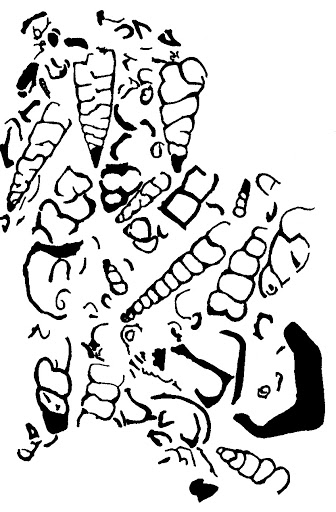
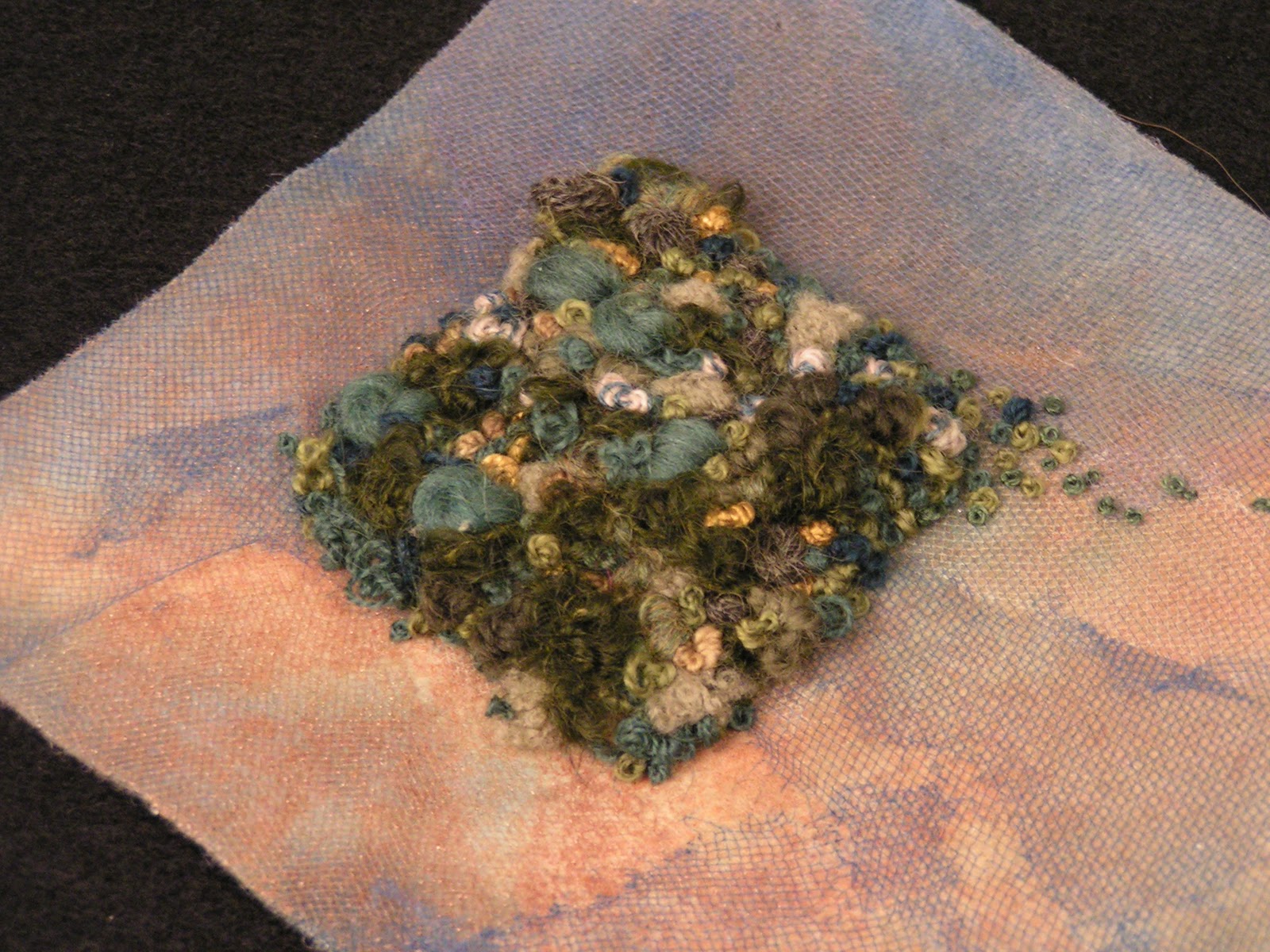
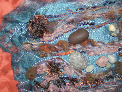
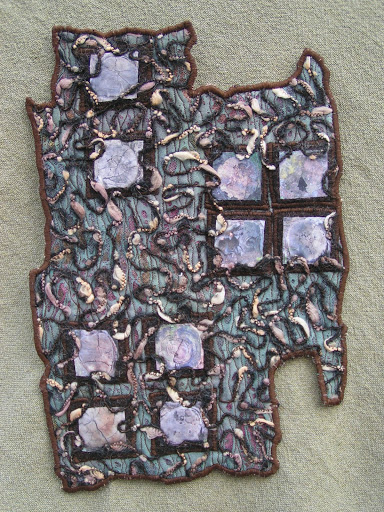
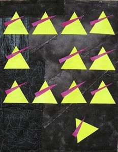
Unity is the presentation of an image that is integrated; an agreement exists between the various elements and they look as if they belong together. Another term for this is harmony. If the various elements are not harmonious, if they appear separate or unrelated, your design is not cohesive and lacks unity. An important aspect of unity is that the whole of the design should be dominant – you should see the whole before seeing the individual parts. Creating visual unity is made easier by the fact that the viewer is looking for some sort of organization, something to relate the elements. Viewers tend to group objects that are close into one unit; negative spaces will also be organized. Objects of similar shapes will be grouped together by the viewer’s brain. Our brain looks for similar elements, and when these elements are recognized, we will see a cohesive design.


Unity can be achieved by the following methods:

  • Proximity – put the elements close together
  • Repetition – repeat various parts of the design to relate the parts to each other
  • Continuation – continue an element from one form or another to draw the eye
  • Continuity – the planned arrangement of various forms so that their edges are lined up i.e. using a grid to create serial designs

However, you don’t want too much unity as it can be boring. Thus you must consider adding variety. Shapes may repeat, but perhaps in different sizes; colors may repeat, but in different values.

Questions to get you started:
Can you produce a design that is only of one subject repeated many times? How do you keep this design from becoming boring?
Practice making small compositions with a variety of geometrical shapes. How do the elements look scattered randomly across the surface? What happens when you move the items into groups that are close together or overlapping? What does your design look like with similar shapes repeating in a pattern? How can you move the viewer’s eye from one shape to the next? If you use a grid as your format, how does this affect the design?
I’d love to hear how you are using the principles of harmony and unity in your  work. Leave a comment or a link and thanks for visiting!

Design Focus Friday – Emphasis on Focal Point by Placement

 I found a few examples of my own work for this weeks examples. To emphasize your focal point by placement, you need to have elements that point the way to the focal area. In the piece above, the rocks are all pointing in towards the rush of water. I didn’t really do that on purpose though, it just came out that way. This piece was done as an experiment and has multiple layers of paint and paper and the focal point developed with the layers.

 In this felted piece entitled “Half way?”, the trail and several wedges of darker color point towards the focal area.

The last example is showing a focal point that is a bit too close to the center for me. I should have put the moon off to the left or right a bit more. All the branches are pointing towards the moon and keep your eyes traveling back to the focal area.

I hope everyone in the US has a wonderful Memorial Day and thanks for stopping by!

Design Focus Friday – Focal Point Using Isolation

 After searching through my photos and artwork, I realize that I rarely use isolation to emphasize my focal point. The illustration above from Bonnie Skaalid shows a still life set up. Because the rest of the pieces are grouped together and the glass is separated from the main group, it becomes the focal point.

Here’s another piece by Quilter Beth in which she demonstrates using isolation to emphasize the focal point. The triangular piece at the bottom looks as if it is falling away from the rest of the group and your eye is therefore drawn to that piece.

Do you use isolation for emphasis? Look through your recent work and see if you find any focal points that are emphasized with isolation. Do leave a comment and let us take a look!